
15 Living Room Gallery Wall Ideas with Layouts You Can Recreate
15 Living Room Gallery Wall Ideas with Layouts You Can Recreate A gallery wall is the fastest way to make…
15 Living Room Gallery Wall Ideas with Layouts You Can Recreate
A gallery wall is the fastest way to make a living room feel finished. It fills that blank stretch of wall over the sofa, turns a pile of frames you have been meaning to hang into something intentional, and gives guests something to actually look at. The hard part is not collecting the art. It is knowing where each piece goes, how far apart they sit, and how to get them on the wall without ten extra holes. Below are 15 gallery wall layouts, each one a complete idea with spacing, a hanging template method, materials, and a lower-cost alternative. Pick the layout that fits your wall, gather your frames, and hang with confidence.
Jump to a layout
- A balanced grid of similar sizes
- A loose asymmetrical cluster
- One central piece with smaller companions
- A vertical arrangement in a narrow area
- A horizontal row above furniture
- A restrained two-color composition
- A mixed-size arrangement with shared spacing
- A low arrangement aligned to a nearby surface
- A group unified by one frame finish
- An arrangement following the wall shape
- A subtle tonal grouping
- A vintage-and-modern mix
- A repeated shape with varied textures
- A corner-spanning arrangement
- A paired composition with generous space
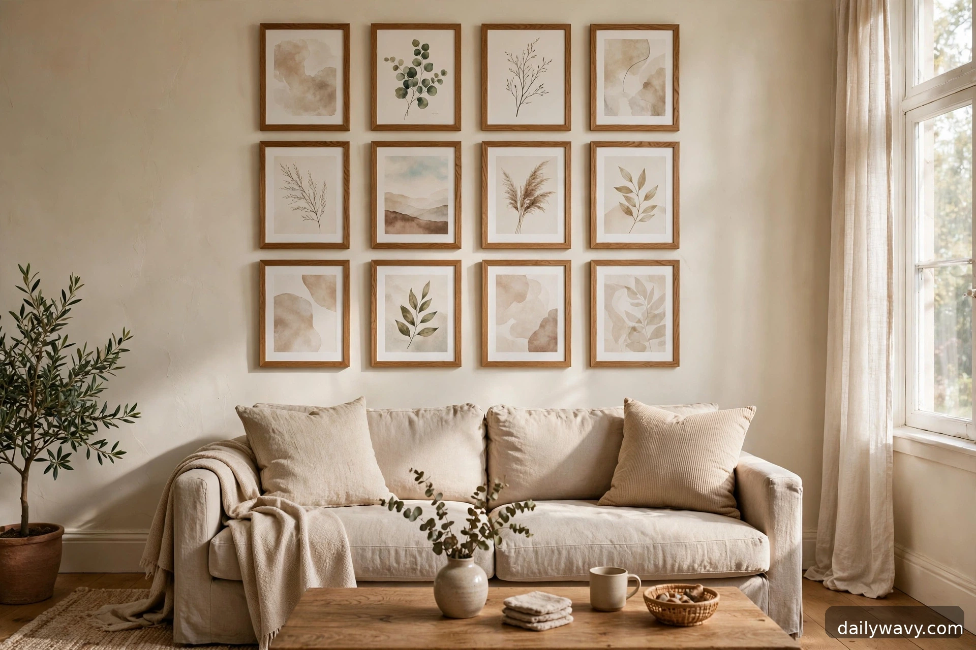
1. A balanced grid of similar sizes
The grid is the calmest layout in this roundup, and the one that forgives the most. Choose six or nine frames in exactly the same size, 12 by 16 inches works beautifully over a standard sofa, and hang them in even rows with 2 to 3 inches of space between every frame. Measure the total width of the grid first, mark the center point on the wall at about 57 to 60 inches from the floor, and work outward from there. The outer edges of the grid should land roughly 6 to 8 inches inside the edges of the furniture below, so a 78-inch sofa takes a grid about 60 inches wide.
Cut paper templates for each frame, tape them up, and step back before you touch a nail. Adjusting paper is free; patching holes is not. Black, white, or natural wood frames all work here, and the art inside can vary as long as the frames match. This layout suits renters too, because lightweight frames under a few pounds each can go up on adhesive hanging strips rated for the weight. Check the package rating and your wall surface, and confirm with your lease before using nails.
Lower-cost alternative: buy one bulk set of identical document frames and print your own art at home or at a copy shop.
2. A loose asymmetrical cluster

If the grid feels too formal for your living room, a loose cluster gives you the same fullness with a relaxed rhythm. Gather frames in a few different sizes, say two large, three medium, and four small, and arrange them so the overall shape stays roughly balanced even though nothing lines up exactly. Start with the largest piece slightly off-center, then fill around it, keeping 2 to 3 inches of breathing room between neighbors. The trick is to keep the outer silhouette of the whole group close to a rectangle or oval, which keeps the looseness from reading as random.
What to measure: the wall area you want to fill, and the widest piece. Build outward on the floor first, photograph it, and use paper templates on the wall to recreate it. This is the most forgiving layout for mixing frame finishes and art styles, because the asymmetry absorbs differences. Approximate effort: an hour to arrange on the floor, plus hanging time.
Lower-cost alternative: use thrifted frames in different finishes and unify them with one coat of the same spray paint.
3. One central piece with smaller companions
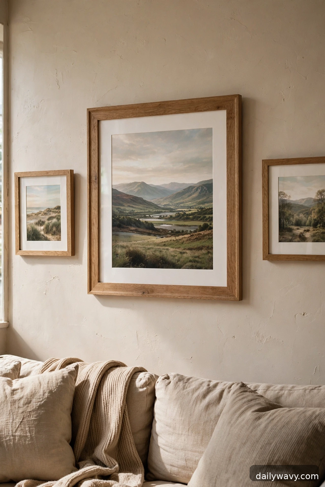
One strong piece does the heavy lifting, and a handful of smaller frames keep it company. Hang your statement piece first, centered at eye level, about 57 to 60 inches from the floor to the middle of the piece. Then place two to four smaller frames around it, leaving 3 to 4 inches of space so the central piece keeps its presence. A large 24 by 36 inch print flanked by 8 by 10 inch pieces on each side is a classic proportion.
This layout works especially well when you own one piece you love and a few smaller things that never found a home. Keep the frame finishes within one family, all black or all natural wood, so the size difference is the only contrast. For heavy central pieces, find a stud or use a wall anchor rated for the weight; plaster walls need hardware made for plaster rather than standard drywall anchors. If you rent, a large lightweight canvas print with adhesive strips can anchor this layout without nails.
Lower-cost alternative: frame a single large poster or calendar print instead of buying original art for the center.
4. A vertical arrangement in a narrow area
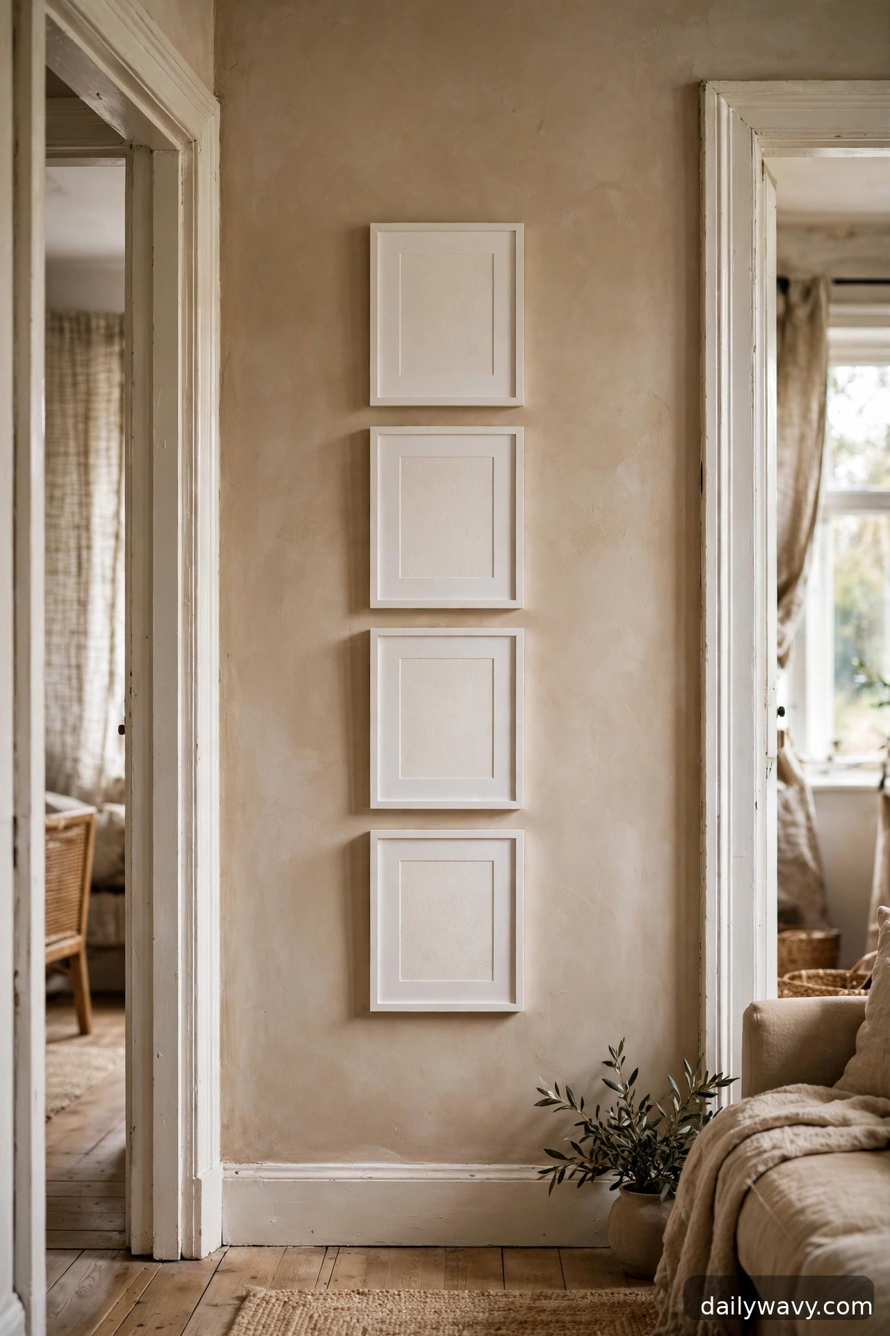
Narrow walls, the strip between two doorways, the panel beside a bookshelf, are made for a vertical column of frames. Stack three to five frames of the same width in a single column with 2 to 3 inches between each, centered on the wall strip. A column of four 11 by 14 inch frames fills a 24-inch-wide wall section beautifully. This layout is a lifesaver in narrow living rooms, where horizontal wall space is scarce but vertical space goes unused.
Measure the wall width and the ceiling height first. Leave at least 6 inches of clear wall above the top frame and below the bottom one so the column breathes. Keep the frames identical in finish for the tidiest look, or alternate two finishes for a quiet rhythm. Because the column is narrow, it hangs quickly, and adhesive strips are usually enough for frames of this size if you respect the weight ratings.
Lower-cost alternative: use one long floating picture ledge instead of individual hangers, then lean the frames in a column.
5. A horizontal row above furniture
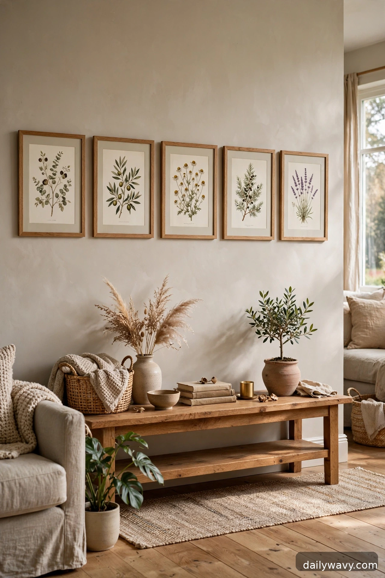
A single horizontal row of frames above a console, bench, or sideboard gives a room a calm baseline. Hang three to five frames in a straight line, all with their centers at the same height, about 57 to 60 inches from the floor, or 6 to 8 inches above the furniture surface if the furniture is tall. Keep 2 to 4 inches between frames, and let the total width of the row span roughly two-thirds to three-quarters of the furniture width.
This layout rewards consistency: same frame size or same frame finish, with art that shares a theme. A row of botanical prints, a series of travel photos, or a set of abstract pieces in matching frames all read as one deliberate statement. Use a level and a long strip of painter’s tape as your guide line so the row stays true. For renters, a picture ledge shelf achieves the same horizontal line with zero holes, and you can rearrange the art whenever the mood changes.
Lower-cost alternative: hang a set of matching clipboards or simple poster hangers in a row.
6. A restrained two-color composition
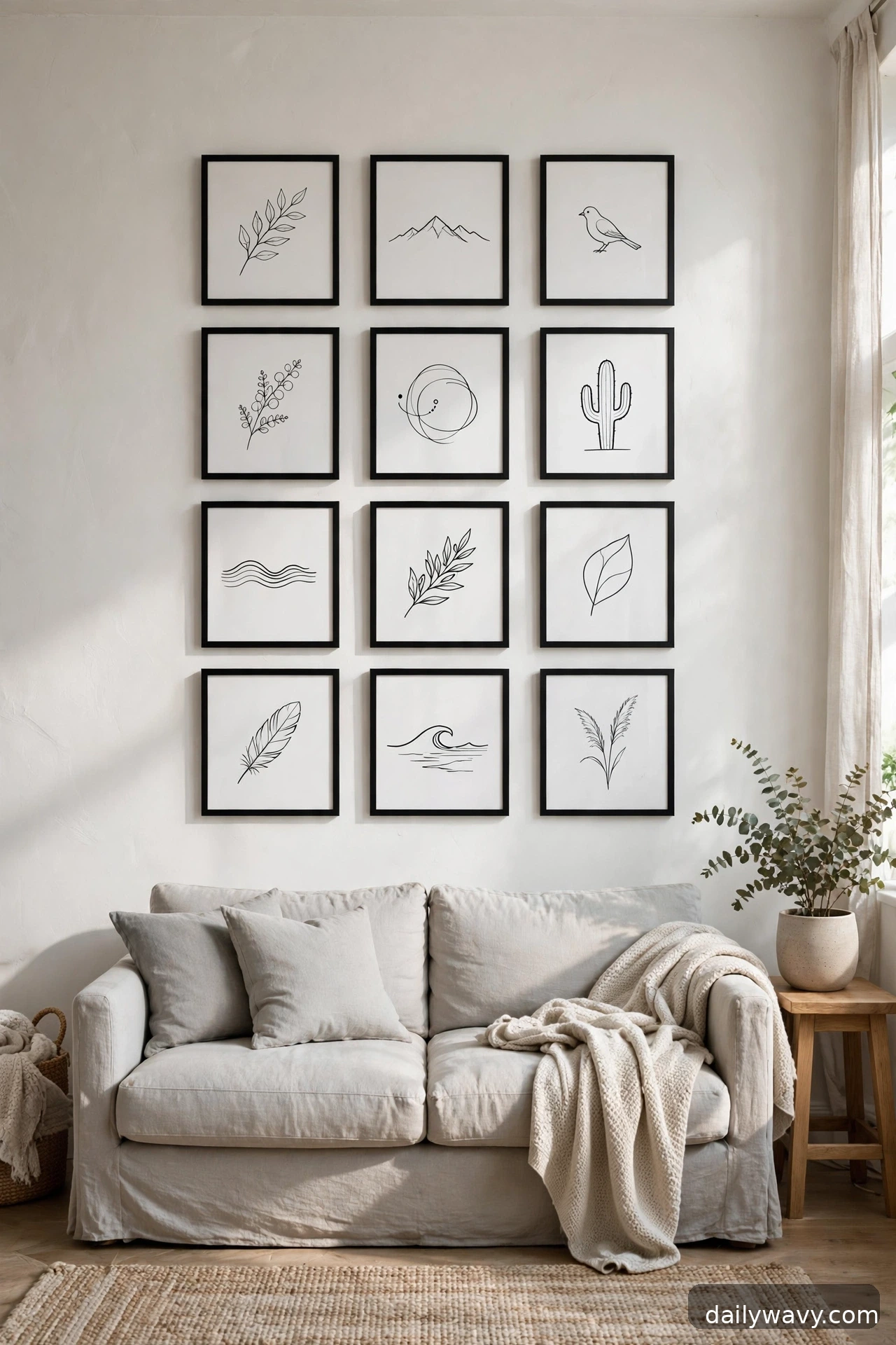
Limit your palette and the whole wall calms down. Choose art in just two colors, black line drawings on white paper, or sepia photographs, and hang them in a loose grid or a tidy column. The restriction does the styling work for you: even frames of different sizes look unified when the art inside shares one palette. Aim for 2 to 3 inches between frames and keep the overall footprint balanced over your furniture.
This layout is ideal when your living room already has a lot going on, patterned textiles, an interesting rug, plants everywhere. A two-color gallery wall adds interest without competing. What to measure: decide the footprint first, then choose frame sizes that fill it. Black and white is the classic pairing, but charcoal and cream or navy and natural linen are softer alternatives. Approximate effort: low, since you can build this from affordable prints.
Lower-cost alternative: print black-and-white versions of your own photos at a copy shop and trim them to fit standard frames.
7. A mixed-size arrangement with shared spacing

Different sizes can still look orderly if the spacing is disciplined. Lay your frames out on the floor, mix large, medium, and small, and commit to exactly one gap measurement everywhere, say 2.5 inches between every frame, no exceptions. The consistent spacing becomes the invisible grid that holds the variety together. Keep the outer edges of the arrangement roughly aligned on at least two sides so the group reads as one shape.
What to measure: the total width and height of your floor arrangement, then transfer it to the wall with paper templates. This is the best layout for a collection that grew over time and refuses to match. The shared spacing does the unifying, so the frame finishes can vary. For heavier large pieces, use proper anchors; lightweight pieces can use adhesive strips. Approximate effort: moderate, mostly in the floor-planning stage.
Lower-cost alternative: buy a few multi-opening collage frames and treat each one as a single unit in the arrangement.
8. A low arrangement aligned to a nearby surface

Not every gallery wall has to float at eye level. A low arrangement sits just above a console, a bench, or the back of a low sofa, with the bottom frames starting 4 to 6 inches above the surface. This creates a layered look where the art and the styled surface read as one vignette. Keep the arrangement compact, two to three rows deep, and align the bottom edges of the lowest frames roughly with each other so the line above the furniture feels intentional.
This layout suits rooms where the art needs to converse with objects below it: a console with a lamp and a stack of books, a bench with cushions. Measure the furniture width first and keep the art within its edges. Because these frames hang low, they are easy to reach for dusting and rearranging, which makes this a good layout for art you like to rotate seasonally. Renters can lean larger pieces on the surface and hang only the small ones.
Lower-cost alternative: lean framed art directly on the console instead of hanging, and add one small hung piece above for height.
9. A group unified by one frame finish
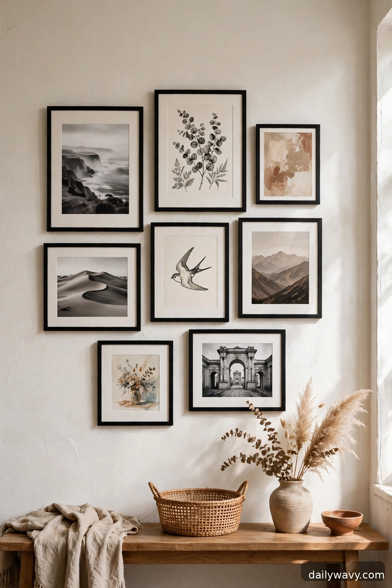
When the art is all over the place, photographs, prints, kids’ drawings, a flea-market painting, one frame finish pulls it together. Choose a single finish, slim black, natural oak, or white, and reframe everything to match. Then hang the pieces in whatever layout suits the wall: a grid, a cluster, a row. The matching frames turn a random collection into a collection, if that makes sense.
What to measure: the sizes you already own, then buy matching frames in those sizes. This is more of a reframing project than a hanging project, so budget for frames rather than hardware. A consistent mat color, all white mats for instance, doubles the unifying effect. If you rent, this layout works beautifully with adhesive strips because the frames are doing the visual work and the hanging method stays invisible.
Lower-cost alternative: paint mismatched thrifted frames in one color instead of buying new ones.
10. An arrangement following the wall shape
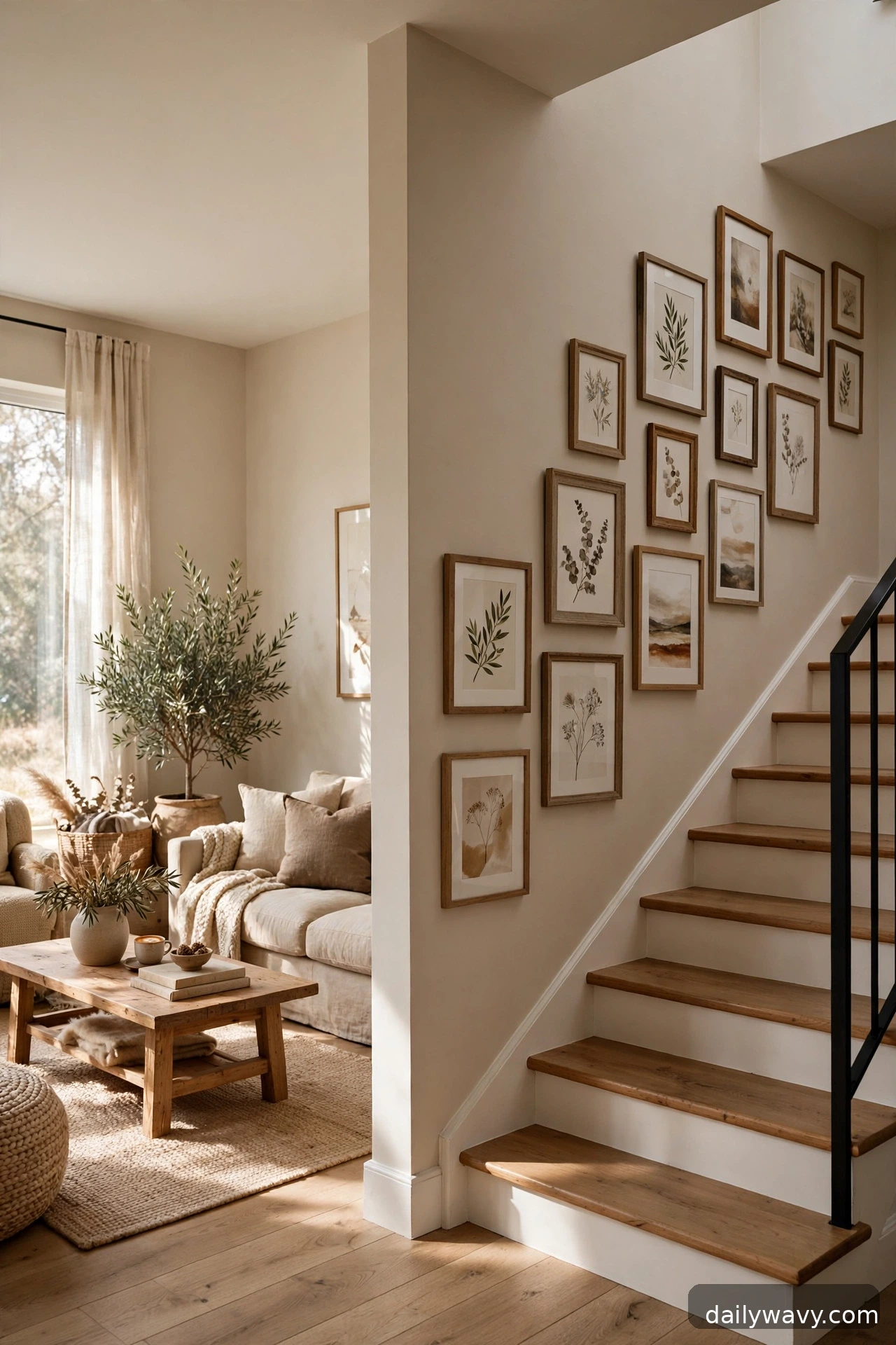
Staircase walls, sloped ceilings, and alcoves all call for a gallery wall that follows the architecture instead of fighting it. On a stair wall, step the frames up the incline so the arrangement echoes the stairs. Under a sloped ceiling, let the top edge of the grouping rise and fall with the slope. The rule is simple: mirror the dominant line of the space.
Measure the angle or the step rhythm first, then choose frames you can space evenly along it. Paper templates are essential here because the slope makes freehand hanging risky. Keep 2 to 3 inches between frames and keep the frames modest in size so the stepped rhythm stays readable. This layout turns an awkward wall into the most interesting wall in the house, and it photographs beautifully. For the stepped version, a laser level or a long straightedge helps keep each step consistent.
Lower-cost alternative: use a simple picture ledge that runs parallel to the stairs and lean frames along it.
11. A subtle tonal grouping
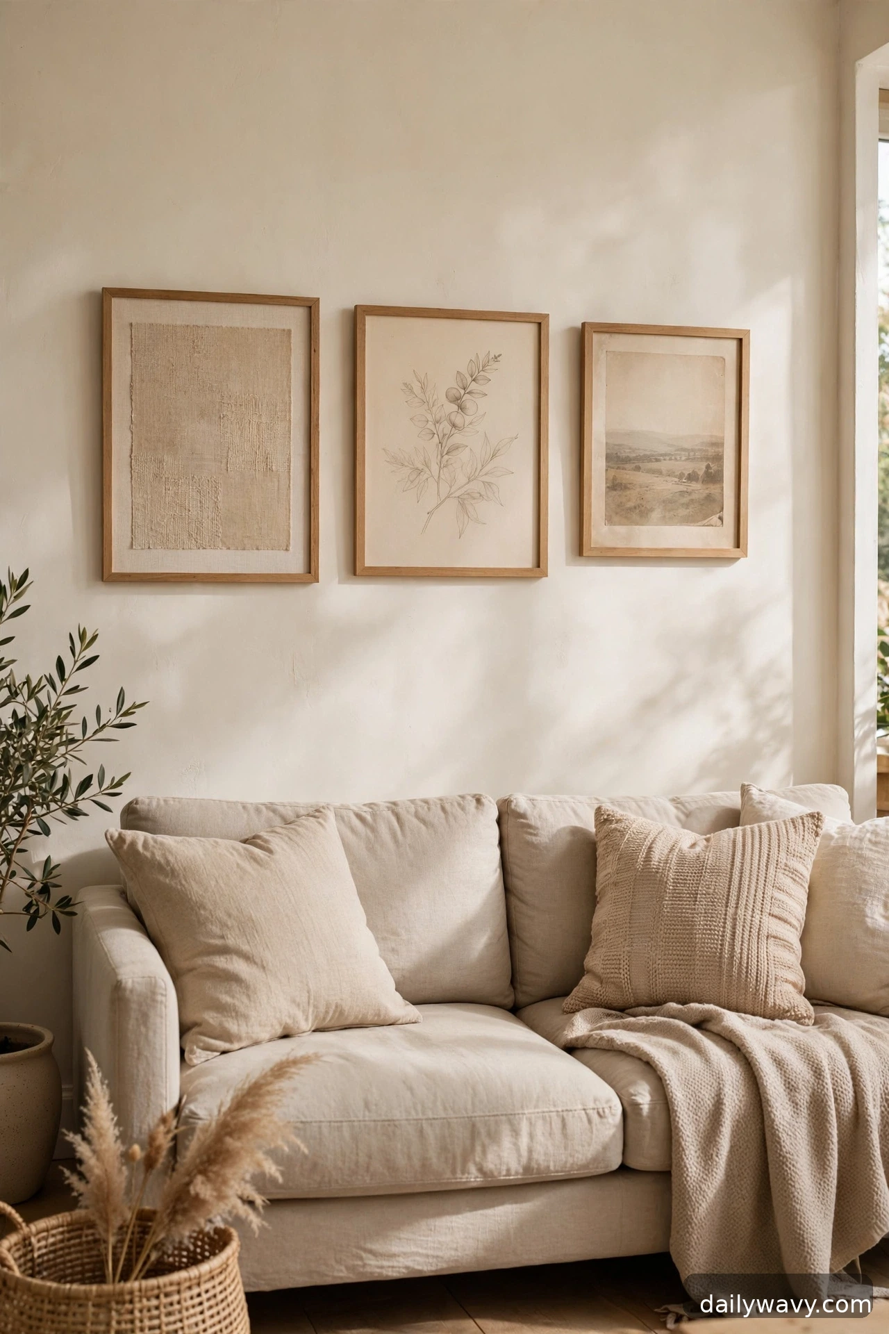
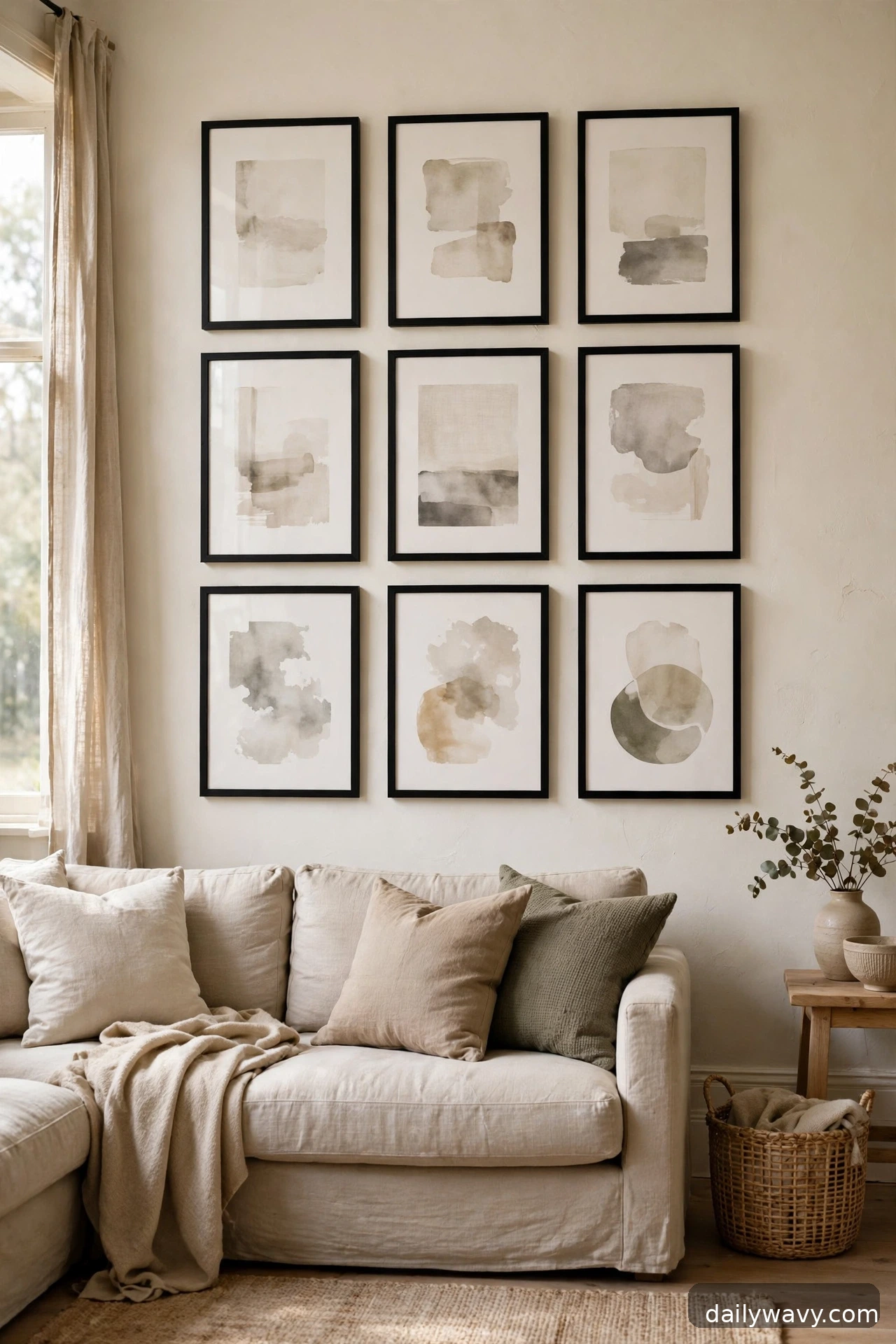
A tonal grouping keeps every piece within one color family, warm beiges, soft grays, muted greens, and lets texture do the talking. Mix a linen-textured print, a pencil sketch, a faded photograph, and a piece of textile art, all in the same tonal range. The eye reads it as calm and cohesive even though the mediums differ. Keep frames slim and quiet, natural wood or thin black, with 2 to 3 inches between pieces.
This layout suits serene living rooms and reads beautifully in daylight. What to measure: the wall area, and make sure the tonal range of the art stays close enough to feel deliberate. Squint at the collection from across the room; if one piece jumps out as much darker or brighter than the rest, it probably belongs elsewhere. Approximate effort: low once the art is chosen, since the palette does the heavy lifting.
Lower-cost alternative: tea-stain or sun-fade your own prints to pull them into one tonal family before framing.
12. A vintage-and-modern mix
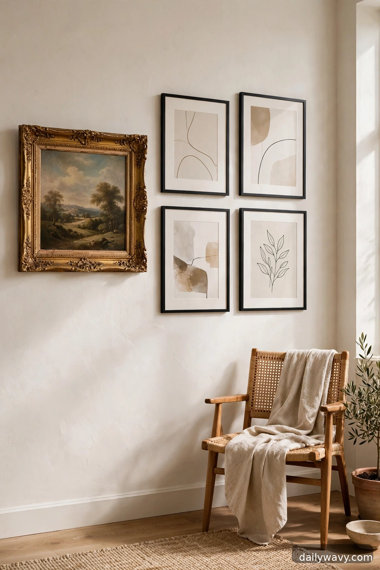
Pairing an old flea-market painting with a crisp modern print is one of the most satisfying moves in decorating. The contrast makes both pieces look better. Hang them close together, 2 to 3 inches apart, so the pairing reads as intentional rather than accidental. A good formula is one vintage piece for every two or three modern ones, with the vintage piece given a position of honor, center or top.
What to measure: nothing special, but do check the weight and condition of vintage frames, since old glass and backing can be heavier and more fragile than they look. Rewire or re-secure anything loose before hanging. Keep the frame finishes in conversation with each other: an ornate gold vintage frame next to a slim black modern frame works precisely because the contrast is clear. For renters, the modern pieces can go on adhesive strips while the heavier vintage piece gets a proper anchor.
Lower-cost alternative: frame pages from old books or vintage postcards as your “vintage” pieces.
13. A repeated shape with varied textures
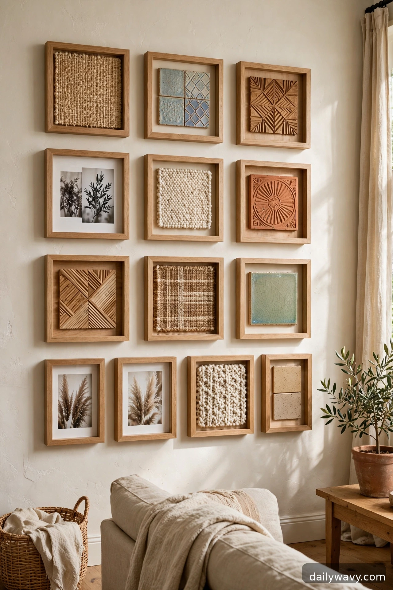
Choose one shape, all squares, all arches, all circles, and repeat it across the wall in different textures. A grid of square frames holding a woven textile, a ceramic tile, a wood relief, and a printed photograph gives you rhythm plus richness. The repeated outline unifies; the varied surfaces keep it interesting. Space the pieces 2 to 3 inches apart in an even grid so the repetition stays crisp.
This layout works beautifully with shallow shadow-box frames, which can hold objects as well as flat art. Measure carefully, because the grid demands precision: cut a spacing jig from cardboard so every gap matches. Keep the palette restrained so the textures, not the colors, are the star. This is a wonderful layout for handmade or collected objects that do not fit standard frames.
Lower-cost alternative: use identical square floating shelves as the repeated shape and style small objects on them.
14. A corner-spanning arrangement
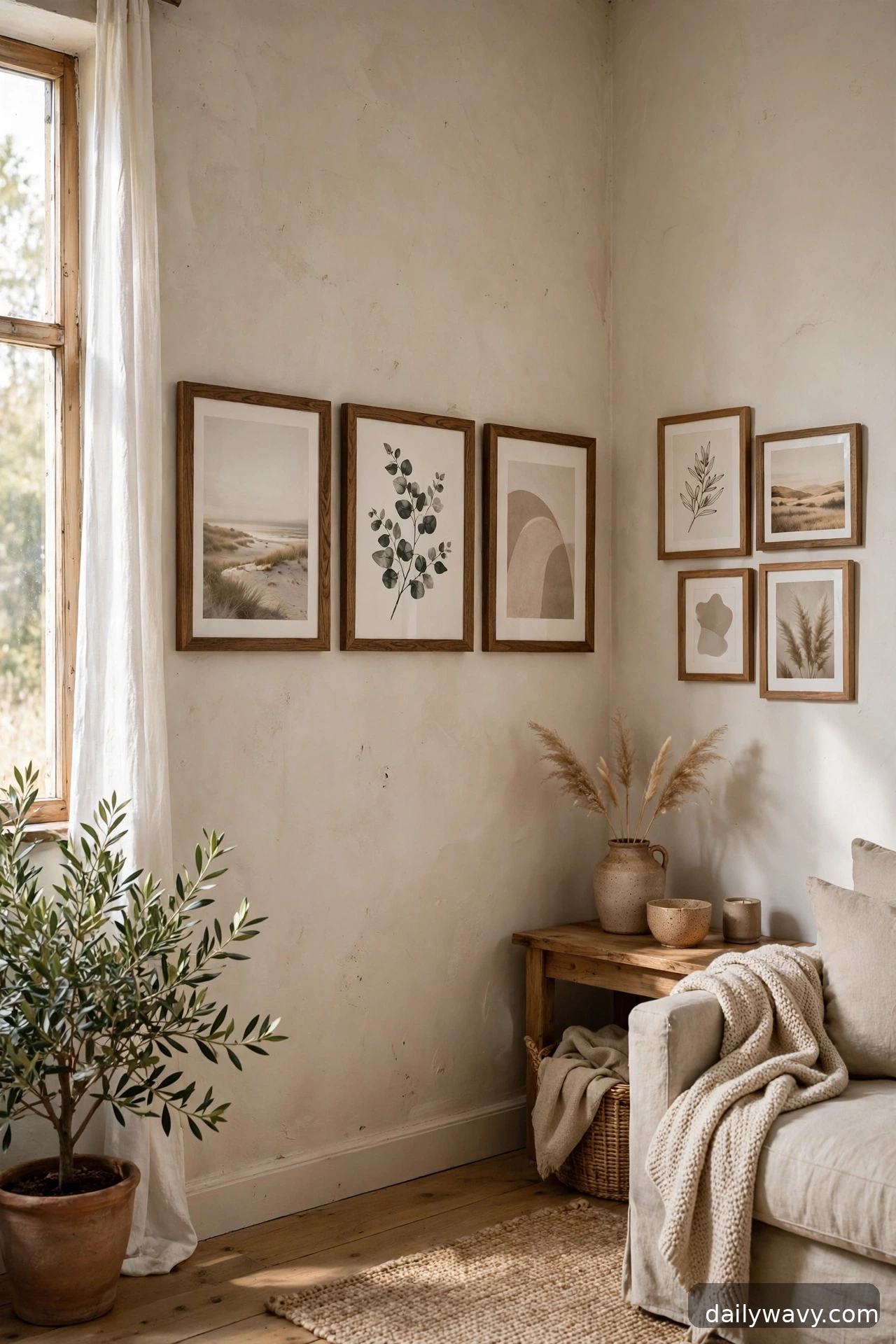
Two walls meeting at a corner are an underused canvas. Wrap your gallery wall around the corner, placing larger pieces on the main wall and smaller companions on the return wall, with the spacing tightening slightly as the arrangement turns the corner. Keep the center of the composition at eye level on both walls so the wrap feels continuous.
What to measure: both wall widths, and plan the corner transition on paper first. The pieces nearest the corner should be small enough that they do not visually collide. This layout suits open-plan living rooms where the corner is a natural focal point, and it makes a small room feel considered from every angle. Use proper anchors for anything heavy, and take extra care with the corner pieces since they get viewed from two directions.
Lower-cost alternative: hang just three pieces, one on each side of the corner and one bridging near it, for a minimal corner moment.
15. A paired composition with generous space
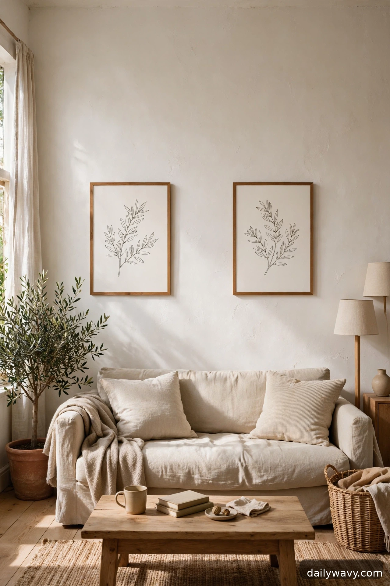
Sometimes the bravest layout is the sparsest. Two pieces, hung with generous space between them, can anchor a wall more powerfully than a crowded cluster. Choose two pieces of similar size and weight, hang them 6 to 12 inches apart, and center the pair over your furniture or on the wall. The negative space around them becomes part of the composition.
This layout suits minimalist living rooms and small walls where a full gallery would overwhelm. What to measure: the wall width, the furniture width, and the gap. Keep the gap consistent and the centers level; with only two pieces, any crookedness shows. Matching frames make this effortless, but two different frames in the same finish family also work. For renters, two lightweight pieces on adhesive strips make this the easiest layout on this list to install and remove.
Lower-cost alternative: two matching prints from the same series, framed identically, are all you need.
Frequently asked questions
How high should I hang a gallery wall?
Aim for the center of the overall grouping at about 57 to 60 inches from the floor, which is average eye level. Above a sofa or console, start the bottom of the arrangement 6 to 8 inches above the furniture. These are widely used conventions, not rules, so adjust for your ceiling height and the people who live in the room.
How far apart should the frames be?
2 to 3 inches between frames is the standard for most layouts. Larger arrangements can go up to 4 inches; tight clusters can drop to 1.5 inches. Whatever you choose, keep it consistent across the whole wall, because even spacing is what makes a gallery wall look deliberate.
How do I plan the layout without making extra holes?
Cut paper templates the size of each frame, tape them to the wall with painter’s tape, and live with the arrangement for a day before hanging. Mark the nail positions through the paper, then hang. For renters, adhesive hanging strips let you skip holes entirely on lightweight frames; always check the weight rating on the package and confirm your lease terms.
What do I do with frames I already own in different sizes?
Use the shared-spacing method from idea 7, or reframe everything in one finish as in idea 9. Mismatched sizes are only a problem when the spacing is also inconsistent.
Can I mix photos and art in one gallery wall?
Yes, and it usually looks better than art alone. Keep the frame finishes or the color palette consistent so the mix reads as one collection. Black-and-white photos are the easiest bridge between colorful art pieces.
How do I hang heavy pieces safely?
Find a wall stud with a stud finder, or use wall anchors rated for the weight of the piece. Plaster walls need hardware designed for plaster. Never trust a single nail for anything over a few pounds, and always check what is behind the wall before drilling near outlets or plumbing. If you are unsure, a handyperson can hang the heavy pieces in under an hour.
A gallery wall rewards the planning more than the purchasing. Paper templates, a tape measure, and an afternoon are the real materials here. Once the layout is up, living rooms feel personal in a way no single piece of art can manage, and rearranging is always an option when the collection grows. If the wall beside your entry is still blank, our small entryway decor ideas will help the rooms flow together, and you can browse more room styling in our Home and Decor collection.


5 Comments