
20 Living Room Curtain Ideas to Frame Your Space
20 Living Room Curtain Ideas to Frame Your Space Curtains are the frame around your living room’s biggest light source,…
20 Living Room Curtain Ideas to Frame Your Space
Curtains are the frame around your living room’s biggest light source, and they change the whole room more than most people expect. The right panels can make a window feel taller, a small room feel calmer, or a plain wall feel finished. This guide walks through 20 living room curtain ideas you can actually compare and recreate. Each one names the fabric, explains how it works with your window and light, and gives you the measurements and hanging details to pull it off. Pick the ideas that fit your space, then use the steps to make them real.
Jump to an idea
- A soft neutral fabric with simple folds
- A subtle stripe echoing room colors
- A textured weave with restrained trim
- A light-filtering treatment with clear edges
- A contrast border framing the opening
- A warm white fabric with natural texture
- A tonal pattern with plain surroundings
- A muted accent color
- A small-scale botanical motif
- A clean geometric repeat
- A darker trim against a light field
- A relaxed fabric texture
- A plain treatment with simple hardware
- A soft check pattern
- A natural-fiber look suited to the room
- A calm monochrome pairing
- A restrained vintage-style fabric
- A linen-look finish with neat hems
- A delicate vertical pattern
- A simple solid color repeated in textiles
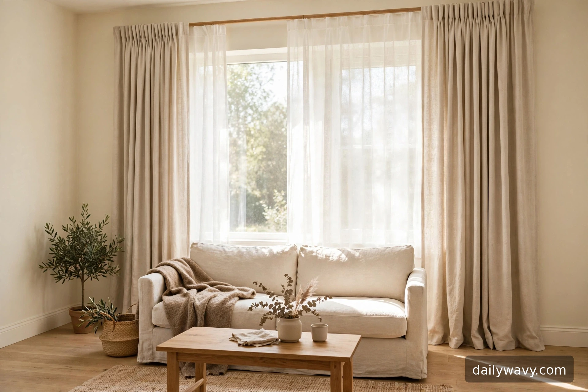
1. A soft neutral fabric with simple folds
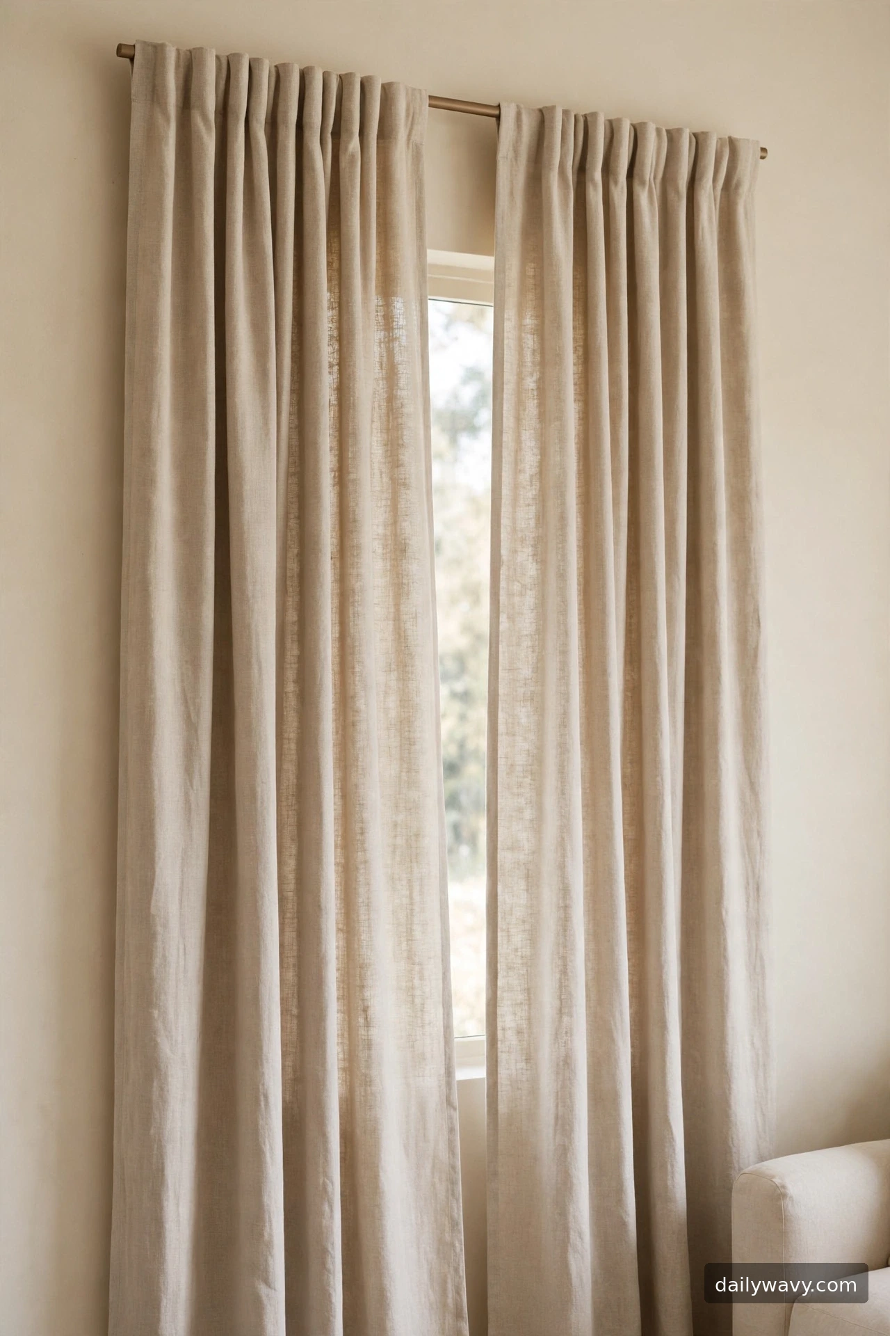
This is the idea to start with if your living room already has plenty going on. A soft neutral fabric with simple folds does not compete with your sofa, rug, or art. It quietly frames the window and lets the daylight do the decorating.
The practical decision here is fullness. For gentle, even folds, buy panels that measure about twice the width of your rod coverage per side. So if each panel covers 40 inches of rod, look for panels around 80 inches wide when laid flat. Cotton-linen blends or washed cotton fall into soft folds without looking limp, and a warm greige or oatmeal tone works with both cool and warm rooms.
Measure the rod first: mount it 4 to 6 inches above the window trim and extend it 6 to 10 inches past the trim on each side so the panels stack on the wall, not the glass. For length, aim for the panels to just kiss the floor or break about an inch. Hardware stays simple here: a 1-inch wooden or matte metal rod with plain finials. Hanging takes under an hour once the rod is up.
A lower-cost alternative is to buy two twin flat sheets in a neutral tone and hem them to length with iron-on hemming tape. They gather into the same soft folds for a fraction of the price.
2. A subtle stripe echoing room colors
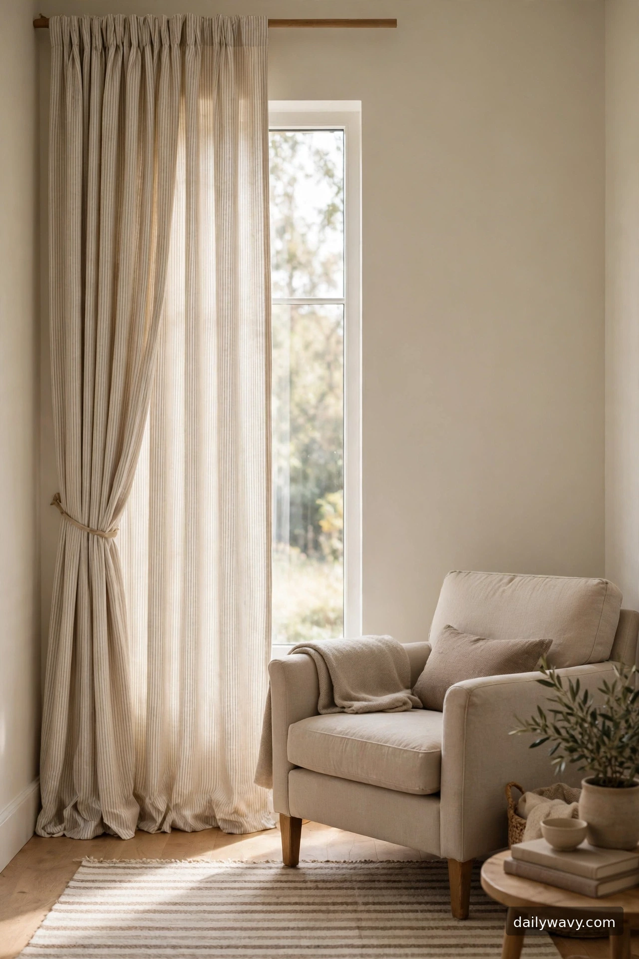
Stripes are one of the easiest patterns to live with because the repeat is predictable. A subtle stripe that picks up two colors already in your room, like the beige of your armchair and the gray of your rug, ties the whole space together without introducing a new hue.
The key decision is stripe scale. Thin pinstripes read as texture from across the room, while wider bands read as a pattern. For most living rooms, stripes under an inch wide keep the effect subtle. Choose a ground color close to your wall tone so the panels do not cut the room in half visually.
Measure for a finished look: stripe panels look best hung high and wide, rod 5 inches above the trim, extending 8 inches each side. Keep the stripe direction running vertically to stretch the window taller. Match the stripe colors to existing pieces within the same tonal family; exact matching is not needed and can look forced.
For the budget version, buy solid cream panels and paint one or two thin stripes near the leading edge with fabric paint and painter’s tape. It sounds crafty, but with a steady hand the result is crisp and custom.
3. A textured weave with restrained trim
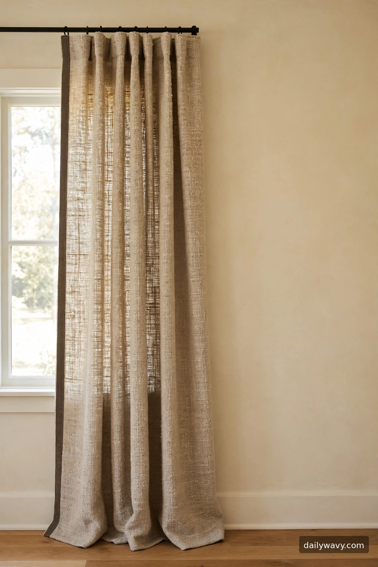
When a room needs interest but you do not want a print, texture is the answer. A slubby woven fabric with a restrained trim band gives the eye something to land on while the color stays quiet. The trim, usually a narrow tape or band along the leading edge, adds a tailored finish.
Decide on the trim first, because it sets the tone. A darker tape in charcoal or espresso reads classic; a tone-on-tone trim reads modern. Keep the trim width under 2 inches so it stays an accent, not a border feature. The fabric itself should have visible slub or crosshatch texture, which you can feel in the hand before buying.
Measure generously: textured weaves compress, so order panels at two and a half times the rod coverage for full, rich gathers. A black or dark-bronze rod suits the tailored look; skip shiny finishes here. Installation is standard rod mounting, but steam the panels first so the weave relaxes into place.
To save money, add trim tape to plain panels yourself. Sew-on or iron-on trim tape costs a few dollars per yard and transforms a basic curtain in an afternoon.
4. A light-filtering treatment with clear edges
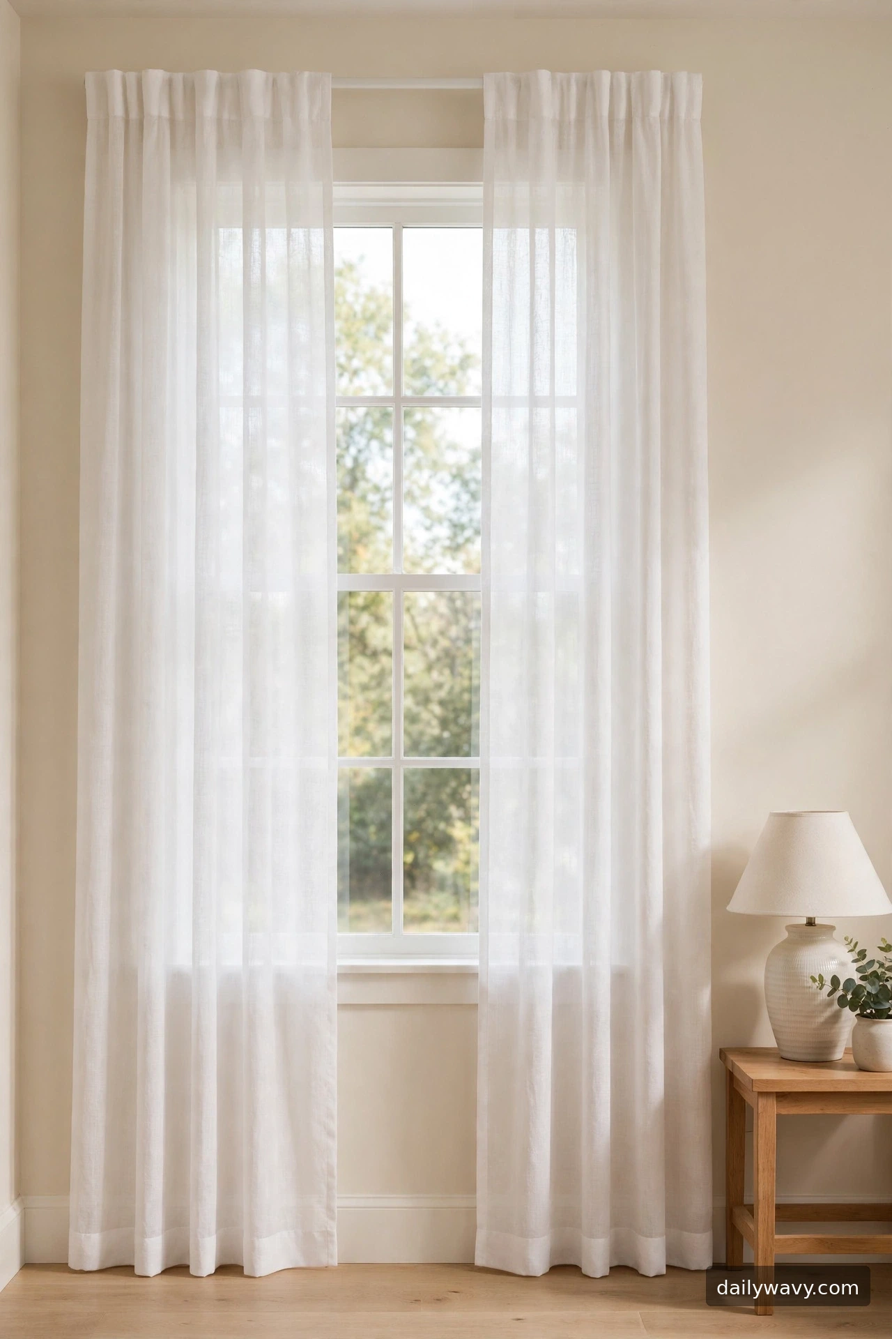
Not every living room wants heavy panels. A light-filtering treatment, sheers or semi-sheers with clean finished edges, keeps the room bright while taking the glare edge off direct sun. The “clear edges” part matters: narrow side hems and a clean bottom hem make sheers look intentional instead of flimsy.
The decision is opacity. Hold the fabric up to a window before committing. If you can clearly read text through it, it is a true sheer and best for daytime privacy plus glow. If shapes blur but light floods in, it is a semi-sheer and works where you want softness with a bit more coverage.
Measure the same way as for heavier panels: rod high and wide, panels to the floor. Sheers gather best at three times fullness because the fabric is so thin. Use a slim rod, half-inch to three-quarter-inch, since heavy hardware overwhelms delicate fabric. White or ivory is the classic choice; anything whiter than your wall can look stark, so compare swatches in daylight.
The budget move is a pair of inexpensive voile panels doubled up. Two thin layers read richer than one, and the total still costs less than one lined panel.
5. A contrast border framing the opening
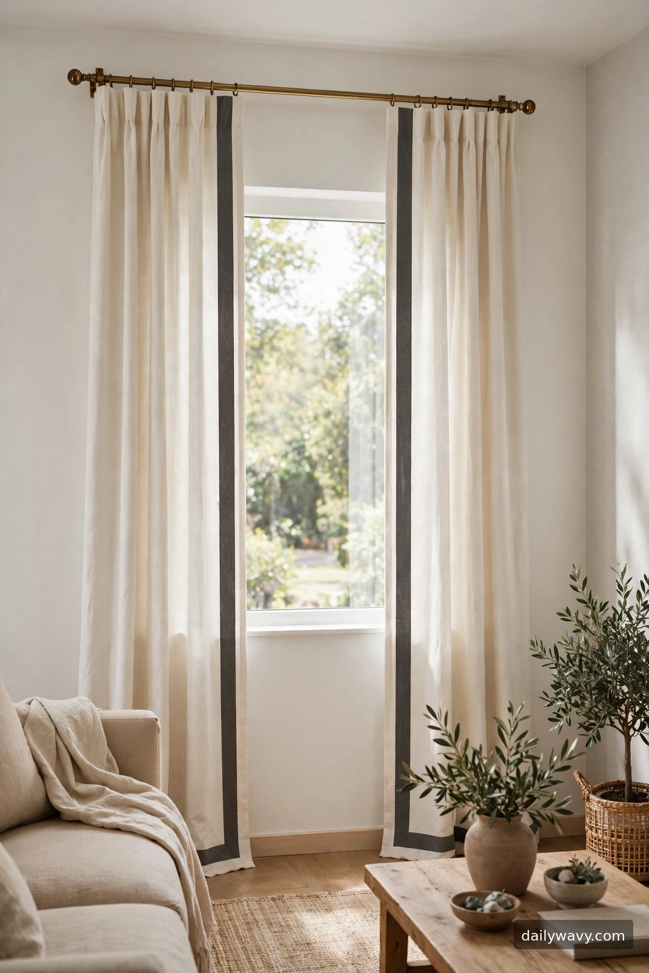
A contrast border works like a picture frame for your window. An ivory panel with a wide charcoal band along its inner edge draws a clean line around the opening and gives the whole wall a sense of structure. It is a tailored look that suits both traditional and modern rooms.
Plan the border width carefully. Two to three inches reads crisp and architectural; wider than four inches starts to dominate. The border color should connect to something else in the room, a dark side table, a black lamp, a charcoal cushion, so it feels related rather than random.
Mount the rod with brass or black hardware to echo the border, and keep panels at the same floor-grazing length on both sides so the frame reads symmetric. Fullness of twice the rod coverage is plenty because the border provides the visual weight.
You can recreate this cheaply by sewing a band of contrasting fabric to plain ivory panels. Cut the band, press, and stitch along the leading edge; a straight stitch and a pressed seam look professionally made.
6. A warm white fabric with natural texture
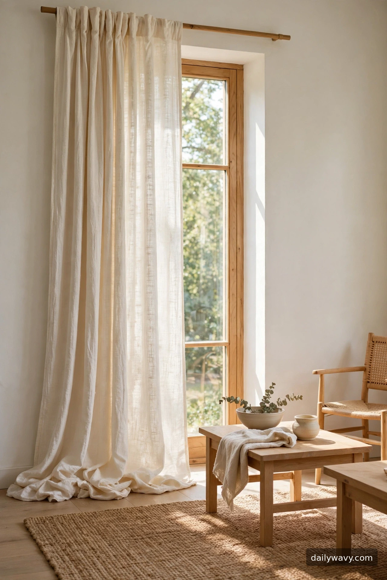
Pure white can look cold next to warm wood floors and cream walls. A warm white fabric with natural texture, think cotton with visible slub, a light jute blend, or washed linen, keeps the brightness but softens the temperature. This is the curtain equivalent of a cream sweater: cozy without trying.
Choose fabric by feel and light. Warm whites range from ivory to ecru; hold swatches against your wall at midday and at dusk, because warm whites shift more than pure white. A medium-weight cotton with a woven texture blocks more glare than a sheer while still glowing.
Hang panels at standard height, rod 4 to 6 inches above trim, floor length. Because the fabric is the feature, keep hardware understated: a simple wood rod in a natural finish. Steam out packaging creases so the texture reads as weave, not wrinkles. Effort is low; the look comes from the fabric itself.
For a lower-cost take, look for warm-white muslin or cotton drop cloths in the paint aisle. Washed once, they soften into a lovely natural texture and hem easily.
7. A tonal pattern with plain surroundings
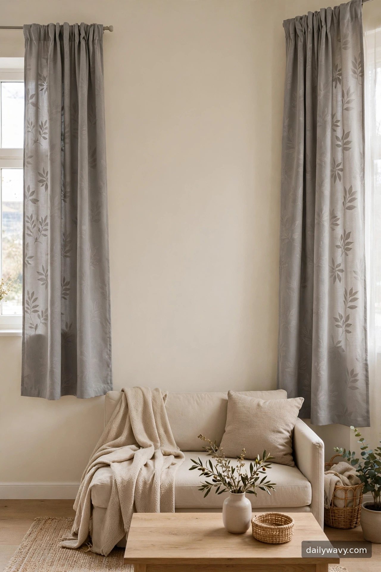
A tonal pattern, one color in two close shades, gives you pattern without contrast. Dove gray on light gray, or sand on cream, reads as texture from a distance and reveals itself up close. Paired with plain surroundings, it is the safest way to try pattern in a calm room.
The trick is keeping everything else plain. Solid wall, solid sofa, simple rug. If the curtains carry the only pattern in the room, they become a feature instead of a fight. Choose a motif with soft edges, like a blurry botanical or an abstract wash, rather than hard geometric lines, so the tonal effect stays gentle.
Measure for balance: because the pattern is quiet, you can afford more fullness. Two and a half times the rod coverage makes tonal panels look luxurious rather than flat. Hang to the floor and let the pattern repeat evenly by spacing the gathers evenly along the rod.
Budget option: sponge or stencil a tone-on-tone pattern onto plain panels with fabric paint one shade darker than the fabric. Practice on a scrap first to keep the motif even.
8. A muted accent color
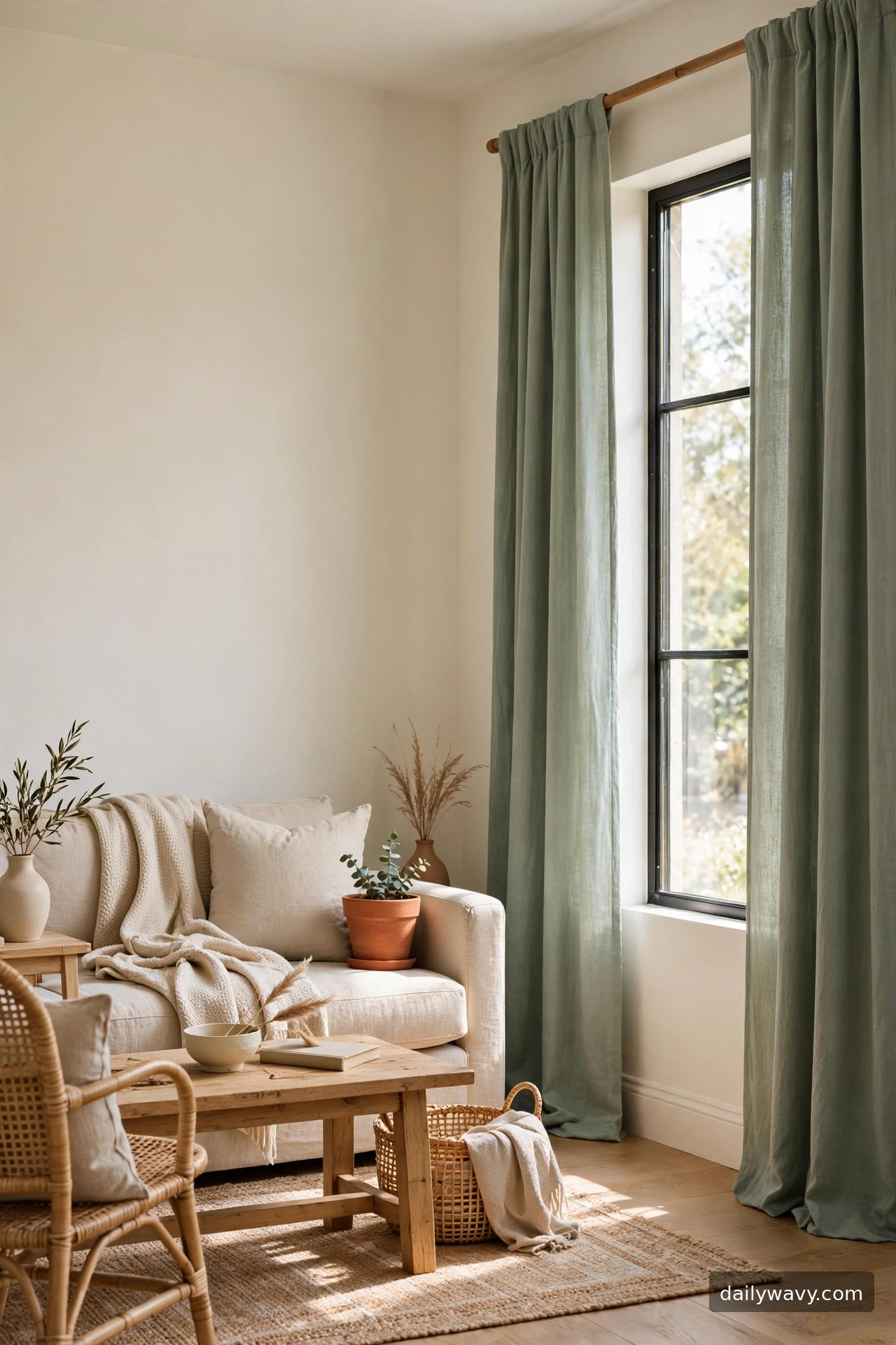
One deliberate color moment can wake up a neutral living room. Sage green, dusty blue, or warm clay curtains become the room’s accent without overwhelming it, especially when everything else stays quiet. The word “muted” is doing the work here: dusty, grayed-down tones read sophisticated, while saturated brights read loud.
Commit to the color by repeating it once elsewhere, small. A cushion, a throw, a piece of pottery in the same family makes the curtains look chosen rather than random. Keep the fabric simple, solid, matte, so the color itself is the statement.
Placement is standard: rod high and wide, floor length. With colored panels, even gathers matter more because the eye reads the color in folds; take time spacing pleats evenly. A wooden rod in a natural finish keeps the look warm; black rod adds contrast.
To test cheaply before committing, drape a colored bedsheet over the rod for a week. If you still love the color after seven days of daylight, invest in real panels.
9. A small-scale botanical motif
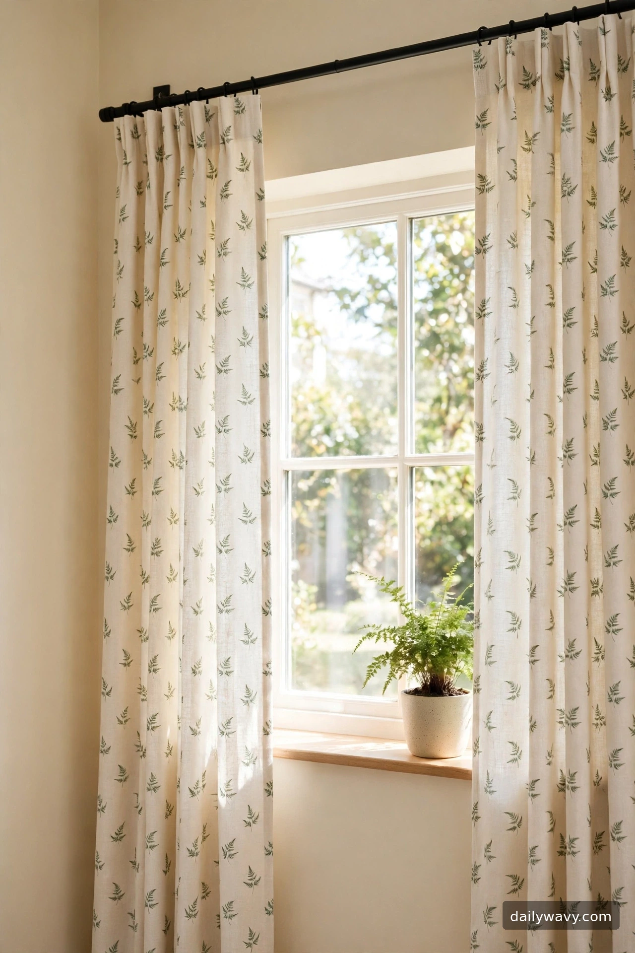
A small botanical motif, tiny fern sprigs or leaf sprays scattered over a light ground, brings nature indoors without going tropical. From across the room it reads almost solid; up close it rewards. This suits rooms with plants, wood tones, and natural textures.
Scale is everything. Motifs under two inches tall keep the effect delicate. Larger leaves turn the same idea into a statement print, which is a different room. Choose a ground color near your wall tone so the pattern floats rather than shouts.
Hang with the same high-and-wide rod placement, and make sure the pattern repeat lines up on both panels for a custom feel. Steam well, because creases interrupt the motif. Floor length keeps it elegant; sill length can work in casual rooms but shows less of the pattern.
A budget approach is a botanical-print flat sheet, hemmed to panel length. Flat sheets come in pretty botanical prints and cost far less than yardage.
10. A clean geometric repeat
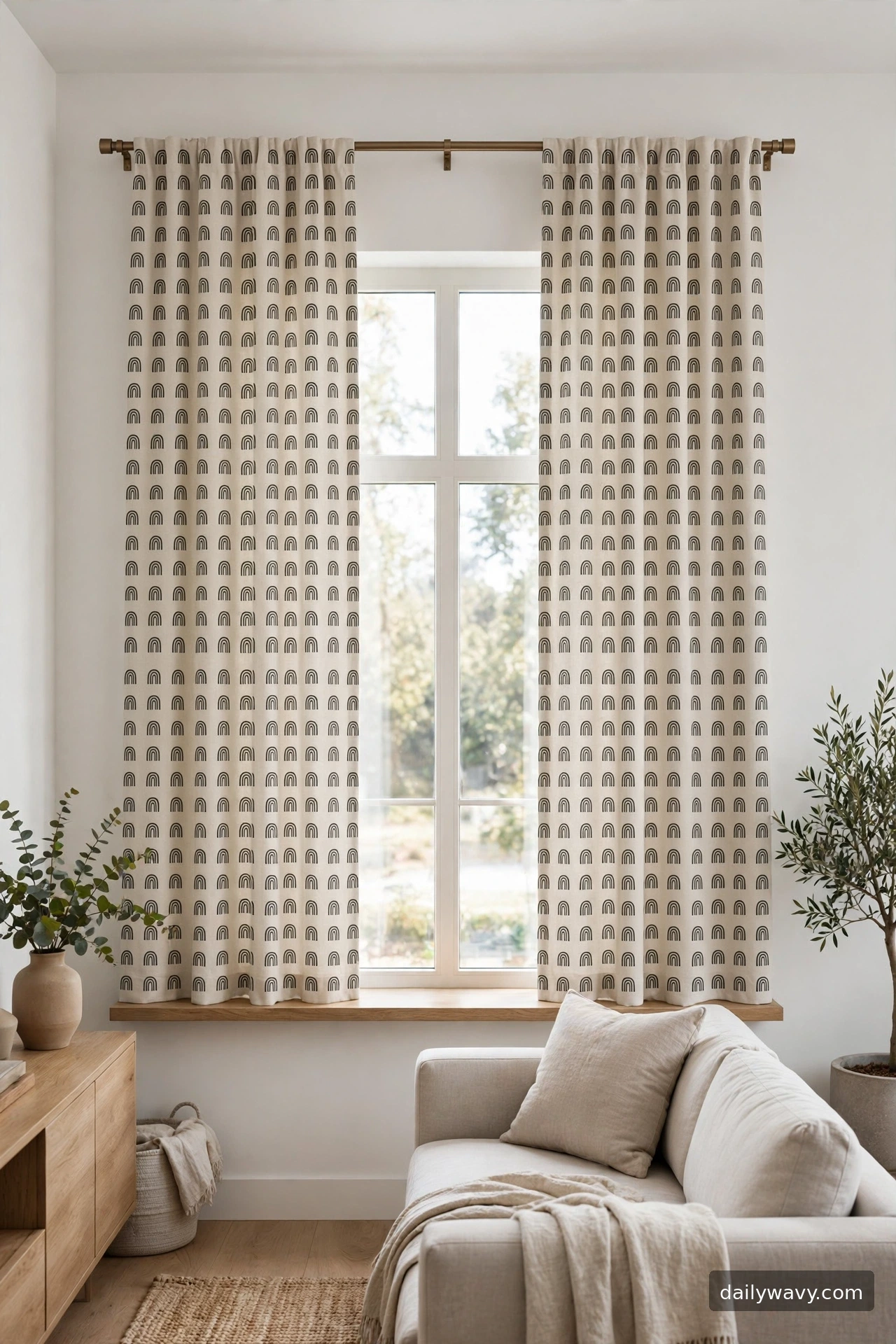
A tidy geometric repeat, small arches, dots, or a neat grid, adds structure to a soft room. It works beautifully in modern living rooms where the furniture has clean lines. The geometry gives the window the same kind of order the furniture has.
Keep the repeat small and the contrast low. A tone-on-tone or two-shade geometric reads calm; high-contrast black and white reads bold and can fight with everything else. Match the metal of the rod, brass or matte black, to the pattern’s accent color for a pulled-together feel.
Measure carefully: geometric patterns show mistakes. Make sure both panels are cut to the same repeat, and center the pattern on each panel. Rod height stays high, length to the floor. Fullness of twice coverage keeps the geometry readable instead of cramped.
Lower-cost version: buy plain panels and apply a geometric stencil with fabric paint. A simple arch or dot stencil, repeated carefully with a level and ruler, looks remarkably sharp.
11. A darker trim against a light field
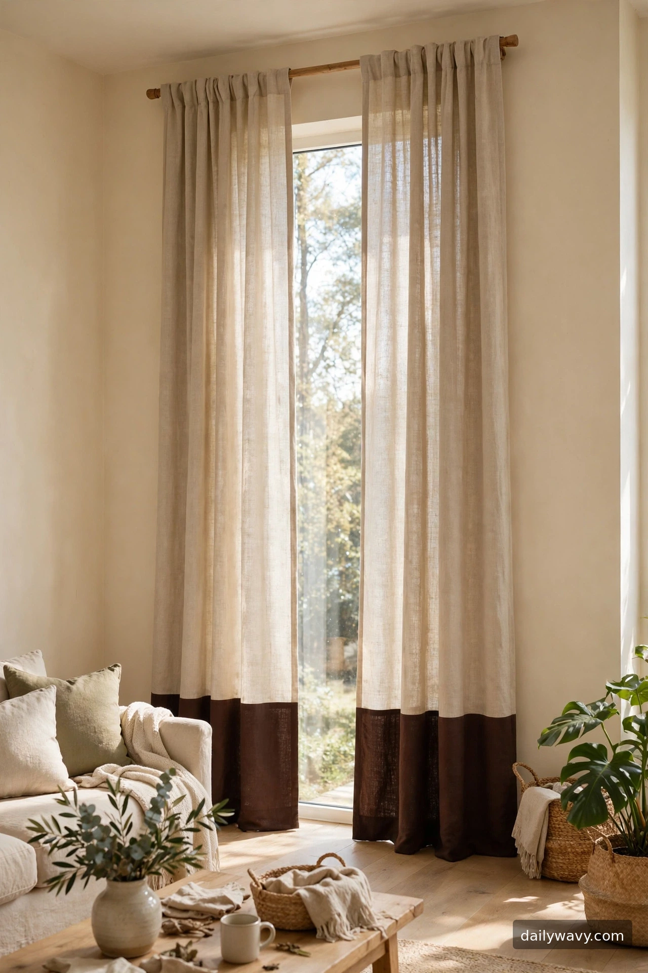
A darker trim against a light field is the inverse of idea 5, and it reads softer. Instead of a bold side border, picture a deep hem band or a bottom-weighted trim on pale panels. The weight at the bottom makes the fabric hang beautifully and adds just enough contrast to define the curtain’s shape.
Decide where the trim goes: a bottom hem band is classic and makes hemming look deliberate; a leading-edge band is more tailored. Either way, keep the trim color within the room’s palette, chocolate brown near wood tones, navy near a blue rug, charcoal near dark furniture.
This idea rewards careful hemming. Measure the finished length, add the trim width plus seam allowances, and press everything before stitching. Hang on a simple rod and let the trim sit just above the floor. The panels can be standard fullness since the trim adds the interest.
Budget method: sew a band of contrasting cotton duck or linen to the bottom of plain light panels. It is a straight seam, beginner-friendly, and looks like a designer detail.
12. A relaxed fabric texture
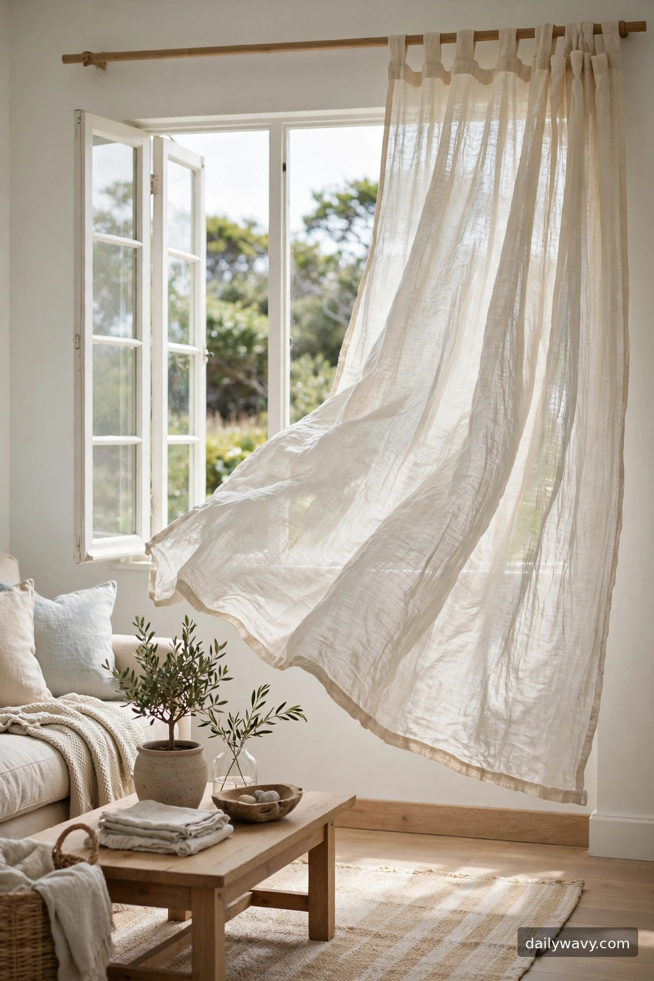
Some rooms need to feel easy, and a relaxed fabric texture does that work. Loosely woven, slightly crinkled panels that move in a breeze say “breezy” louder than any pattern. This is the coastal-calm or casual-boho answer to stiff formal drapes.
The practical choice is a fabric that does not need ironing. Crinkle cotton, washed linen blends, or loose gauze weaves look better slightly imperfect. Avoid fabrics that crease hard, because relaxed texture should look soft, not wrinkled.
Hang these with minimal fuss. A simple rod, even gathers, panels puddling an inch or two on the floor for that unstudied feel. Puddling suits relaxed fabrics; on tailored fabrics it can look sloppy, so match the length choice to the mood. Light filtration stays high, which suits bright rooms.
The cheapest path is unbleached muslin or cheesecloth-weight cotton, hemmed simply. At a few dollars a yard, you can afford generous fullness, which is what makes this look.
13. A plain treatment with simple hardware
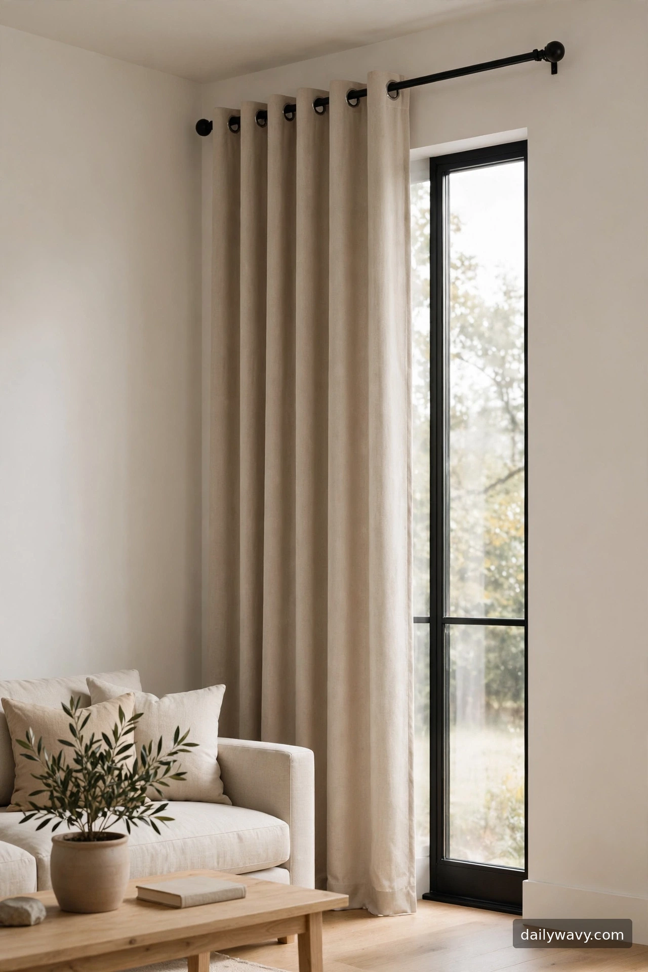
Sometimes the hardware is the idea. Plain oatmeal or greige panels on a beautifully simple rod, slim matte black with round finials, or warm brass with clean lines, let the mounting do the talking. The curtain becomes almost a backdrop for the line of the rod.
Invest the budget in the rod, not the panels. A well-made rod with solid brackets and smooth rings operates better and looks better than an expensive fabric on a flimsy rod. Choose a rod diameter around 1 inch for panels with grommets; slimmer for back-tab or rod-pocket styles.
Measure with hardware in mind: the rod should extend far enough that panels clear the glass completely when open, about 8 to 10 inches past the trim each side. Rings or grommets should glide without catching, so test the action before final hanging. Panels to the floor, even spacing.
Lower-cost alternative: spray-paint a basic rod in matte black or brass, replace plastic finials with wooden ones, and hang plain panels. The upgrade reads custom for the price of a can of paint.
14. A soft check pattern
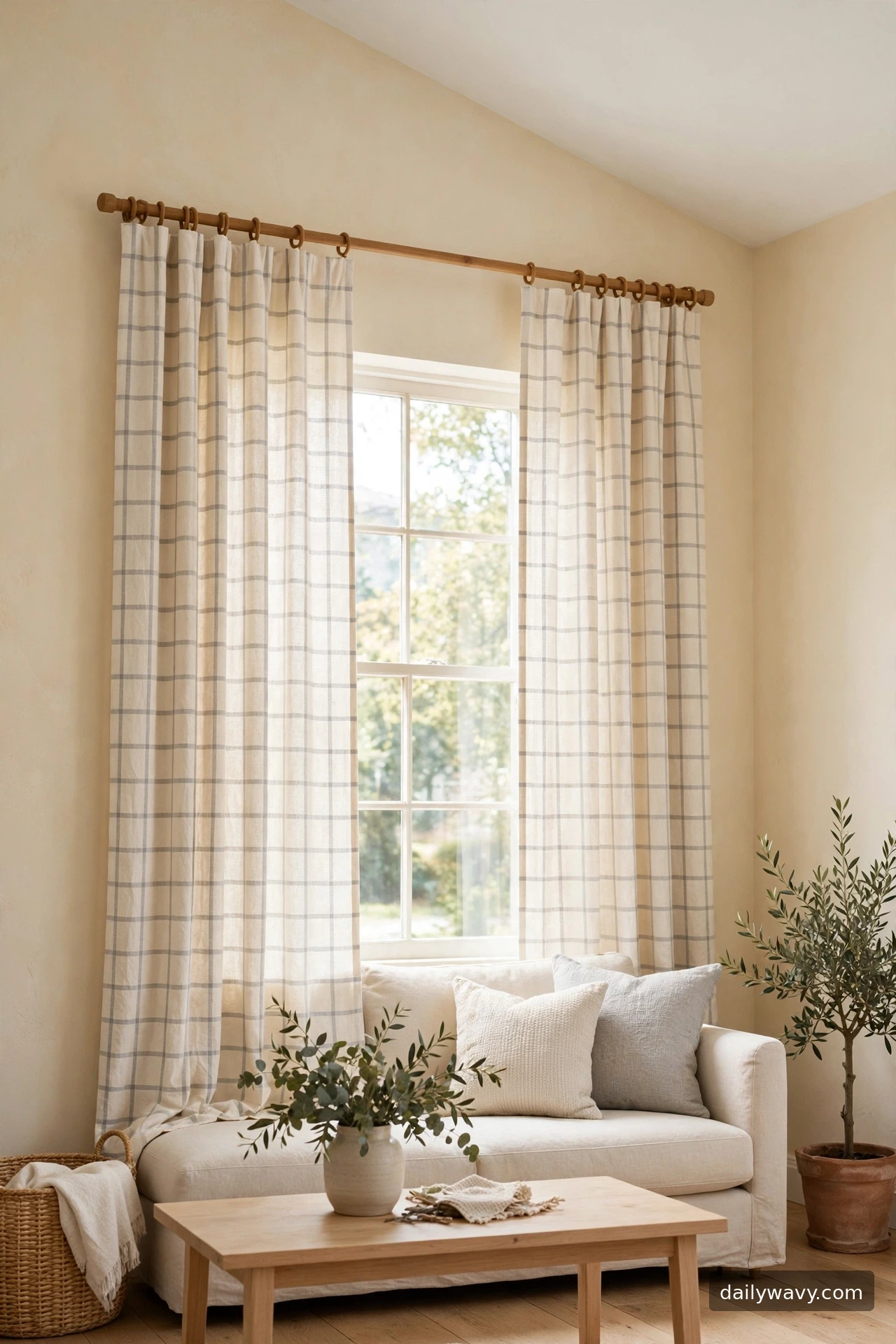
A soft check, windowpane or gentle gingham in cream and gray, brings cozy familiarity to a living room. It reads farmhouse-friendly without going rustic, especially in small scales and muted colors. This is pattern as comfort.
Choose the check scale to suit the room. Small checks under an inch feel refined; larger checks feel casual. Cream grounds with light gray or tan lines suit most living rooms; bolder colorways suit country or vintage styles. Keep the rest of the room’s patterns quiet so the check can breathe.
Hang at standard height with even gathers. Checks reveal uneven spacing, so take a minute to distribute pleats evenly. Floor length is the safe choice; a check can also work at sill length in a casual nook, but measure carefully so the pattern centers on each panel.
Budget version: paint a windowpane grid on plain cream panels with fabric paint and a straightedge. Measure twice, tape carefully, and the grid will look woven rather than painted.
15. A natural-fiber look suited to the room
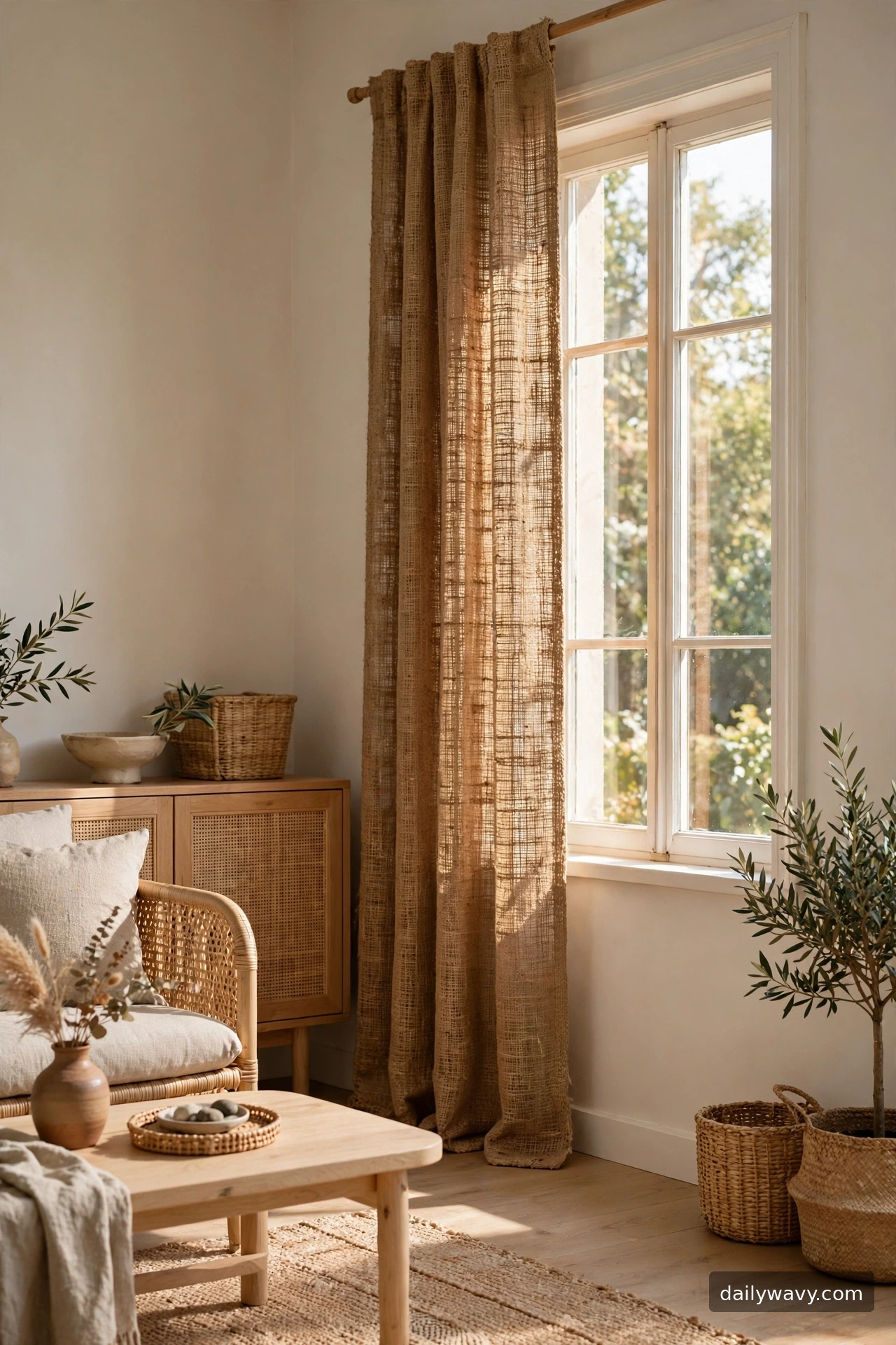
Natural-fiber looks, jute, hemp blends, or rattan-toned weaves, bring an earthy grounding to living rooms with plants, wood, and woven textures. The key phrase is “suited to the room”: this idea only works when the rest of the space speaks the same material language.
Assess honestly before committing. If your room is full of sleek lacquer and chrome, natural fibers will look out of place. If you have oak floors, linen upholstery, and a basket or two, they will look inevitable. The fabric should echo tones already present, warm tans, honey, or natural flax.
These fabrics are often loosely woven, so expect light to filter through and plan for a lining if you need privacy. Hang on wooden rods for material harmony. Measure for generous fullness, two and a half times coverage, because texture reads best in deep folds. Keep hems simple; a straight stitched hem suits the honest material.
Lower-cost take: burlap-look or jute-blend tablecloths, hemmed to panel size. They have the fiber texture at a fraction of drapery-yardage prices.
16. A calm monochrome pairing
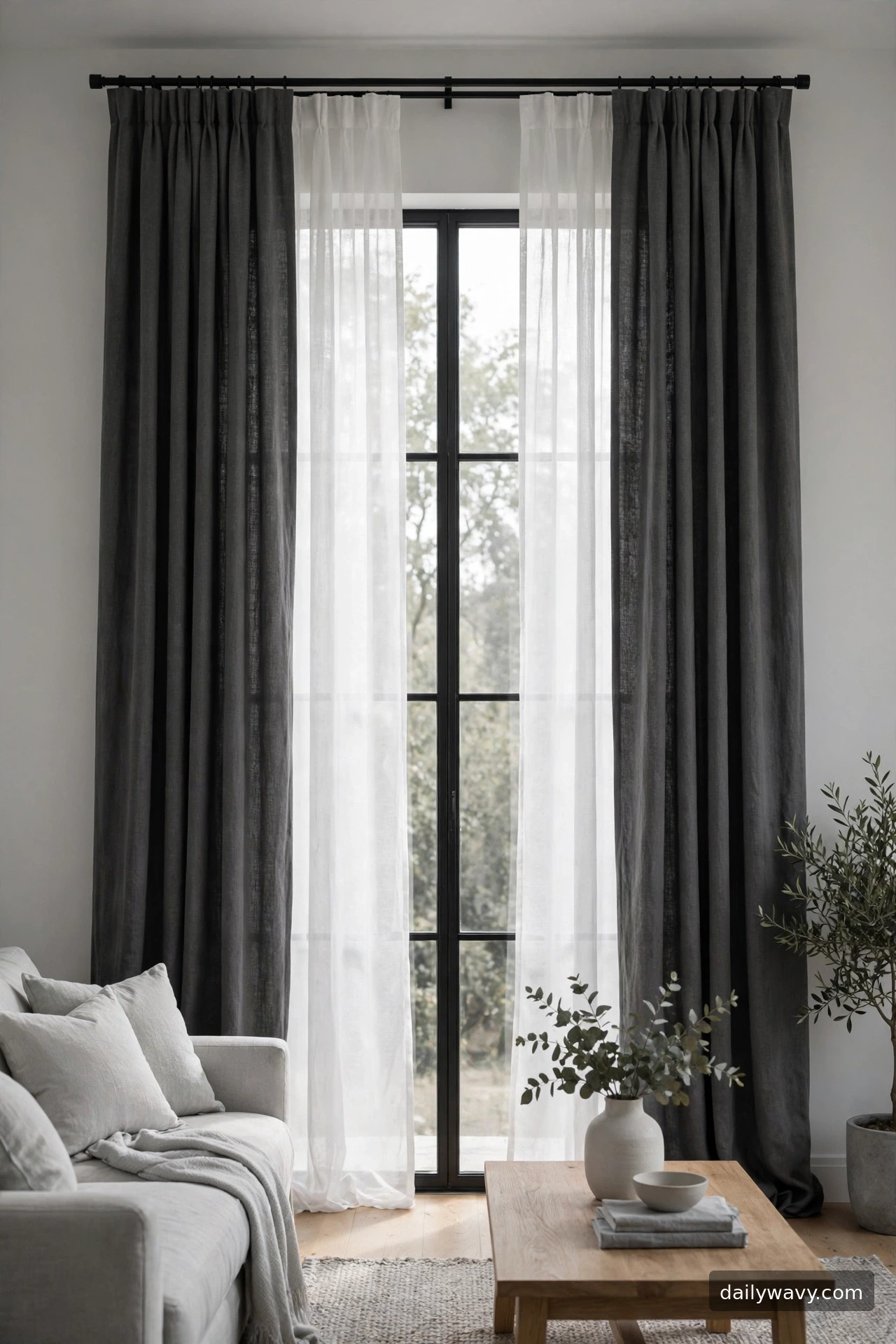
Layering white sheers behind solid charcoal or soft black panels gives you two moods in one window: bright and airy by day, grounded and private by night. The monochrome palette keeps the layering calm instead of busy, and the depth between layers adds a designer feel.
This needs a double rod or a rod plus a ceiling-mounted track. Plan the projection: the back layer sits closer to the wall, the front layer projects 3 to 4 inches further. Measure both layers to the floor; the sheer can stop just at the sill if you prefer, but floor length looks more finished.
Keep the room’s palette within the monochrome family while the curtains do the drama. Gray walls, white trim, black accents elsewhere in the room make this look intentional. Operate the layers independently: sheers closed for soft light, panels drawn for evening.
Budget approach: mount a tension rod inside the window frame for the sheer layer and a standard rod above for the panels. Two simple systems beat one expensive double rod.
17. A restrained vintage-style fabric
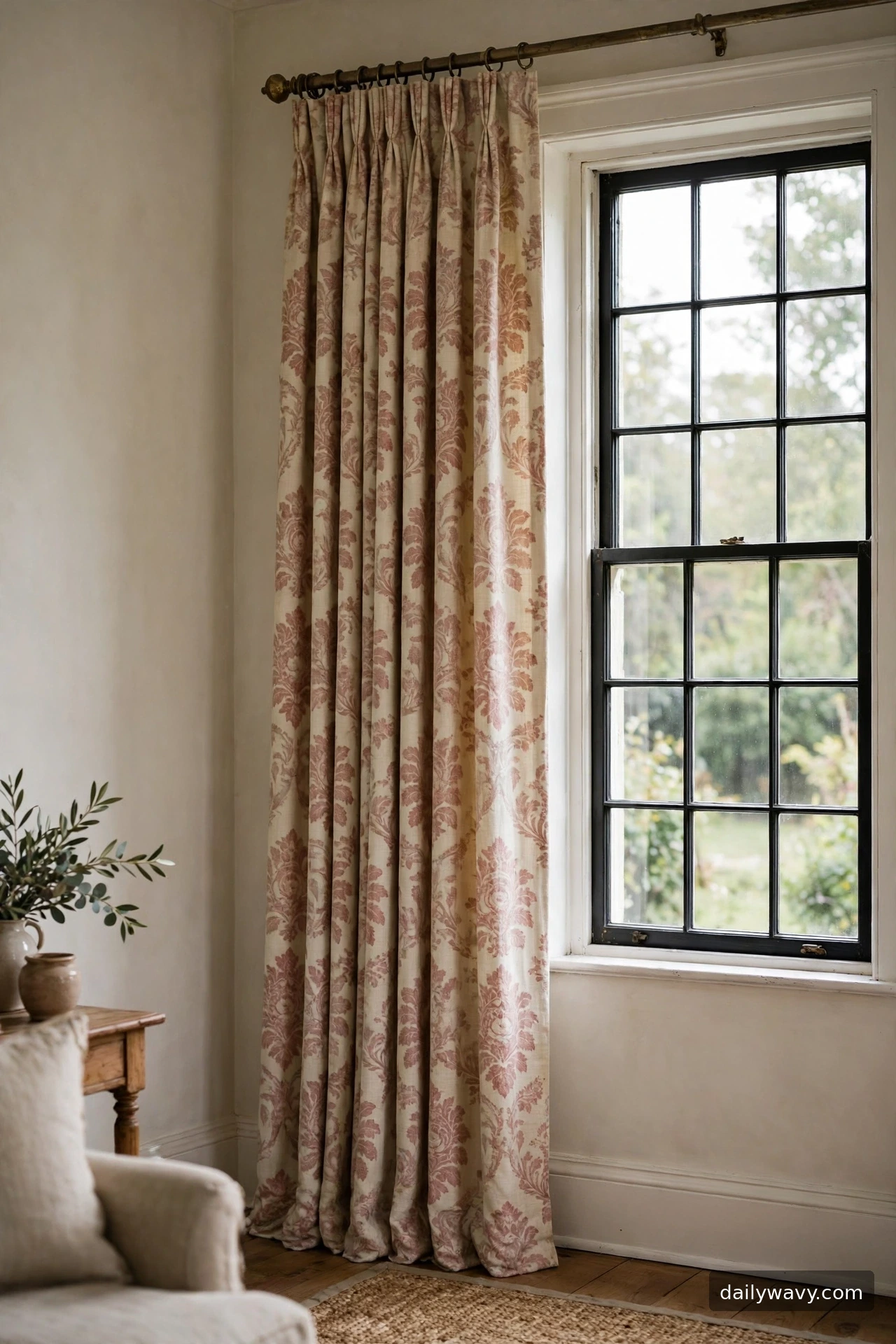
A restrained vintage-style fabric, faded damask, a quiet toile, or a soft floral in dusty tones, brings history without costume. The restraint matters: one vintage element in a current room reads collected; a room full of them reads themed.
Let the fabric be the only vintage voice. Pair it with clean-lined furniture and plain walls so the pattern feels like a find, not a set. Aged brass hardware suits this idea better than black or chrome. Choose patterns in dusty, grayed colors rather than bright reproductions.
Measure for a slightly more formal hang: rod 6 inches above trim, panels pooling just an inch, or breaking cleanly at the floor. Vintage patterns often have large repeats, so buy extra length to match the pattern across panels. Steam thoroughly; old-style prints show creases.
For the budget, hunt thrift stores and estate sales for vintage drapes in good fabric. Quality vintage cotton and linen outlasts most new budget panels, and the patina is the point.
18. A linen-look finish with neat hems
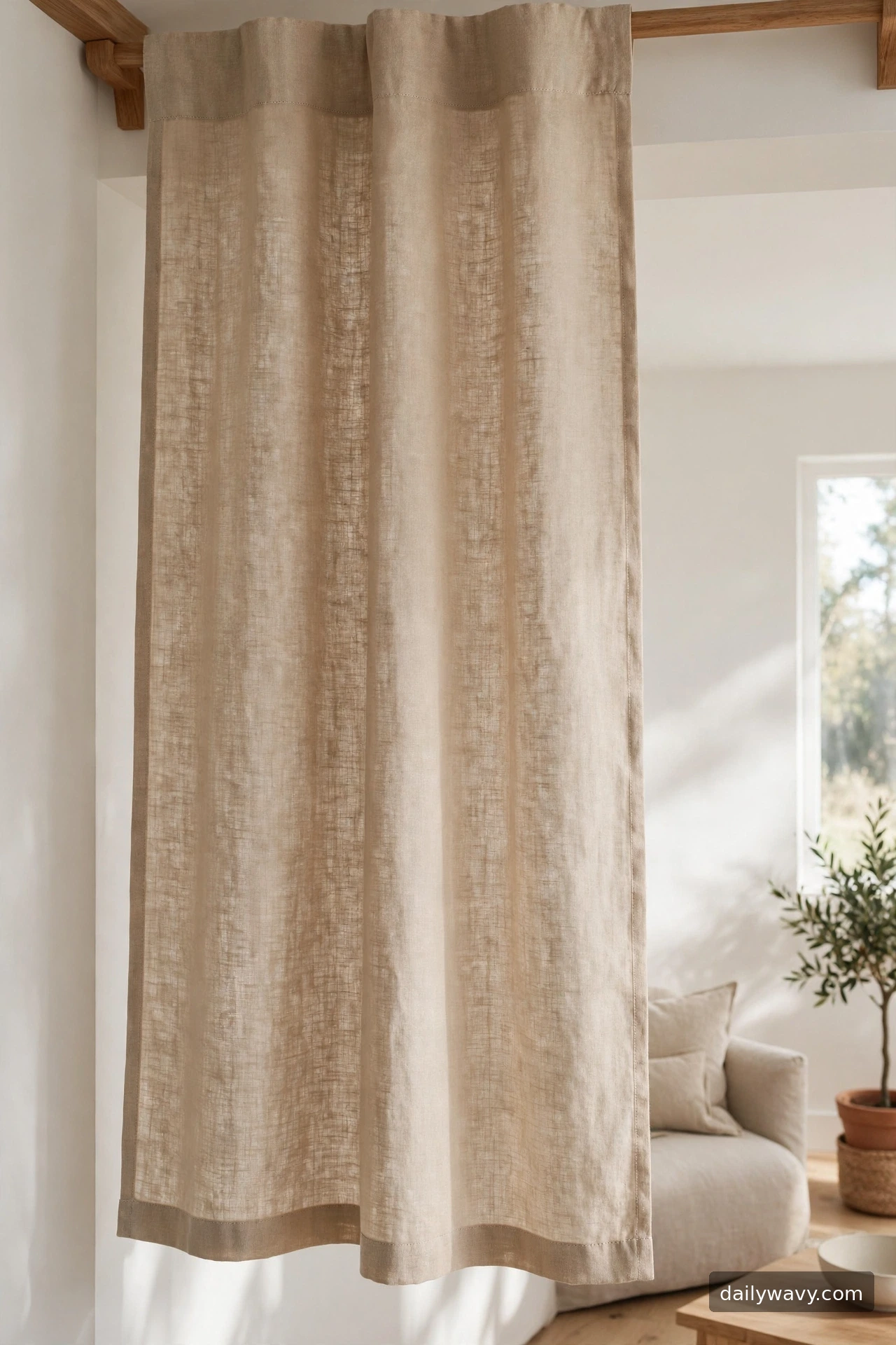
Linen-look fabrics give the breezy elegance of real linen with easier care and lower cost. The “neat hems” part is what separates this from the relaxed look in idea 12: crisp stitched hems, even gathers, and a tailored fall. It is casual fabric with formal manners.
Buy the best linen-look you can feel: the weave should be visible but the hand should be smooth, not scratchy. Flax, oatmeal, and natural tones are the classics; white linen-look can glow beautifully in bright rooms. Check that the fabric hangs straight on the bolt; some blends twist, which shows in the finished panel.
Hemming matters most here. Measure the finished length twice, press the hem before stitching, and keep side hems narrow and even. Hang on a simple wooden or brushed-metal rod. Standard fullness, twice the coverage, keeps the look crisp rather than billowy.
Lower-cost method: buy linen-look tablecloths in the right drop length. Many are hemmed on all four sides already, so you only add a rod pocket or tabs.
19. A delicate vertical pattern
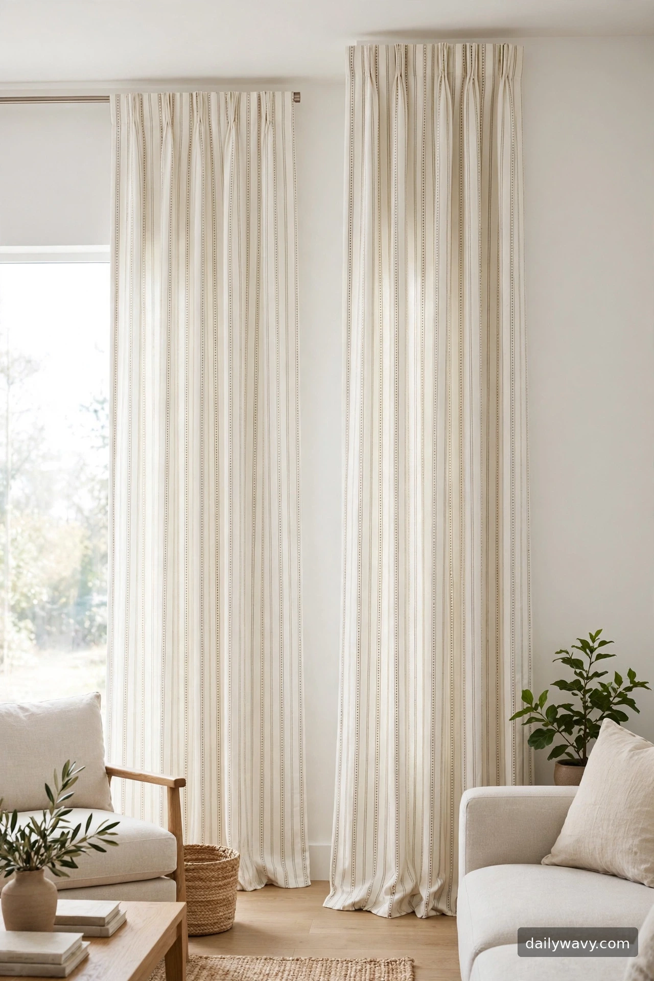
Vertical lines make ceilings feel taller, and a delicate vertical pattern on curtains doubles that effect with the window. Thin pinstripes, tiny dot columns, or fine ticking stripes draw the eye up and give the room a lift. This is a quiet fix for rooms with standard eight-foot ceilings.
Keep the pattern delicate: lines under a quarter inch, low contrast with the ground. Strong verticals can feel like a tent; whisper-thin ones feel like architecture. Ivory grounds with tone-on-tone lines are the safest and most versatile.
Hang the rod as high as the room allows, 6 to 8 inches above the trim or even at ceiling height, to maximize the lifting effect. Panels to the floor, no puddling, so the vertical line runs clean. Match the pattern repeat on both panels so the lines continue evenly.
Budget trick: apply thin vertical stripes of fabric paint or iron-on tape to plain ivory panels. Use a level and a long straightedge; the eye forgives small wobbles, but straight lines sell the effect.
20. A simple solid color repeated in textiles
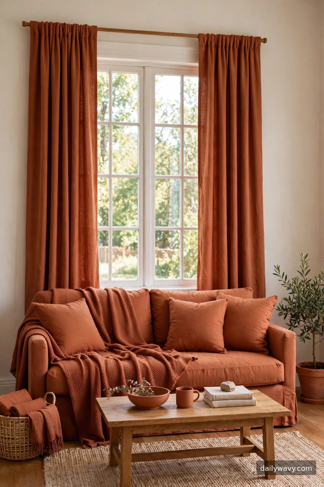
The oldest designer trick is also the simplest: pick one solid color for the curtains and repeat it in the room’s textiles. Terracotta panels with a terracotta throw and matching cushions, or sage panels with a sage rug binding, make the whole room feel composed. The repetition is what turns a color choice into a scheme.
Choose the color from something you already love and will keep: a rug, a piece of art, a favorite cushion. Then buy the curtains in the closest solid you can find. Exact dye-lot matching across brands is nearly impossible, so aim for the same family and depth rather than an identical shade; close harmony looks richer than forced matching.
Place the repeated color at three points minimum: curtains, plus two smaller textiles. That triangle of color is what the eye reads as intentional. Keep the curtain fabric matte and simple so the color, not the texture, carries the idea. Standard hanging: high, wide, floor length.
The budget version starts at the thrift store or sale rack: find the curtains first in a color you love, then hunt cushions and throws in the same family. Building outward from one find is often cheaper than matching everything at once.
Frequently asked questions
How high should I hang living room curtains?
Mount the rod 4 to 6 inches above the window trim, or higher for a taller look. Extending the rod 6 to 10 inches past the trim on each side lets panels stack on the wall so they frame the glass instead of covering it.
How wide should curtain panels be?
For soft, even folds, each panel should measure about twice the width it will cover on the rod. Sheers and textured weaves look better at two and a half to three times coverage. Measure the rod coverage per side, then multiply.
Should living room curtains touch the floor?
Floor-grazing length, just kissing the floor or breaking about an inch, is the most versatile and looks finished in almost every room. Puddling an inch or two suits only relaxed fabrics; tailored fabrics look sloppy pooled.
How do I choose between sheers and heavier panels?
Think about light and privacy. Sheers keep the room bright and soften glare but offer little evening privacy. Heavier panels give privacy and insulation but darken the room when closed. Layering both on a double rod gives you the choice daily.
What curtain colors work in most living rooms?
Warm neutrals like ivory, oatmeal, greige, and soft taupe suit the widest range of rooms and light conditions. If you want color, choose one muted tone and repeat it once in a cushion or throw so it looks deliberate.
How do I keep curtain cords safe around kids?
Choose cordless options like wand-drawn panels or motorized rods where children play. If you have cords, keep them short, secured with a cleat high on the wall, and out of reach of cribs, beds, and play areas. Never place a crib or child’s bed near a window with long cords.
A finished frame for your room
Curtains are one of the few changes that touch light, color, texture, and proportion all at once, which is why they repay the attention. Start with your window’s measurements and your room’s light, pick the idea that fits both, and hang with care. The difference between good curtains and great ones is rarely the fabric price; it is the rod height, the fullness, and the hem. If you are rethinking the whole room around the windows, our narrow living room layout guide covers how furniture placement and window treatments work together, and small entryway decor shows how to carry your fabric story into the next room. For more room-by-room ideas, browse the Home and Decor category.



3 Comments