12 Kitchen Backsplash With Wood Cabinets Ideas to Compare Before You Choose
Pairing a backsplash with wood cabinets is one of those decisions that quietly shapes how your whole kitchen feels. Wood…
Pairing a backsplash with wood cabinets is one of those decisions that quietly shapes how your whole kitchen feels. Wood brings warmth and grain that no paint can fake, and the backsplash you set against it decides whether that warmth reads cozy or dated. The twelve ideas below are all built for real kitchens with real wood cabinetry, from oak to walnut, and each one includes materials, measurements, styling details, and how to test samples before you commit. Compare them side by side, order a few samples, and choose with confidence.
In This Guide:
- A Textured Surface With Plain Accessories
- A Low-Contrast Palette In A Compact Space
- An Accent Pulled From Nearby Artwork
- A Vintage-Inspired Detail With Modern Shapes
- A Restrained Mix Of Two Finishes
- A Repeated Shape Across Adjacent Surfaces
- A Light Background With One Saturated Accent
- A Balanced Warm-And-Cool Pairing
- A Small-Scale Grid With Restrained Contrast
- A Vertical Rhythm That Draws The Eye Upward
- A Warm Accent Paired With A Cool Neutral
- A Subtle Geometric Motif
The Backsplash Rules Before You Choose
A few practical ground rules will save you from an expensive do-over. First, always sample in your own kitchen. Order full-size samples, at least 4×4 inches, of every tile you are considering, and look at them taped to the wall at breakfast, noon, and under the range hood light at night. Wood cabinets change character dramatically under different light, and a tile that looked perfect at the showroom can turn green or pink next to your oak.
Second, protect your wall behind the range. Any backsplash material there must handle heat and grease; ceramic, porcelain, glass, and stone all qualify, while wallpaper only belongs outside direct heat and splash zones unless it is specifically rated for kitchens.
Third, match undertones, not just colors. Wood cabinets lean warm (golden oak), cool (gray-washed maple), or neutral (walnut). Hold your tile sample against the cabinet door and squint: if the two fight, the undertone is off.
Fourth, plan grout color as carefully as tile. A high-contrast grout makes every grid line visible and turns the backsplash into a pattern; a grout that matches the tile keeps it quiet and textural.
Finally, hardware is the jewelry. Real handle finishes, brass, matte black, oil-rubbed bronze, change how the whole pairing reads, so test hardware and tile together, not separately.
1. A Textured Surface With Plain Accessories
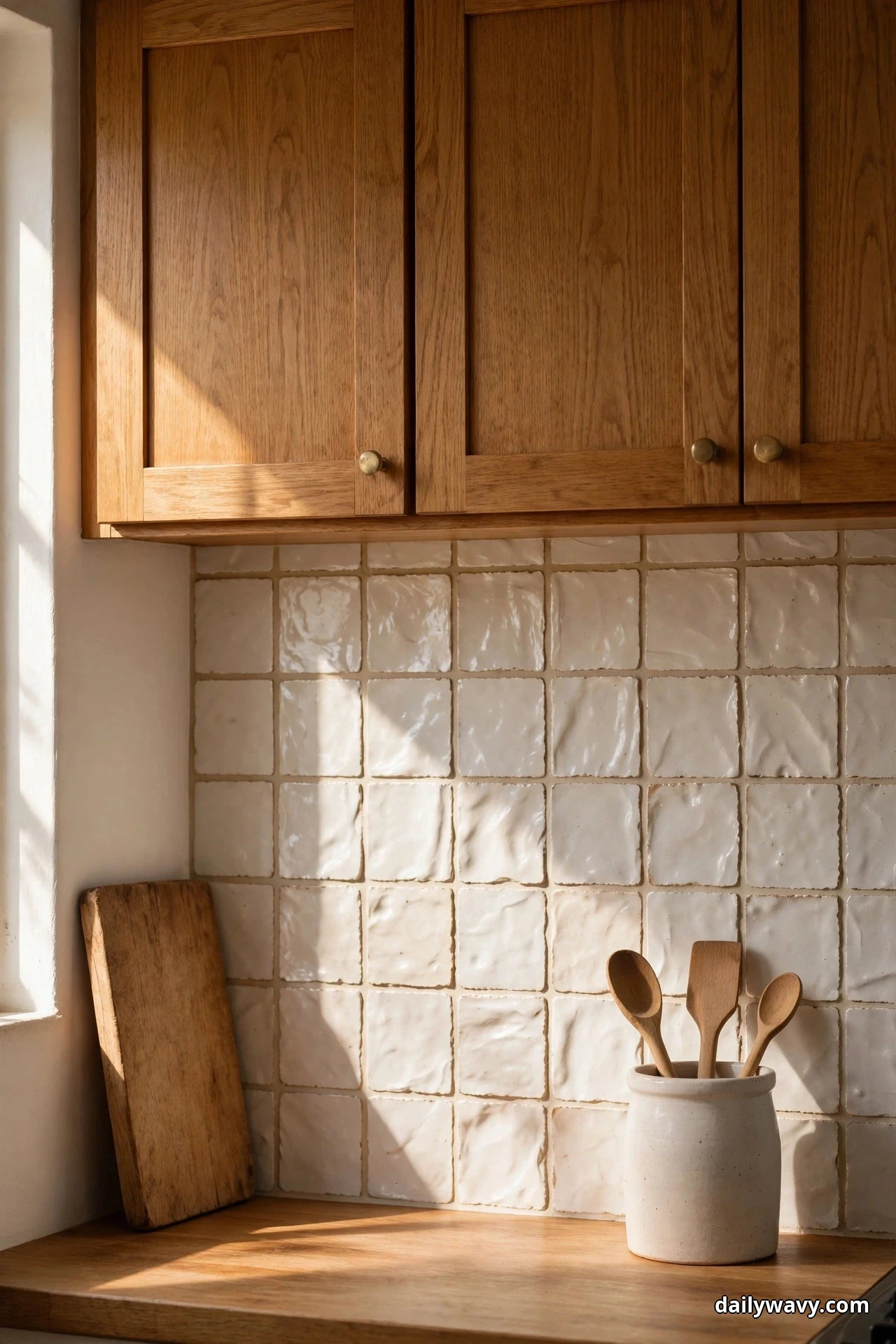
Handmade-look zellige or crackle-glazed ceramic tile has a surface that shifts with the light, which makes it a natural partner for wood grain. The tile does the visual work, so the accessories stay plain: a wooden cutting board, one ceramic utensil crock, maybe a single potted herb.
Choose a 4×4-inch zellige-style tile in a warm white or pale sand. Real zellige varies piece to piece, which is the point, but budget-friendly ceramic versions capture the same handmade undulation. Pair it with warm white grout, like a sand or almond tone, so the texture reads as movement rather than grid lines. Run the tile all the way to the underside of the upper cabinets for a clean line.
Hardware: brushed brass pulls pick up the warm undertones in both the tile and the wood. Test a pull against your cabinet door before buying in bulk.
Sample-testing advice: order at least four full tiles, not one. The variation across pieces is the whole appeal, and a single tile will not tell you whether the batch runs too glossy or too flat. Tape all four to the wall at eye level and view them from across the room.
Effort and budget: zellige-style ceramic runs roughly $8 to $15 per square foot for the tile itself; a typical 30-square-foot backsplash area lands around $400 to $700 in materials before labor. Expect about 2 extra hours of tile-setting time compared with flat tile, because each piece needs individual attention.
2. A Low-Contrast Palette In A Compact Space
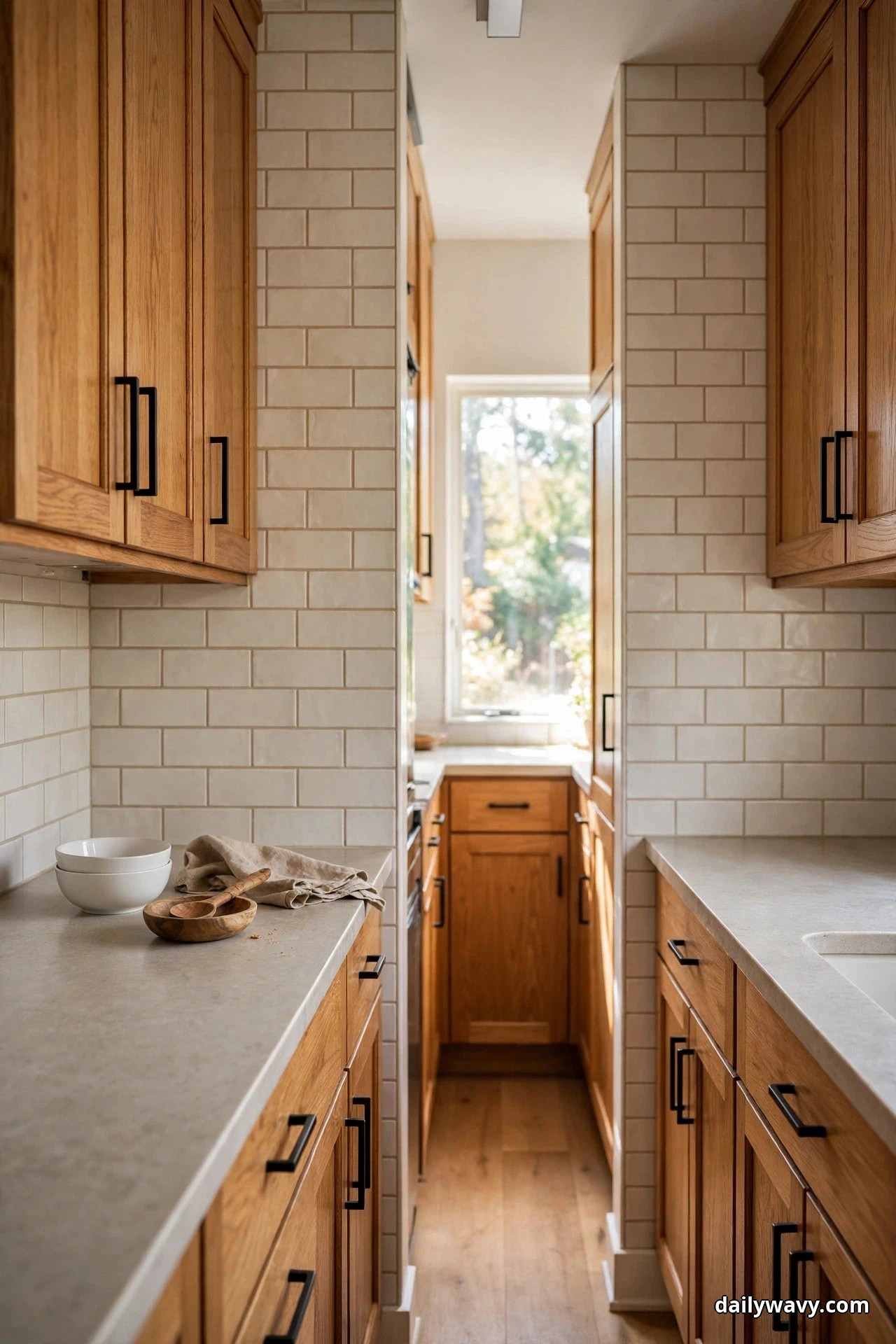
In a small kitchen, a low-contrast backsplash keeps the walls from closing in. The trick is to stay within two steps of your cabinet color on the lightness scale: light wood gets a slightly lighter tile, medium wood gets a tile just a touch softer.
For honey oak or maple cabinets, a matte 3×6-inch subway tile in warm off-white with a matching warm grout disappears in the best way. The eye reads it as one continuous surface, which makes a galley kitchen feel wider. Gloss finish bounces light around, but in a compact space matte hides splatter better and needs wiping down less often.
Keep the upper cabinets off the wall if you can, or use open shelving in one section, so the low-contrast tile has room to breathe. Plain accessories only: a small stack of white bowls, one wooden spoon rest.
Hardware: slim matte black bar pulls add just enough definition without breaking the quiet palette. Black against warm wood is a classic contrast that never reads busy.
Sample-testing advice: photograph the sample wall with your phone in both daylight and evening light. Compact kitchens rely on artificial light after dark, and a low-contrast tile that looks seamless at noon can turn yellow under warm bulbs. Warm white bulbs (2700K to 3000K) keep the palette honest.
Effort and budget: subway tile is the most economical option, roughly $3 to $7 per square foot, and most tilers can set it in a single day. Materials for a 30-square-foot area run about $150 to $350.
3. An Accent Pulled From Nearby Artwork
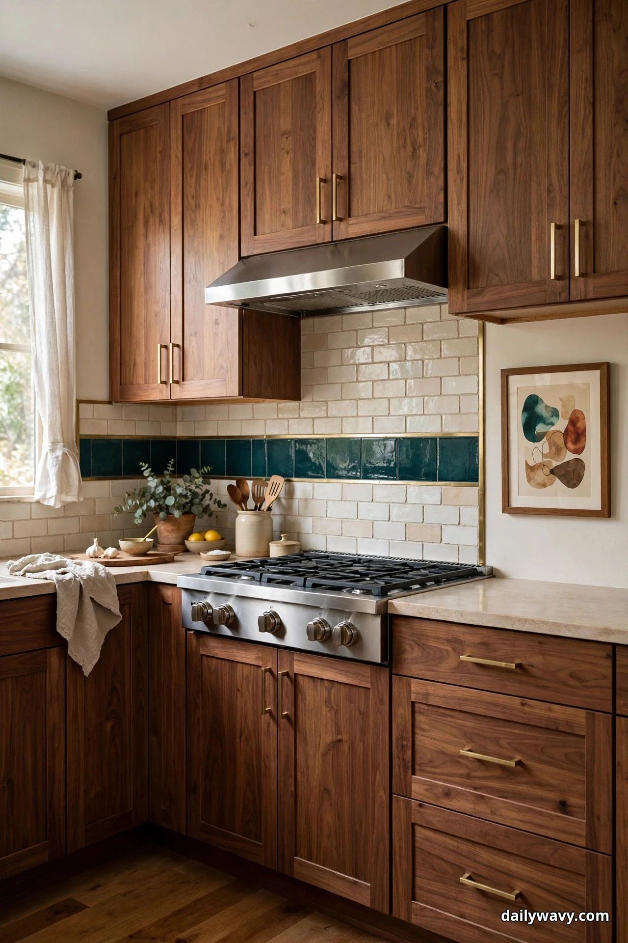
If you already have artwork in or near your kitchen, let it do the color-picking. A backsplash that borrows one accent color from a framed print, a rug runner, or even a vintage cookbook collection feels intentional in a way random color never does.
Say your artwork has deep teal and terracotta against a cream ground, and your cabinets are warm walnut. Use a cream handmade-look field tile, then run a single horizontal band of teal glazed tile at eye level, about 4 inches tall, as a pencil liner. The teal appears exactly twice in the room, in the art and in the band, and the repetition is what makes it feel designed.
Measure carefully: a liner band works best centered on the range or the sink, running the full width of the countertop run. Use tile edge trim (schluter strip in brushed brass) on both long edges of the band for a finished look.
Hardware: oil-rubbed bronze knobs sit quietly against walnut and let the teal band be the star.
Sample-testing advice: bring a photo of the artwork to the tile shop on your phone, but also bring the actual frame if it is portable. Phone screens shift colors; the real frame does not. Hold the accent tile against the frame in natural light before committing.
Effort and budget: adding a liner band to a standard field tile adds roughly $80 to $150 in tile cost and about an hour of setter time. Keep spare accent tiles; a single discontinued glaze line can be impossible to match later.
4. A Vintage-Inspired Detail With Modern Shapes
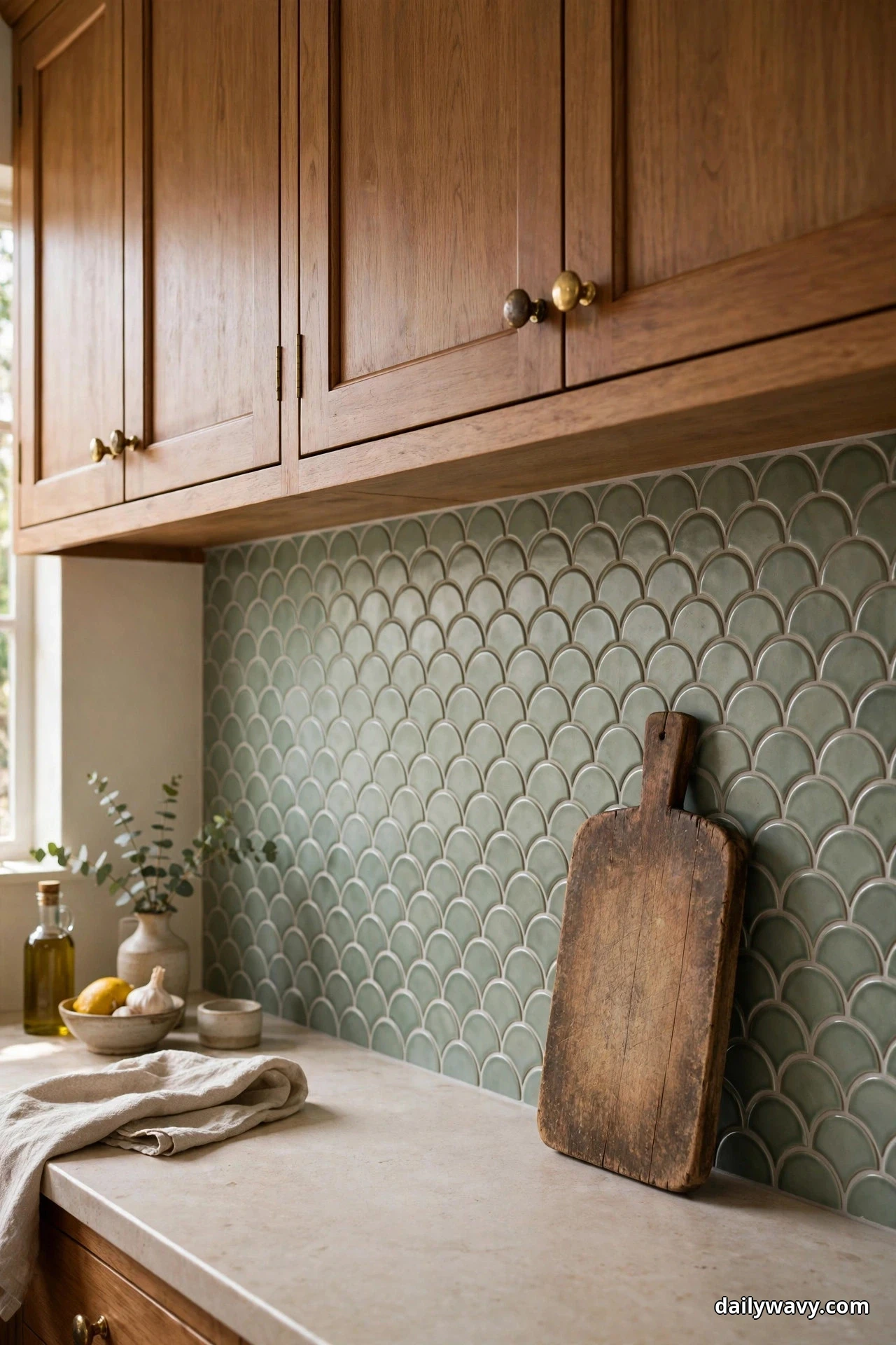
Old kitchens had character in the details, and you can borrow that feeling without living in a period house. The formula here: one vintage-inspired element, like a scalloped tile edge or a patterned encaustic-look tile, set within thoroughly modern shapes and spacing.
Try a scallop (fish-scale) tile in a muted sage or dusty blue, run in straight rows rather than the traditional offset, behind medium-tone wood cabinets. The scallop shape is the vintage nod; the straight grid and clean grout lines keep it current. Limit the patterned or shaped tile to the main backsplash run and use a plain field tile on the side walls so the room does not feel themed.
Pair with a simple quartz or butcher-block counter, plain white ceramic accessories, and one vintage wooden cutting board leaning against the backsplash for good measure.
Hardware: unlacquered brass knobs that will patina over time. They start bright and mellow into a warm brown that echoes vintage brass, and they cost about the same as standard brass.
Sample-testing advice: scallop tiles look dramatically different in a full installation than in a single sample. Lay at least six tiles on the floor in the pattern you plan, stand back six feet, and check whether the scallops read as texture or as fish. If they read as fish, switch to a smaller scallop or a softer color.
Effort and budget: shaped tiles run $10 to $20 per square foot, and the layout takes a skilled setter about 25 percent longer than straight grid. Materials for 30 square feet land around $450 to $800.
5. A Restrained Mix Of Two Finishes
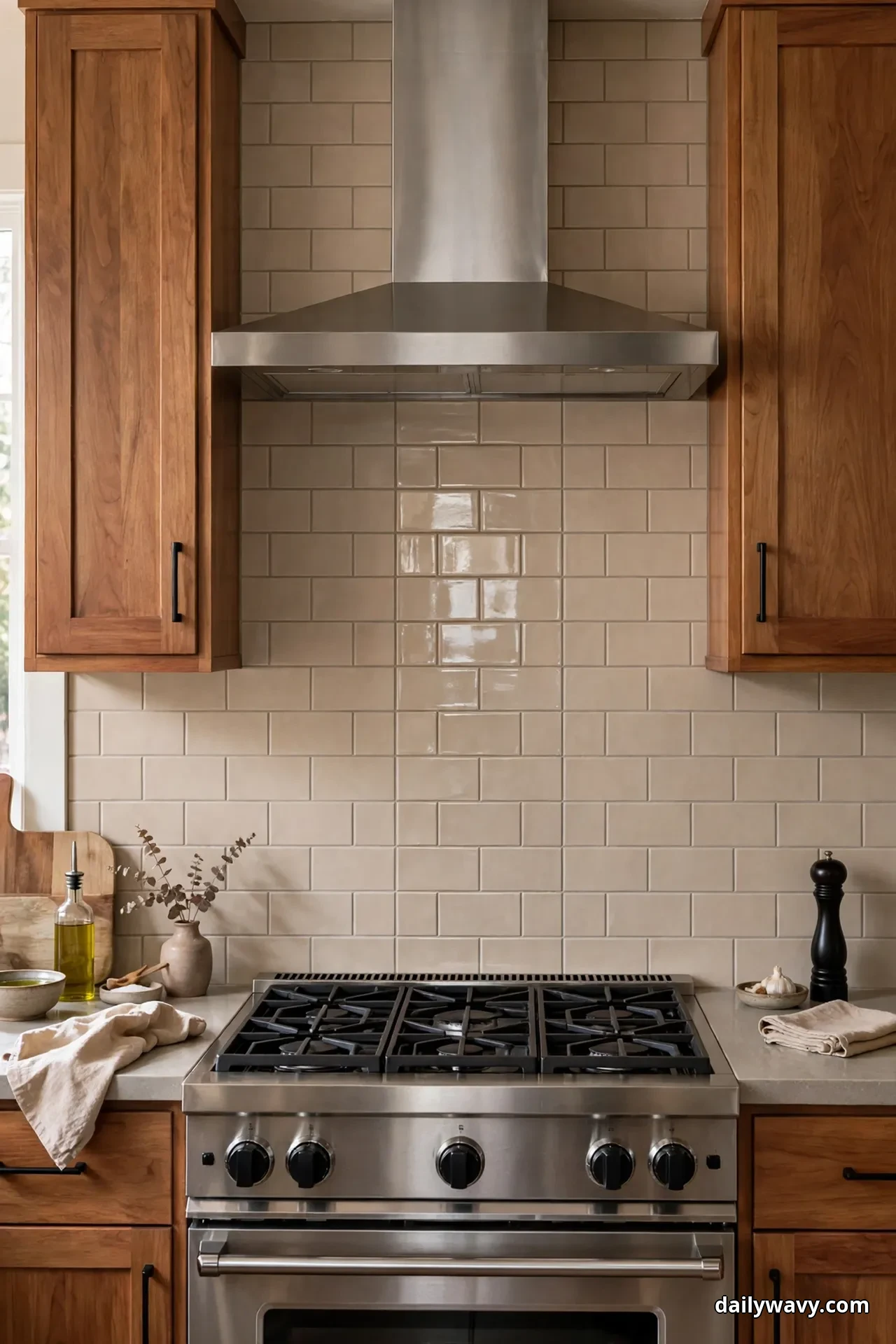
Wood already brings one strong finish to the room. Adding two more, a matte and a gloss, in the backsplash gives you depth without clutter, as long as the colors stay restrained.
Set a matte 2×8-inch tile in warm greige as the field, then inlay a single vertical stripe of the same tile in a gloss finish, about 8 inches wide, centered behind the range. The stripe catches light and marks the cooking zone without adding a new color. Everything else in the room stays matte: the cabinets, the hardware, the counter.
Grout: use one warm gray grout for both finishes so the contrast comes only from light, not from lines.
Hardware: matte black pulls. The black echoes the range and keeps the whole composition grounded.
Sample-testing advice: the gloss-versus-matte difference is subtle, so view samples under your actual under-cabinet lighting. If you do not have under-cabinet lights yet, install them before choosing tile; they change everything about how finish reads, and they are worth every penny.
Effort and budget: mixing two finishes of the same tile usually costs no more than a single finish, since manufacturers sell both from the same line. The only added cost is the extra layout time, about 30 minutes for the stripe.
6. A Repeated Shape Across Adjacent Surfaces
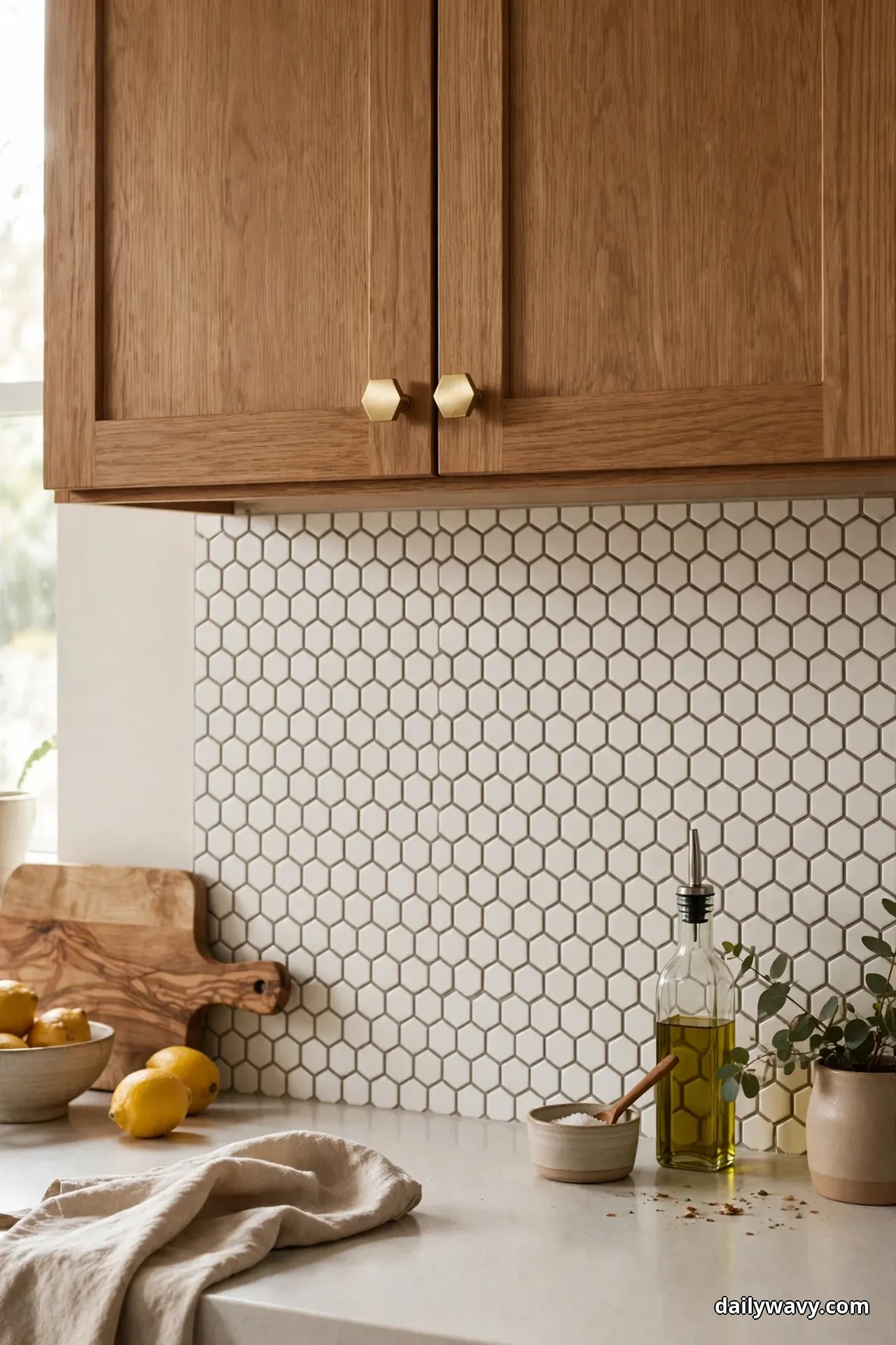
Repetition is the quietest form of design. When a shape appears in the backsplash and then again in the floor, the counter edge, or the cabinet hardware, the kitchen feels put together even if nothing matches exactly.
A practical version: hexagon tile backsplash in a soft warm white, with the hexagon shape repeated in the floor as a larger-format hex or in the hardware as hex-shaped knobs. Keep the backsplash hex small, about 2 inches, so it reads as texture from across the room, and use a grout color one shade darker than the tile so the shape is legible without shouting.
Wood cabinets in a medium oak tone sit beautifully against warm white hexes because the honey in the wood and the warmth in the tile share an undertone.
Hardware: hex-shaped knobs in brushed brass. They are inexpensive, about $3 to $5 each, and they tie the whole scheme together.
Sample-testing advice: hexagon tile is notorious for grout-width variation. Ask your setter what grout joint width they plan, 1/8 inch is standard, and make sure the sample board shows that exact spacing. A tight sample that becomes a wide joint on the wall is a common disappointment.
Effort and budget: small hex tile runs $7 to $14 per square foot and takes roughly 30 percent longer to set than subway tile because of the geometry. Budget around $350 to $600 in materials for a 30-square-foot area.
7. A Light Background With One Saturated Accent
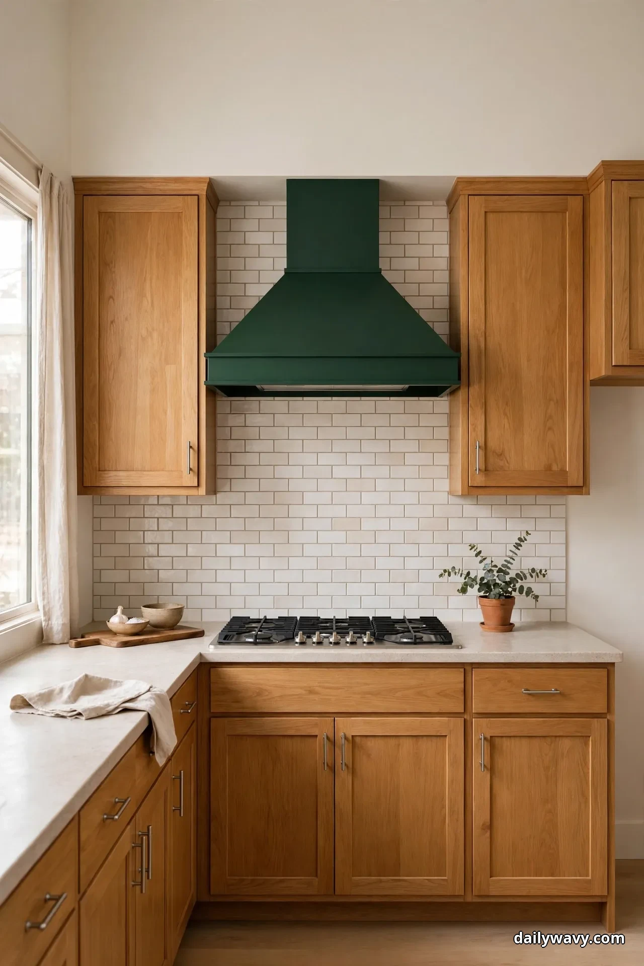
Wood cabinets are warm and mid-toned by nature, so a light backsplash opens the room up, and a single saturated accent stops it from feeling washed out. This is the idea for people who want color but fear commitment.
Cover the backsplash in a light, warm-white 4×12-inch tile laid in a stacked pattern. Then choose one saturated accent and use it exactly once per section: a deep green range hood, a row of cobalt glass pulls on one cabinet run, or a single shelf of amber glassware against the tile. The rule is one accent, repeated nowhere else except maybe in a dish towel.
The saturated accent should be warm or cool depending on your wood: golden oak takes cool accents (forest green, navy) beautifully, while walnut loves warm ones (amber, terracotta).
Hardware: keep it simple and warm, brushed nickel or champagne bronze, so the hardware does not compete with the accent.
Sample-testing advice: test the accent color as a physical object, not a paint chip. A cobalt pull, a green vase, a folded towel. Color chips lie about how a saturated color behaves in three dimensions; objects tell the truth.
Effort and budget: large-format light tile is economical, $4 to $9 per square foot, and the stacked pattern sets fast. The accent costs whatever the object costs, which is the beauty of this idea: a $30 vase can carry the whole room.
8. A Balanced Warm-And-Cool Pairing
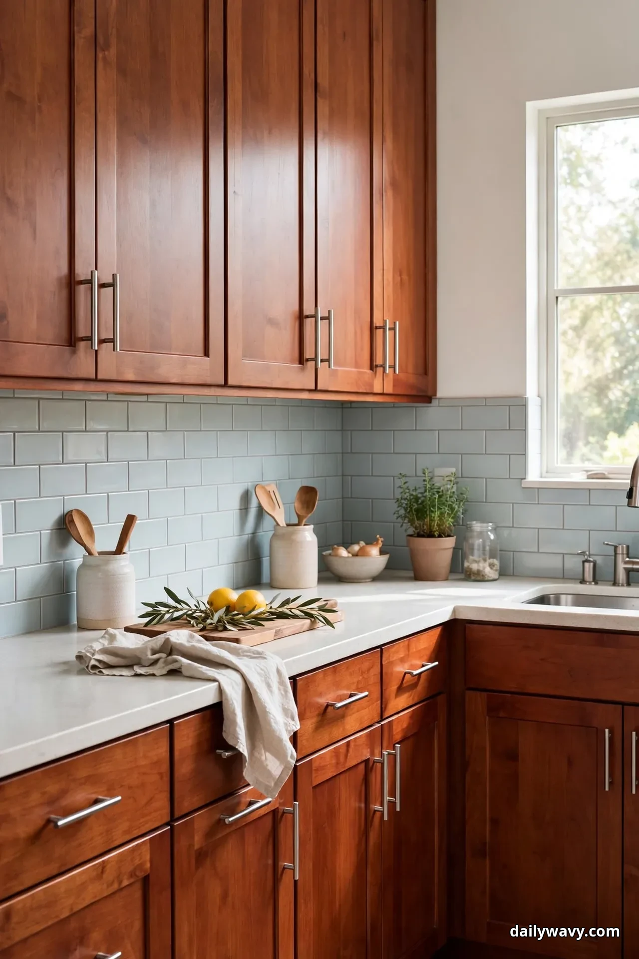
Some kitchens need both warmth and coolness to feel complete, especially open-plan spaces where the kitchen meets a cooler-toned living area. A warm wood cabinet paired with a cool-toned backsplash, or vice versa, creates that balance.
With warm cherry or oak cabinets, try a cool pale blue-gray 3×12-inch tile with a soft matte finish. The blue-gray cools the wood down just enough, and the long tile format keeps it contemporary. Use a cool gray grout that matches the tile so the grout lines stay quiet.
The key word is balanced: the tile should be pale, not saturated, so the wood still dominates. Think of the backsplash as the cool glass of water next to a warm meal.
Hardware: brushed stainless or polished nickel. Cool metals reinforce the cool tile and keep the pairing crisp.
Sample-testing advice: cool tiles are the most likely to clash with wood undertones. Tape the sample to the cabinet door and check it at three times of day. If the tile ever reads green or purple next to your wood, the undertone is wrong. A true blue-gray stays blue-gray.
Effort and budget: long-format ceramic tile runs $6 to $12 per square foot. Materials for 30 square feet come in around $250 to $500, and the running-bond pattern is standard setter fare.
9. A Small-Scale Grid With Restrained Contrast
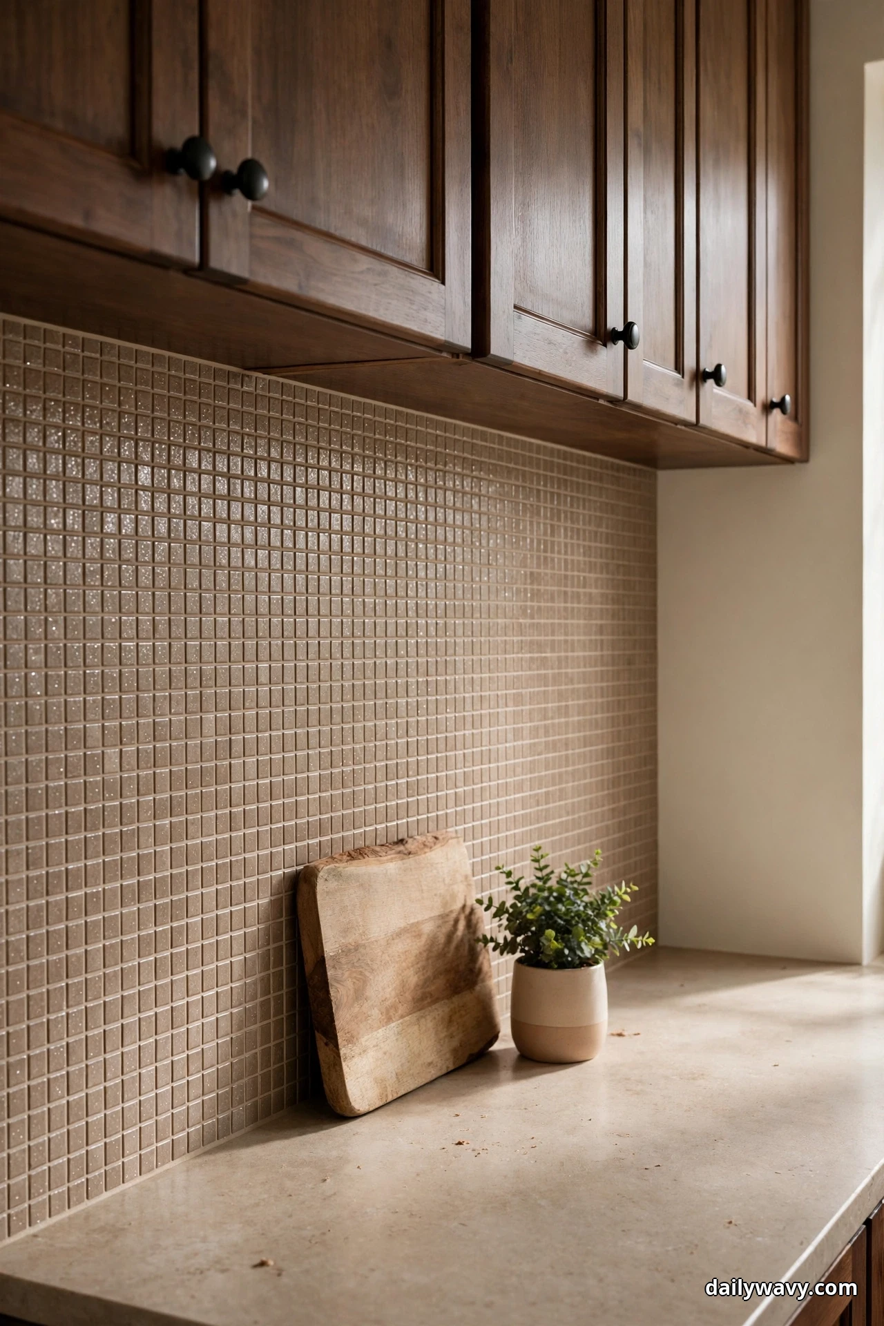
Small tiles make a big statement when the contrast is restrained. A 1×1 or 2×2-inch mosaic in a tone just slightly deeper than the counter creates a fine-grained texture that reads as rich rather than busy.
Use a 2×2-inch porcelain mosaic in warm taupe with a matching taupe grout. The small scale catches light across hundreds of edges, which gives the wall a soft shimmer, but the restrained color keeps it calm. This works especially well with darker wood cabinets, like walnut or espresso-stained oak, because the lighter mosaic lifts the whole wall.
Keep accessories minimal: the mosaic is already the texture in the room. One cutting board, one small plant, nothing more.
Hardware: simple round knobs in matte black. The round shape echoes the small grid without competing with it.
Sample-testing advice: mosaic sheets can vary between dye lots. Buy all your mosaic at once from the same lot, and check the lot number on the box. If you run short mid-job, a different lot can be visibly different on the wall.
Effort and budget: mosaic tile runs $8 to $16 per square foot, and setting small tile is labor-intensive, expect about 40 percent more labor time than standard tile. Materials for 30 square feet run $350 to $650.
10. A Vertical Rhythm That Draws The Eye Upward
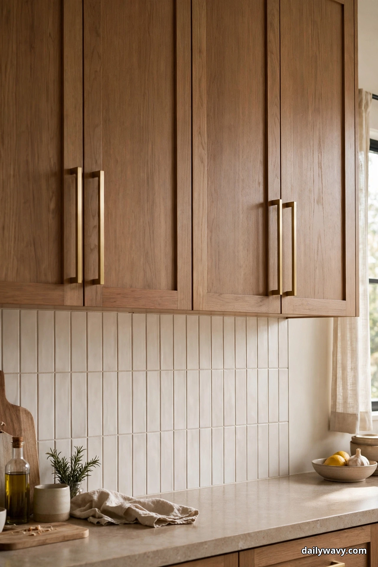
Vertical tile layouts make ceilings feel higher, which is a gift in kitchens with 8-foot ceilings and wood cabinets that can feel heavy. The trick is simple: lay rectangular tile vertically instead of horizontally.
Take a 3×12-inch tile in a soft warm white and stack it vertically in a straight grid. The vertical lines pull the eye up to the ceiling and make the backsplash feel taller than it is. This works best when the tile runs all the way to the ceiling behind the range hood or to the underside of tall upper cabinets.
Pair with wood cabinets in any tone; the vertical rhythm is a layout choice, not a color one. Keep grout close to the tile color so the rhythm comes from the tile edges, not the grout lines.
Hardware: vertical bar pulls mounted vertically echo the tile rhythm. It is a small detail, but the repetition is what makes the room feel considered.
Sample-testing advice: vertical layouts use more cuts around outlets and switches, so count your outlets and plan the layout on paper first. Start the vertical courses at the center of the range or sink so the cuts land symmetrically at the edges.
Effort and budget: vertical layouts cost the same in materials as horizontal, $4 to $10 per square foot for the tile, but add about 10 percent in labor for the extra cuts. Budget $200 to $450 in materials for 30 square feet.
11. A Warm Accent Paired With A Cool Neutral
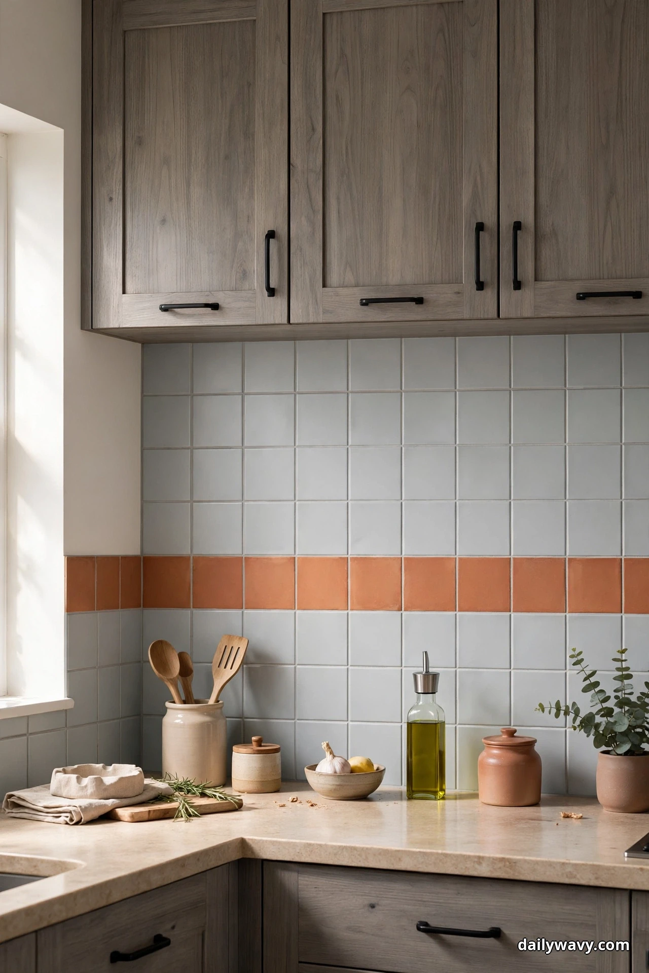
This is the inverse of idea 8, and it suits kitchens where the wood cabinets lean cool or gray. A warm accent tile against a cool neutral field wakes up gray-washed or driftwood-toned cabinets without overwhelming them.
Use a cool light-gray 4×4-inch field tile with a warm terracotta or amber accent tile used sparingly: a single horizontal row at counter height, or a small diamond inlay behind the range. The warm accent should cover no more than 10 percent of the backsplash area. Any more and it stops being an accent.
The cool gray field needs a cool gray grout to stay quiet; the accent tiles can share the same grout since the color contrast does the work.
Hardware: matte black pulls. Black sits comfortably between warm and cool and belongs to neither camp.
Sample-testing advice: terracotta varies wildly in tone, from pink to orange to brown. Hold your accent tile against the gray field tile and the cabinet door together, all three at once, before buying. The accent has to agree with both.
Effort and budget: mixing in an accent row adds about $50 to $120 in tile cost to a standard field installation. Keep the accent tile from the same manufacturer as the field tile when possible so the thickness matches and the wall stays flat.
12. A Subtle Geometric Motif
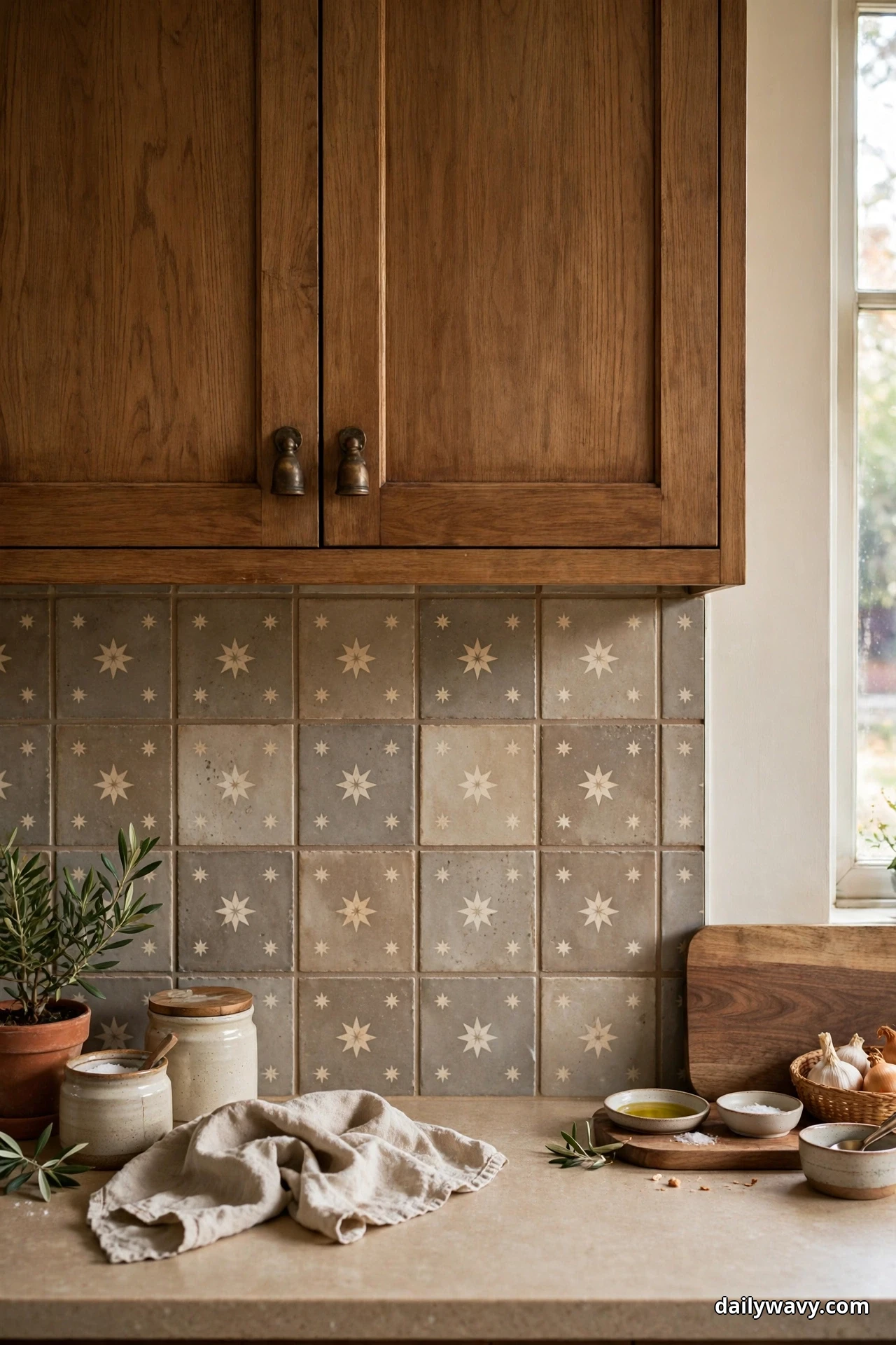
For the kitchen that wants pattern without busyness, a subtle geometric motif in tone-on-tone tile gives you the best of both. The pattern is visible up close and nearly disappears from across the room.
Use a 6×6-inch encaustic-look porcelain tile in warm gray and cream, a simple star or quatrefoil motif, behind medium wood cabinets. Porcelain versions of encaustic tile need no sealing and handle kitchen grease far better than real cement tile. Lay it in a straight grid and use a warm gray grout that matches the darker tone in the pattern.
Limit the motif to the main backsplash wall. Side walls get a plain field tile pulled from the motif’s background color, so the pattern has a frame.
Hardware: simple cup pulls in aged bronze. The vintage feel of the cup pull suits the encaustic pattern without competing with it.
Sample-testing advice: geometric patterns need a dry layout before setting. Have your setter lay out at least one full wall on the floor first so you can approve where the pattern falls around outlets, the range, and the window. Moving one tile changes the whole rhythm.
Effort and budget: encaustic-look porcelain runs $9 to $18 per square foot. Materials for 30 square feet land around $400 to $750, and the dry layout adds about an hour to the job.
Practical FAQ
How do I test backsplash samples with my wood cabinets?
Tape full-size samples to the wall at eye level and live with them for at least three days. View them in morning light, afternoon light, and under your range hood and under-cabinet lights at night. Photograph them with your phone too, since photos reveal color clashes your eyes adjust to in person. Never choose from a single small chip.
What backsplash goes with oak cabinets?
Oak has strong golden undertones and visible grain, so it pairs best with warm-toned tile: warm whites, creams, sage, terracotta, and warm grays. Cool blue-grays can work if they are pale and the undertone is checked carefully. Avoid stark cool whites, which make oak look orange by comparison.
What backsplash goes with walnut or dark wood cabinets?
Dark wood needs lightness on the wall to keep the kitchen from feeling cave-like. Light warm whites, pale creams, light sage, and soft warm grays all lift dark cabinets. A small amount of saturated accent, deep green or amber, adds life without darkening the room.
Can I use wallpaper as a backsplash with wood cabinets?
Only outside direct heat and splash zones, and only if it is rated for kitchen use. Behind the range and sink, stick to tile, glass, or stone. If you love a wallpaper pattern, use it on a side wall and keep tile where water and grease live.
How much does a backsplash cost?
For a typical 30-square-foot backsplash, tile materials run $150 to $800 depending on the tile, plus $400 to $1,200 for professional installation in most US markets. DIY installation cuts the labor cost but budget an extra 10 percent of tile for cuts and mistakes.
Should the grout match the tile or contrast?
Match the grout to the tile when you want texture without pattern, which suits most wood-cabinet kitchens. Use contrasting grout only when the grid itself is the design, like a dark grout with white subway tile for a graphic look. Remember that dark grout shows less staining over time.
The Takeaway
The right backsplash does not compete with your wood cabinets; it completes them. Start with your cabinet’s undertone, sample tile in your own light, and choose the idea above that fits your space, your budget, and your tolerance for pattern. Order full-size samples of your top two contenders, tape them up, and live with them for a few days. The one you keep glancing at is your answer. For more kitchen planning help, our small pantry organization guide keeps the inside of your cabinets as tidy as the outside, and the narrow living room layout ideas help the rooms beyond the kitchen feel just as considered. The full Home and Decor collection has the rest of the library waiting.