12 Pink Bedding Styling Ideas with Layers and Texture
Pink bedding has a reputation problem. Mention it and people picture a little girl’s room, all sugar and no substance….
Pink bedding has a reputation problem. Mention it and people picture a little girl’s room, all sugar and no substance. But the pink showing up in real bedrooms right now is nothing like that. It is dusty rose linen, blush waffle weave, a vintage quilt the color of faded peonies. Styled with warm neutrals and honest texture, pink bedding reads calm, grown, and quietly luxurious. This guide walks through twelve layering ideas you can actually recreate, from a tonal pillow arrangement to the piping detail that makes a plain duvet look custom. Pick your pink family, measure your bed, and start with one layer.
In This Guide
- A Tonal Pillow Arrangement
- A Woven Bed-Foot Basket With A Spare Throw
- A Darker Fitted Sheet Peeking Beneath
- A Light Waffle Blanket At The Foot
- A Vintage Quilt Used As An Accent
- A Pair Of Different-Size Cushions
- A Small-Scale Print With A Plain Duvet
- A Warm Wood Bedside Surface Nearby
- A Smooth Bedspread With One Textured Pillow
- A Subtle Contrast Piping Detail
- A Breathable Sheet Set With A Light Cover
- A Folded Quilt Across The Lower Third
The Pink Bedding Rules Before You Style Anything
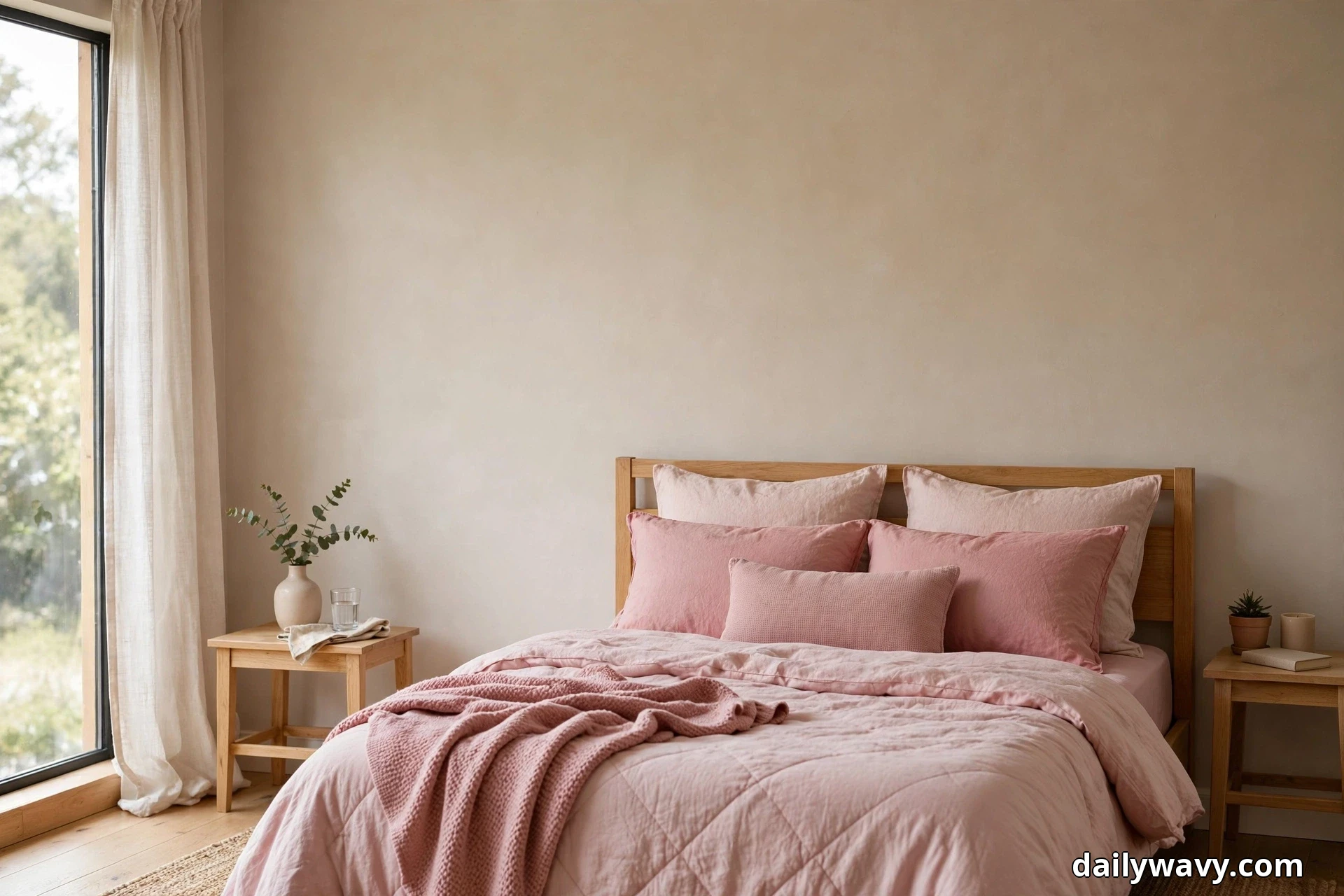
Before you buy a single pillow, learn the five decisions that separate sophisticated pink bedding from a bedroom that looks like a candy wrapper. First, pick one pink family and stay inside it. Blush, rose, dusty pink, and mauve all live on the warm side of pink, and they layer beautifully together. Neon pink, hot pink, and bubblegum do not belong in this family. Choose three or four tones from the warm side and let them do the talking.
Second, let texture carry the color. A flat pink duvet in a single shiny fabric is what gives pink bedding its bad name. The same blush in washed linen, waffle weave, quilted cotton, and soft velvet reads rich and intentional because the light hits each surface differently. When in doubt, add another texture before you add another color.
Third, layer in a fixed order so the bed looks styled instead of piled. Fitted sheet first, then the flat sheet folded back at the top, then the duvet or coverlet, then one folded quilt or throw across the foot, and finally pillows arranged back to front, largest at the headboard. Every layer should show a few inches of the one beneath it. That visible edge is what makes layering look deliberate.
Fourth, measure the bed before you shop. A queen mattress is 60 by 80 inches and a king is 76 by 80, but the drop matters more than the top. Your duvet or coverlet should fall 12 to 15 inches past the mattress edge on each side to look generous rather than skimpy. If your bedroom is on the snug side, our small bedroom with a queen bed ideas show how to keep the footprint working while the bedding takes center stage.
Fifth, keep everything around the bed warm and quiet. Cream walls, natural wood, brushed brass, undyed wool. Pink against warm neutrals looks expensive. Pink against stark white and chrome can look clinical. Warm bulbs in the 2700K to 3000K range keep blush tones honeyed instead of flat. Wash all pink fabrics before styling day, since pink dyes can bleed in the first wash.
1. A Tonal Pillow Arrangement
Nothing changes a bed faster than the pillows, and nothing is easier to get wrong. The trick is staying tonal: several pinks from the same warm family, each in a different fabric, arranged largest to smallest. The eye reads it as one intentional gradient instead of a random pile of cushions.
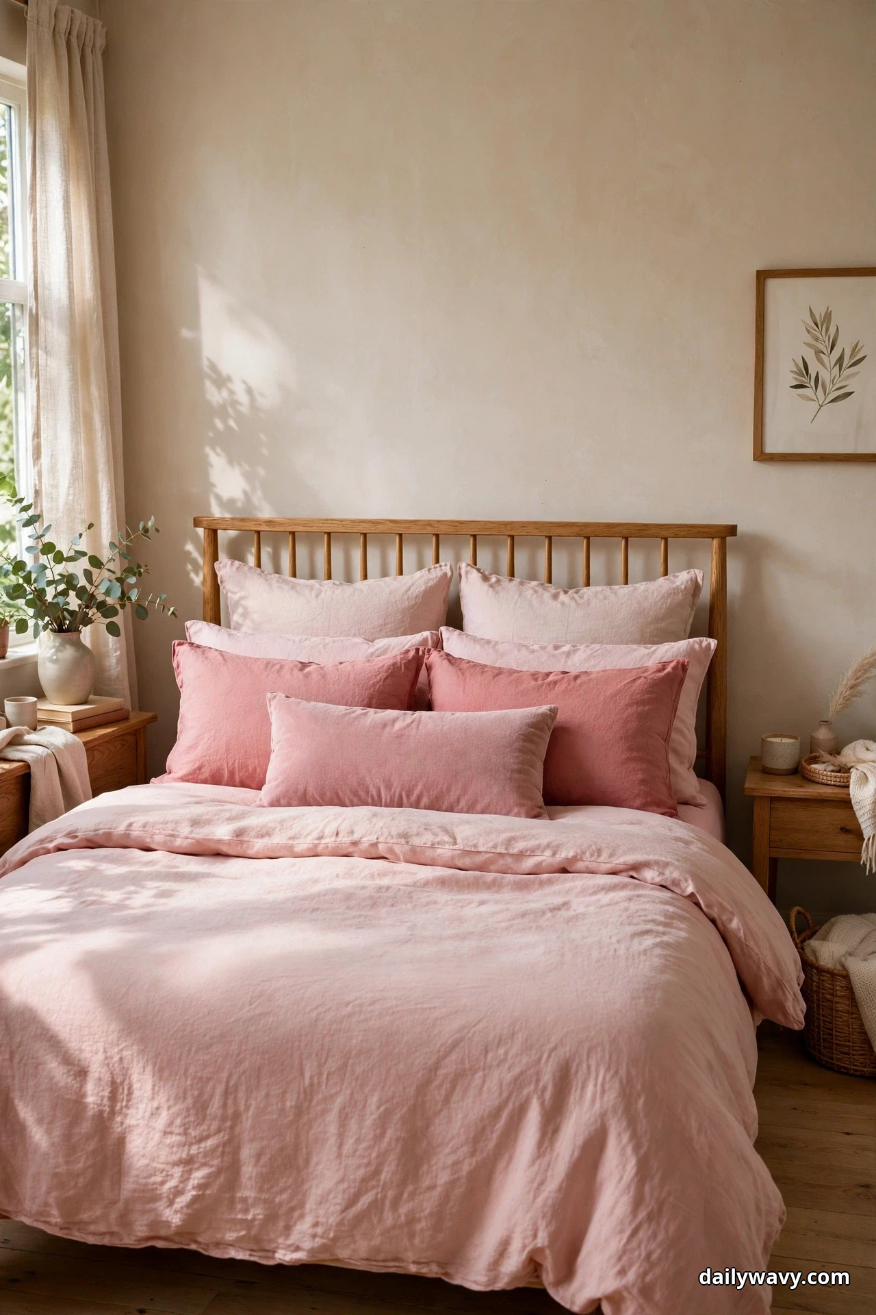
The look: Blush linen euro shams (26 by 26 inches) standing against the headboard, rose cotton sleeping pillows in front of those, and a dusty pink lumbar cushion (14 by 36 inches) as the final layer. The solid blush duvet underneath stays quiet so the pillows do the work. Four to five pinks total is the sweet spot. Any more and the gradient turns muddy.
What to measure: Euro shams need a 26-inch square insert, one size up from the sham if you like them plump. Standard sleeping pillows are 20 by 26 inches. Leave about 6 inches of duvet showing between the front pillow and the folded top edge so the bed has breathing room.
Effort and budget: An afternoon, mostly spent fluffing and rearranging. Lower-cost alternative: keep your existing white sleeping pillows and buy just two euro shams plus one lumbar in pink tones. New covers on old inserts cost a fraction of a full set.
2. A Woven Bed-Foot Basket With A Spare Throw
A basket at the foot of the bed solves two problems at once. It gives the spare throw a real home instead of a crumpled heap, and the woven texture adds the natural, earthy note that keeps all that pink from floating away. Seagrass and rattan both work; the looser the weave, the more casual the room feels.
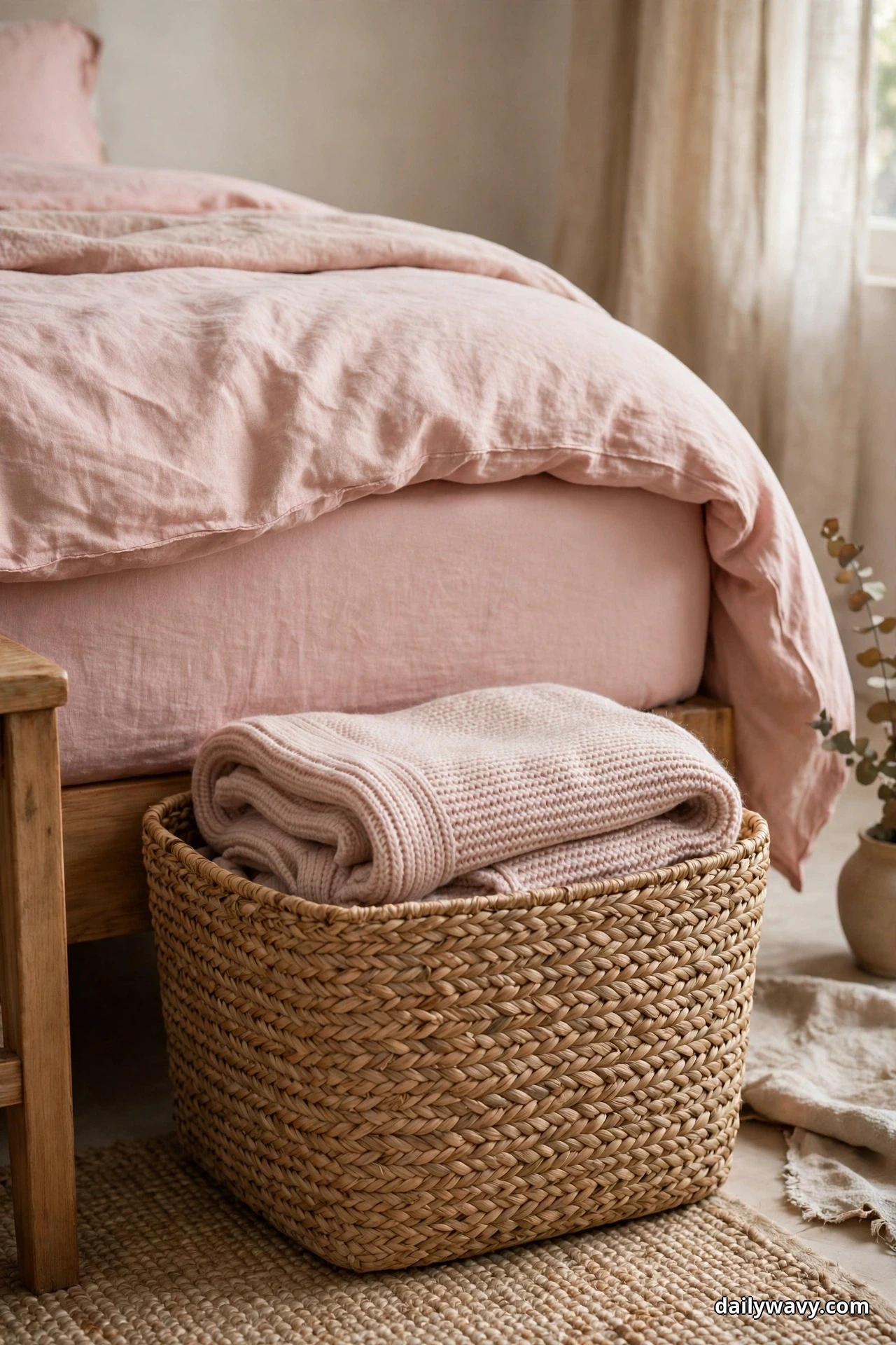
The look: A medium seagrass basket, roughly 18 inches wide and 14 inches tall, sitting at the foot of the bed slightly off center. Inside, one spare throw in blush pink knit, folded in thirds so the texture shows. The basket’s golden tan tone warms up the whole foot of the bed.
What to measure: The basket should be no wider than half the bed’s width, or it starts to look like luggage. Leave at least 24 inches of walking space between the basket and the bedroom door swing.
Effort and budget: Under an hour including a fold practice run. Lower-cost alternative: thrift the basket and buy one quality throw instead of a matching set. A single beautiful throw in a basket looks more collected than three cheap ones.
3. A Darker Fitted Sheet Peeking Beneath
This is the stylist’s secret that costs nothing. Let a darker fitted sheet show a few inches below the lighter flat sheet and duvet, and suddenly the bed has depth it did not have before. The darker line at the base anchors all the pale pink above it, the way a dark frame anchors a light photograph.
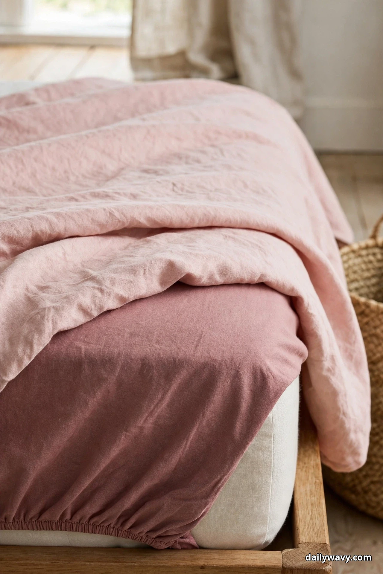
The look: A fitted sheet in dusty rose or muted mauve, a shade or two deeper than the flat sheet and duvet in blush. Pull the duvet and flat sheet up so 3 to 4 inches of the fitted sheet shows along the sides and foot. The effect is subtle from across the room and gorgeous up close.
What to measure: Fitted sheets need the right pocket depth. Measure your mattress height including any topper; most need a 14 to 15 inch pocket. Too shallow and the corners pop off by morning.
Effort and budget: Zero extra cost if you already own a darker sheet, or the price of one fitted sheet. Lower-cost alternative: dye an old white fitted sheet with a single box of rose fabric dye. It will not be perfectly even, and that is exactly the point.
4. A Light Waffle Blanket At The Foot
Waffle weave is the hardest-working texture in bedding. It reads cozy without weight, it photographs beautifully because the grid catches light and shadow, and a light blush waffle blanket folded across the foot of the bed adds a finished layer in under a minute. This is the layer guests always touch first.
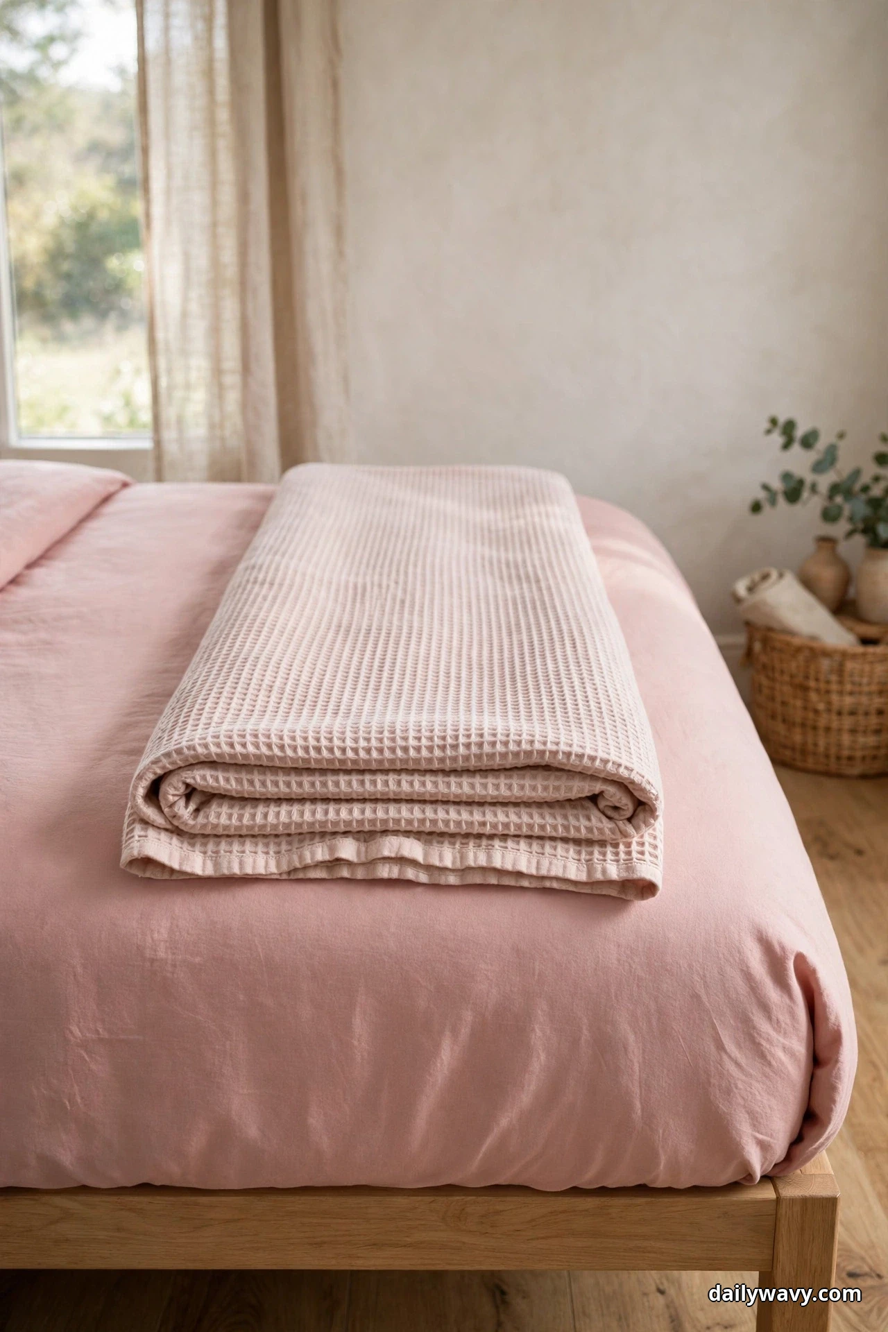
The look: A blush or pale rose waffle blanket, roughly 50 by 70 inches, folded in thirds lengthwise and laid straight across the foot of the bed. The fold should sit about 18 inches up from the foot edge. The honeycomb texture shows best in natural side light, so style this layer in the morning.
What to measure: A throw-sized blanket works for a queen; a king bed wants something closer to 60 by 80 so it does not look like a scarf. Keep the fold crisp by smoothing it with your hands rather than ironing, which flattens the waffle.
Effort and budget: Ten minutes. Lower-cost alternative: a waffle blanket in undyed cream layered over pink sheets gives you the texture for less than a pink one, and the contrast is lovely.
5. A Vintage Quilt Used As An Accent
A vintage quilt brings something new bedding cannot: a pattern with a past. Draped as an accent over pink bedding, a faded floral or feedsack quilt in rose and cream adds history and keeps the room from feeling like a showroom. The slight irregularity of hand quilting is the whole appeal, so do not look for perfection.
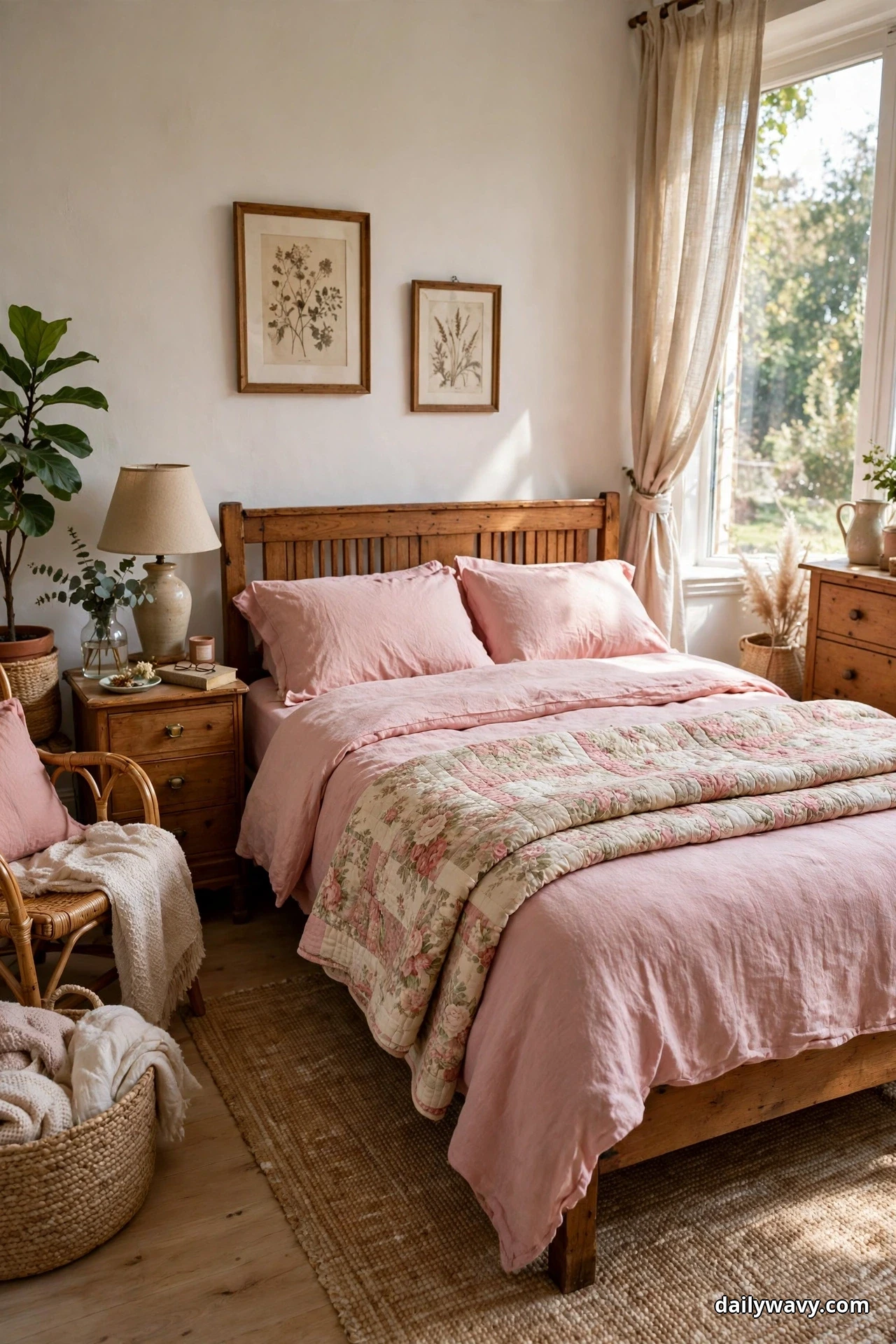
The look: A vintage or vintage-style quilt in faded pink florals on a cream ground, folded once and laid across the lower half of the bed at a slight angle. The angle matters; perfectly straight looks staged, while a few degrees off looks lived in. Let one corner drape over the edge.
What to measure: A full or queen quilt (90 by 90 inches) gives you enough drape on a queen bed. Check vintage quilts for thin spots by holding them to the light; a few worn patches are character, but large threadbare areas will keep tearing.
Effort and budget: A weekend of hunting at flea markets and estate sales, which is half the fun. Lower-cost alternative: quilt-style coverlets with a vintage floral print give the look for the price of new bedding, and they survive the washing machine without a second thought.
6. A Pair Of Different-Size Cushions
Two cushions in deliberately different sizes look more designed than a matched set ever will. The size contrast creates a little composition on the bed, and when the two cushions are in related pinks but different fabrics, the pairing feels collected rather than decorated. This is the easiest idea on this list to get right.
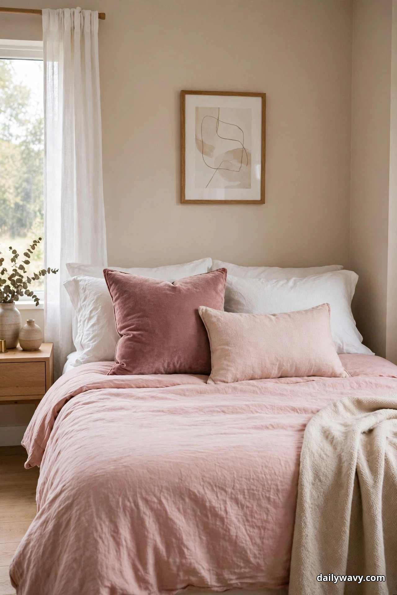
The look: One large square cushion (22 by 22 inches) in dusty rose velvet placed slightly left of center, and one smaller lumbar (12 by 20 inches) in blush linen tucked in front and slightly right. The asymmetry is intentional. Velvet against linen gives you the texture contrast that makes the pairing sing.
What to measure: Inserts should be 2 inches larger than the covers for that plump, karate-chopped look. A 22-inch cover wants a 24-inch insert. Anything smaller looks deflated by week two.
Effort and budget: An hour of shopping or an afternoon of sewing if you make the covers. Lower-cost alternative: buy the velvet cushion and make the linen lumbar from a remnant. Lumbar covers are two straight seams; they are the ideal first sewing project.
7. A Small-Scale Print With A Plain Duvet
A plain duvet is a blank canvas, and a small-scale print is the brushstroke that keeps it interesting. The key word is small scale: tiny florals, mini dots, or a fine stripe in pink on cream. From the doorway it reads as texture; up close it rewards a second look. Large prints fight with layering, but small ones play nicely with every other idea here.
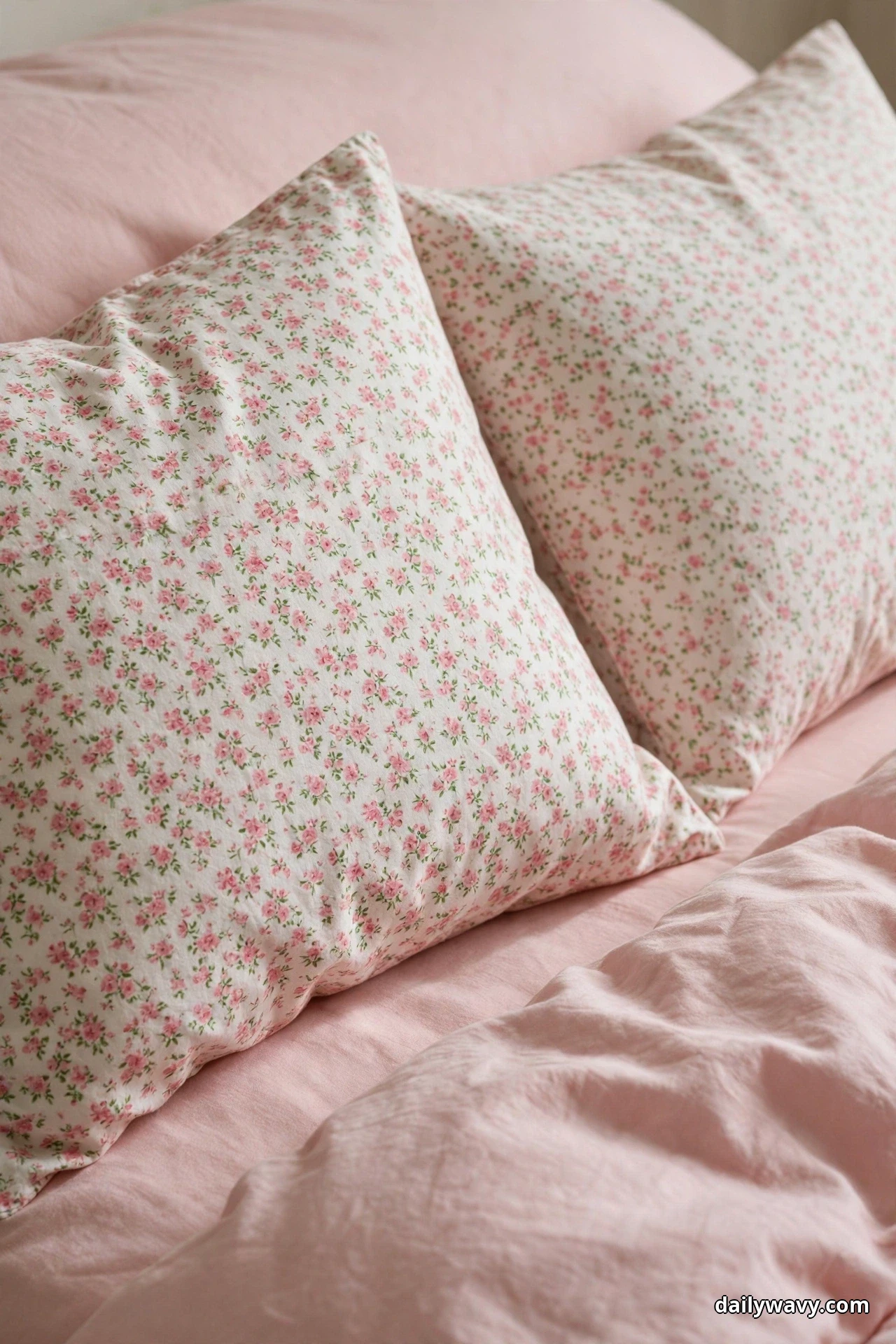
The look: Shams in a small pink floral or dot print on a cream ground, two of them, set against a solid blush duvet. Keep the print to the shams and maybe one lumbar; the duvet stays plain so the bed does not turn busy. The print’s background should be close to your wall or trim color so it ties the room together.
What to measure: Print scale matters more than pillow size. Hold the fabric at arm’s length; if you can still see the individual motif, it is small enough. Motifs larger than about 2 inches start competing with the layers.
Effort and budget: The cost of two printed shams, often sold as a pair. Lower-cost alternative: a printed lumbar alone, in front of plain shams, gives you the same hit of pattern for half the price.
8. A Warm Wood Bedside Surface Nearby
Pink bedding looks its best next to warm wood. A walnut or oak nightstand beside the bed grounds all that softness with something solid and a little masculine, and the contrast is what makes the pink feel sophisticated instead of sweet. The bedside surface is part of the bedding story, not separate from it.
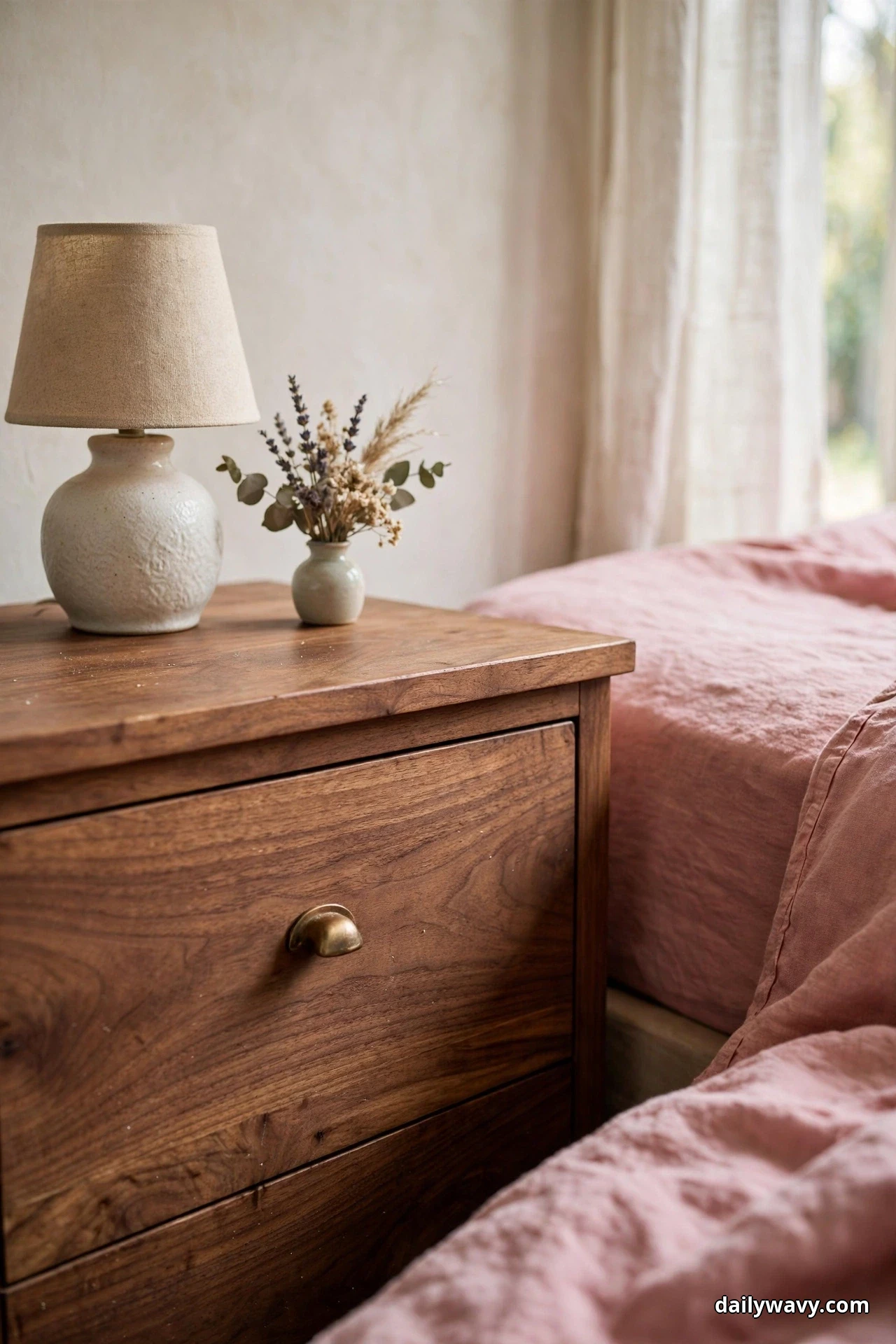
The look: A nightstand in warm walnut or white oak, 24 to 28 inches tall, styled simply: a small ceramic lamp with a linen shade, a tiny vase with dried flowers or a sprig of eucalyptus, and nothing else. The pink duvet edge in frame connects the table to the bed. One styled surface beats three cluttered ones.
What to measure: The nightstand top should sit within 2 inches of the mattress top for easy lamp reach. Leave 3 to 4 inches between the bed frame and the table so bedding can move without snagging.
Effort and budget: A weekend if you are refinishing a thrifted table, an afternoon if you are just restyling. Lower-cost alternative: a coat of warm-toned furniture oil can turn a pale thrifted table convincingly walnut-adjacent. Carry the same warm wood language toward the door with our small entryway decor ideas so the whole home tells one story.
9. A Smooth Bedspread With One Textured Pillow
Restraint is a styling choice too. A smooth, matte bedspread in solid blush with exactly one textured pillow does more with less than a bed buried in cushions. The single contrasting pillow becomes a focal point, and the smooth expanse of the spread makes the room feel calm and uncluttered. Minimalists, this one is yours.
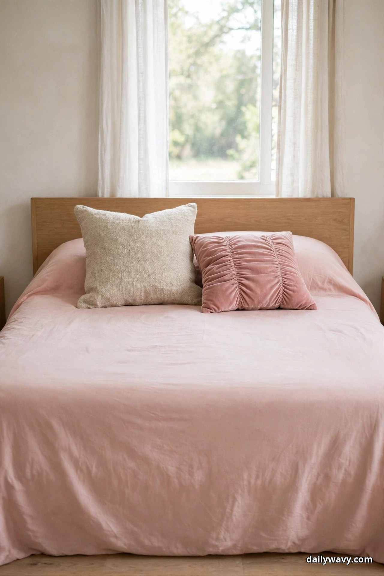
The look: A smooth matelassé or plain-weave bedspread in solid blush pink, pulled smooth and tucked at the foot. One pillow in a contrasting texture, ruched velvet or nubby boucle in dusty rose, centered against the sleeping pillows. That is the entire styling. Resist the urge to add more.
What to measure: A bedspread should cover to just below the mattress edge on the sides; measure the drop and buy accordingly. The single accent pillow reads best at 18 to 20 inches square, big enough to notice, small enough to stay special.
Effort and budget: Under an hour. Lower-cost alternative: if you already own a smooth white or cream spread, one textured pink pillow and a pink throw at the foot deliver ninety percent of this look.
10. A Subtle Contrast Piping Detail
Piping is the quiet luxury of bedding. A thin cord of deeper rose along the edge of a blush duvet or sham outlines each piece like a pencil line, and it makes plain bedding look custom without a single pattern. You notice it the way you notice good tailoring: not consciously, but the whole thing looks better.
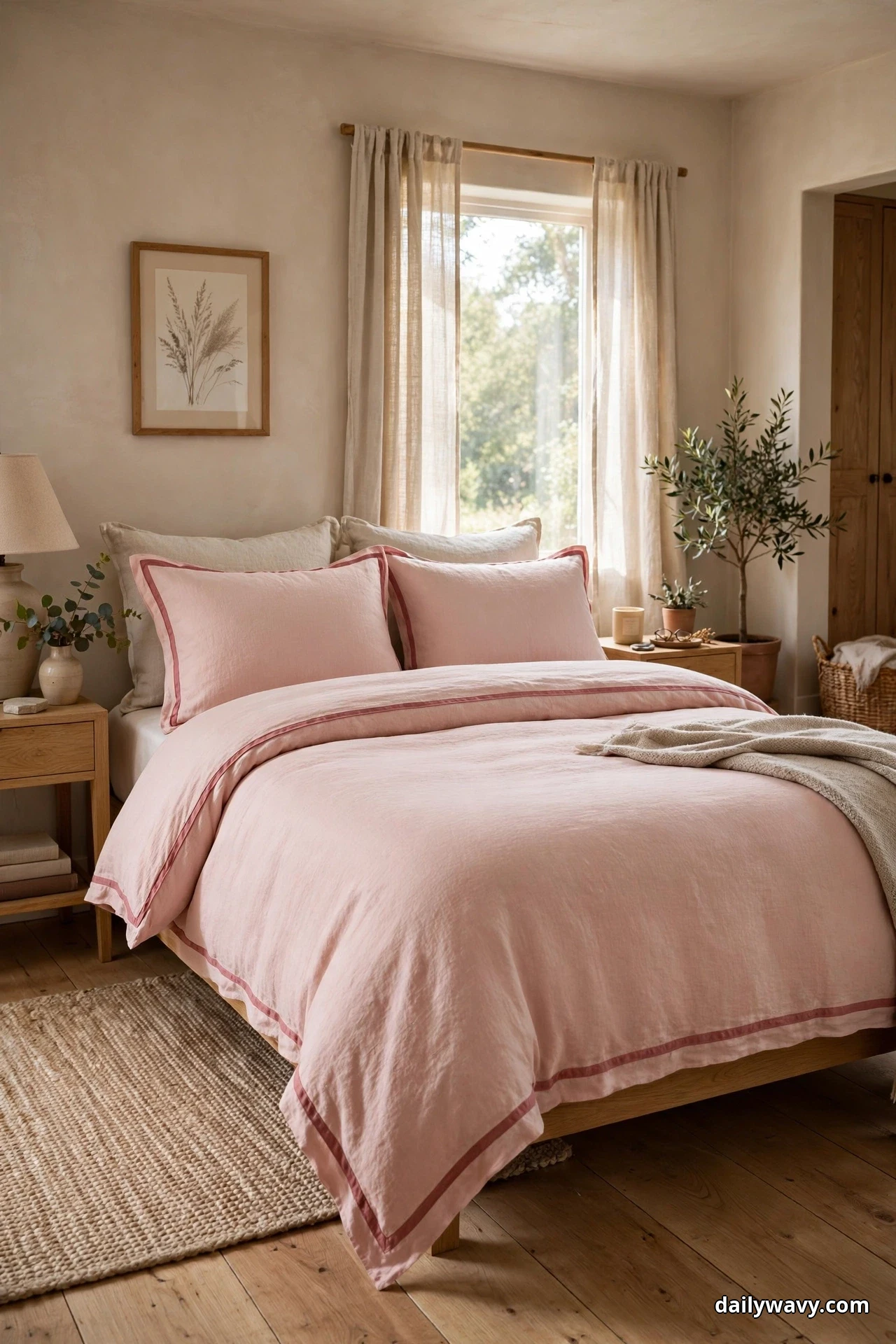
The look: Blush pink duvet cover and shams with contrast piping in dusty rose or muted mauve, about an eighth of an inch wide. The piping should be one to two shades deeper than the ground fabric, never a complementary color. Keep everything else plain so the outline stays the star.
What to measure: Standard duvet and sham sizes apply; the piping comes built into the cover. If you are having covers made, budget an extra half yard of the contrast fabric for the cord.
Effort and budget: Piped sets cost slightly more than plain ones off the shelf. Lower-cost alternative: a tailor or upholstery shop can add piping to your existing duvet cover for far less than a new set, usually within a week.
11. A Breathable Sheet Set With A Light Cover
Pink bedding is not just a cold-weather look. In summer, the whole formula gets lighter: breathable cotton or linen sheets in pale pink, one light coverlet instead of a duvet, and fewer pillows. The room feels airy instead of heavy, and pale pink in morning light is genuinely one of the prettiest things a bedroom can do.
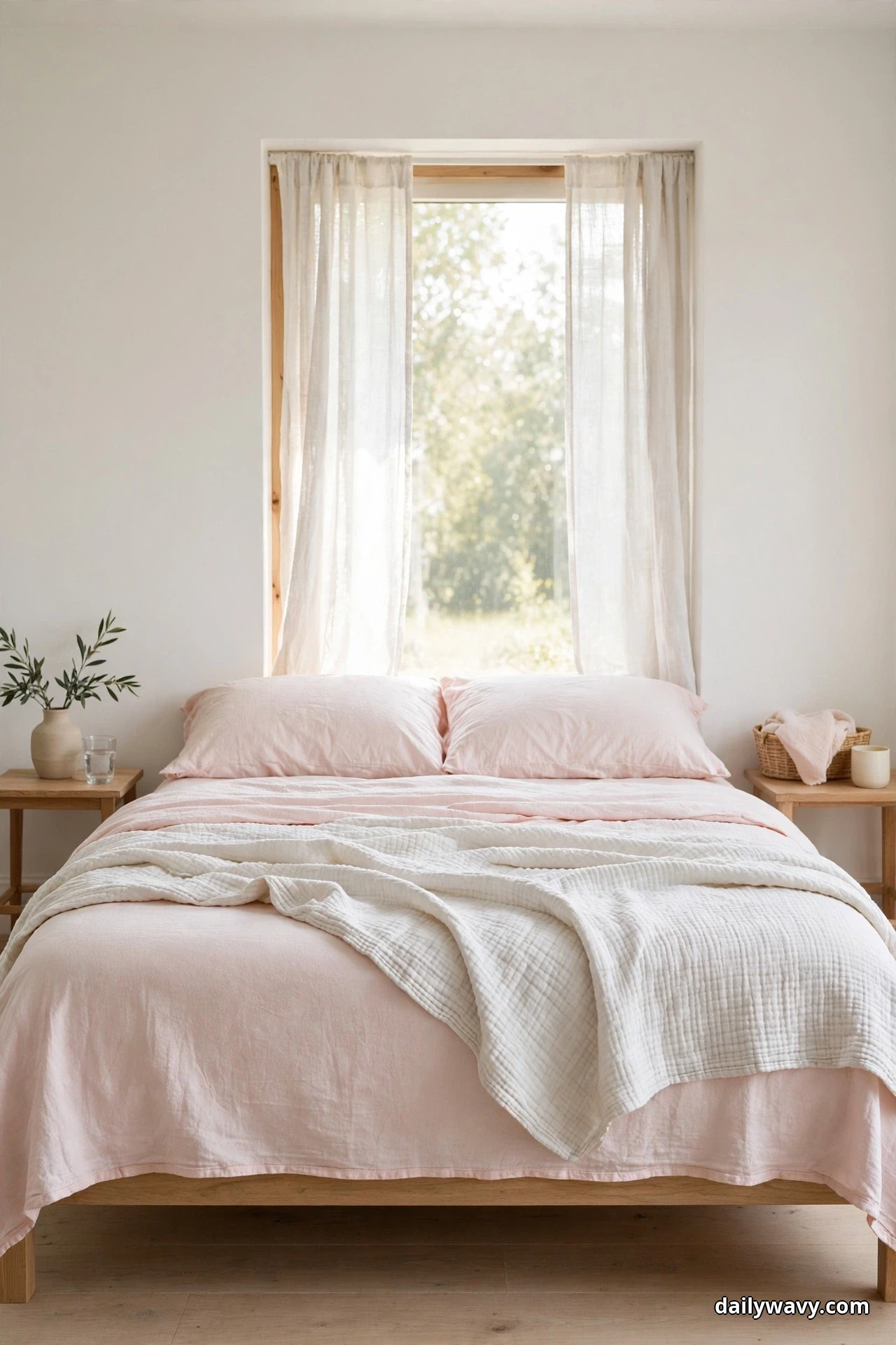
The look: Pale pink percale or linen sheets, a light coverlet in blush folded back to show the sheet beneath, and just the sleeping pillows plus one lumbar. Skip the heavy quilt and the extra throws until fall. The bed should look like it breathes.
What to measure: Percale in the 200 to 400 thread count range sleeps coolest; above that it starts feeling slick. Linen gets softer with every wash, so buy it slightly crisp knowing it will relax.
Effort and budget: A sheet set swap, done in the time it takes to change the bed. Lower-cost alternative: keep your existing summer sheets and add one pale pink coverlet. It is the single piece that signals the seasonal switch.
12. A Folded Quilt Across The Lower Third
If you only try one idea from this list, make it this one. A quilt folded across the lower third of the bed adds color, texture, and a finished line in under a minute, and it works over literally any bedding underneath. It is the styling equivalent of a belt: small piece, whole outfit pulled together.
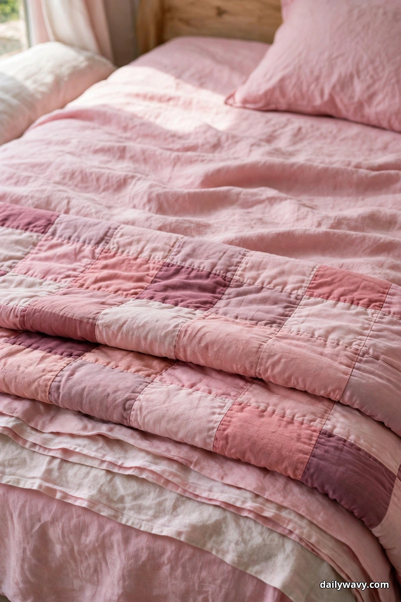
The look: A quilt in layered pink tones, rose, blush, and cream, folded into a band about 18 inches deep and laid straight across the lower third of the bed. The fold line should be crisp; smooth it with your hands and let the ends fall evenly over both sides. Underneath can be as simple as a plain duvet.
What to measure: Fold the quilt so the band covers from about 18 inches above the foot to the foot edge. On a queen, a quilt folded in thirds gives you roughly the right depth; adjust until the proportions look even.
Effort and budget: One minute, once the quilt is washed. Lower-cost alternative: any quilt you already own works, even a non-pink one, as long as it has one pink tone in it. The fold is doing the styling, not the price tag.
Pink Bedding Questions, Answered
How do I keep pink bedding from looking childish?
Stay on the warm, dusty side of pink and lean on texture. Blush linen, dusty rose velvet, and washed cotton read grown. Shiny hot pink polyester reads young. Warm neutrals around the bed and one natural material, like wood or seagrass, finish the job.
Which pink shades suit warm versus cool natural light?
North-facing rooms with cool light love warmer pinks like rose and peach-blush, which balance the blue cast. South-facing rooms with warm light can handle cooler dusty pinks and mauves without them turning orange. When in doubt, tape fabric swatches to the bed and check them morning and evening.
How many pillows should actually go on the bed?
For sleeping, two. For styling, add euros and one or two accents, then stop. If making the bed takes more than three minutes, you have too many. Every pillow should earn its place by adding a tone or a texture you do not already have.
Can I mix pink with gray or beige?
Warm beige, greige, and oatmeal are pink’s best friends. Cool blue-gray is trickier; it can make blush look muddy. If your room has gray walls, choose pinks with a touch of mauve in them, which share gray’s cool undertone.
How do I stop layered pink bedding from fading in the wash?
Wash in cold water with a gentle detergent, skip the bleach entirely, and line dry or tumble dry low. Pink dyes fade fastest in hot water and harsh sun, so dry printed or deep-rose pieces in the shade. Washing similar tones together also helps; a blush sheet washed with white towels will pick up lint that dulls the color.
Does pink bedding work in summer, or is it only a winter look?
It works year round if you change the weight. Winter wants velvet, quilted layers, and deeper rose. Summer wants percale, linen, and pale blush with fewer layers. The color stays; only the fabrics change.
A Softer Bed Is Closer Than You Think
Twelve ideas, one pink family, and a bed that finally looks the way you pictured it. Start with the fold across the lower third or the tonal pillows, since both change the room in an afternoon. Then add texture one layer at a time and let the bed evolve instead of overhauling it in a weekend. If blue is more your speed, our blue bedding styling ideas work the same layering magic in a cooler palette. For now, browse more Home and Decor ideas and save the layers you love. Your mornings are about to get softer.