
18 Green Kitchen Backsplash Ideas to Compare Before You Choose
Green is a kitchen color that keeps showing up, and the backsplash is where it shines bright. A green backsplash…
Green is a kitchen color that keeps showing up, and the backsplash is where it shines bright. A green backsplash can feel calm and collected or bold and full of personality, and the difference comes down to tone, tile size, and how much wall you give it. This roundup gives you eighteen complete ideas to compare side by side, each with real measurements, materials you can actually buy, and an honest look at the effort involved. Collect the ones that fit your space, order samples of two or three, and decide in your own light before you commit. If the rest of the kitchen is on your mind too, our small pantry organization ideas help the storage keep up.
Jump to an idea
- A subtle geometric motif
- A matte finish beside a reflective detail
- A tonal arrangement with matching trim
- A narrow border defining one zone
- A single focal area with plain surroundings
- A dark accent repeated in hardware
- A warm wood element softening the palette
- A simple repeated line pattern
- A contrasting edge at the counter
- A textured surface with plain accessories
- A low-contrast palette in a compact space
- An accent pulled from nearby artwork
- A vintage-inspired detail with modern shapes
- A restrained mix of two finishes
- A repeated shape across adjacent surfaces
- A light background with one saturated accent
- A balanced warm-and-cool pairing
- A small-scale grid with restrained contrast
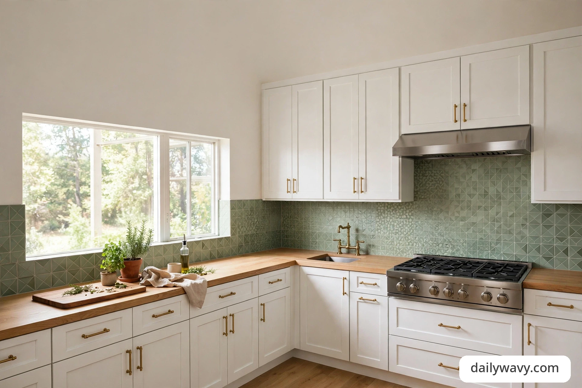
How to compare before you choose
Every idea below becomes easier to judge when you follow the same short process. Start by measuring the wall: height from countertop to the underside of the wall cabinets (usually 18 inches), total width of each run, and any full-height zones behind the range. Multiply width by height for each rectangle and add them; that square footage is your shopping number.
Order samples before anything else. Real sample boards, three at most, from the tile lines you are considering. Tape them to the wall and look at them morning, noon, and night for at least three days, because green can shift noticeably between cool daylight and warm evening bulbs. Check how the grout reads too: a grout sample card next to the tile tells you more than a screen can. Finally, keep materials where they belong. Ceramic, porcelain, and glass tiles handle the heat and splatter behind a range just fine; wallpaper or peel-and-stick panels should stay on side walls or coffee bars, outside direct heat and heavy wet zones, unless the product is specifically rated for those spots.
1. A subtle geometric motif
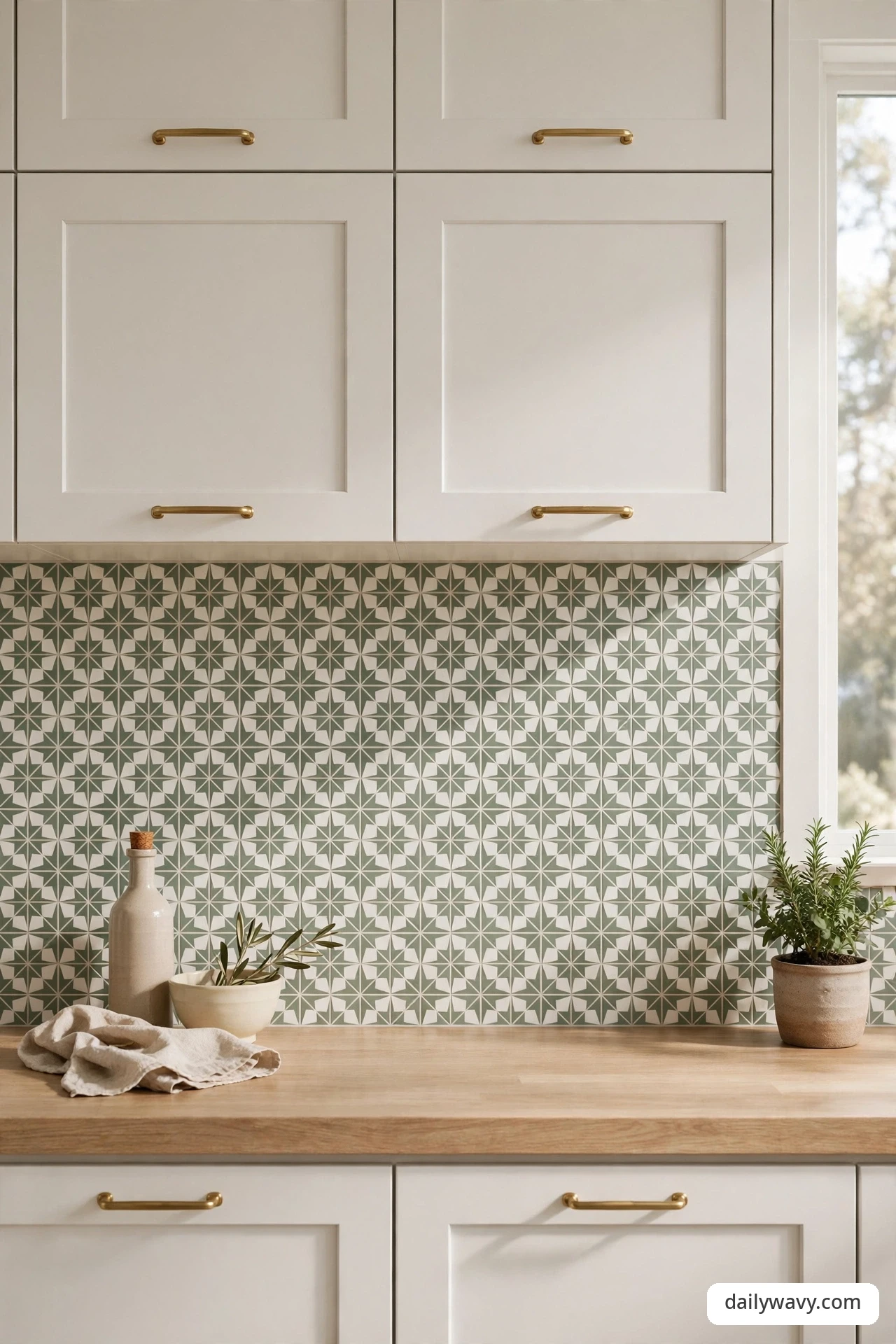
A quiet geometric pattern is a friendly way into a patterned backsplash. The motif reads as texture from across the room and only reveals its shape when you step closer, so it adds interest without demanding attention. Sage or eucalyptus tones on a soft white ground keep it gentle, and the pattern can hide small grout inconsistencies more easily than a flat field of solid tile.
What to measure: the full wall width and the 18-inch standard splash height, plus any range run that goes to the ceiling or hood. Count outlets and light switches; each one becomes a tile cut. Materials: 4×4 or 5×5 inch patterned ceramic or encaustic-look porcelain, unsanded or sanded grout to match your grout line width, bullnose or a matching trim piece for exposed edges. Placement: run the motif across the whole wall for a cohesive look, centering the pattern on the range or sink. Approximate effort: a weekend for an experienced DIYer on a 30-square-foot wall, or a one-day professional job. Realistic lower-cost alternative: use the patterned tile only behind the range as a framed panel and fill the rest with a plain matching solid.
2. A matte finish beside a reflective detail

Matte tile has a soft, chalky calm that glossy tile cannot imitate, and pairing it with one reflective element keeps it from looking flat. Think matte forest-green subway tile with a polished brass faucet, or a matte field broken by a single band of glossy liner tile. The contrast gives the eye somewhere to land and makes both finishes look more intentional.
What to measure: note the finish of every metal already in the room (faucet, cabinet pulls, light fixtures) so the reflective detail can echo it instead of fighting it. Materials: matte ceramic or porcelain in your chosen green, one reflective companion such as polished brass hardware, a slim glass liner strip, or a stainless shelf. Placement: keep the reflective detail to one or two moments, not scattered everywhere; repetition in one line reads calmer than the same finish dotted around. Approximate effort: swapping cabinet hardware is an hour of work and quickly transforms the pairing; adding a liner strip means partial retiling. Realistic lower-cost alternative: keep your existing tile and change only the hardware and faucet to a polished finish for the contrast.
3. A tonal arrangement with matching trim
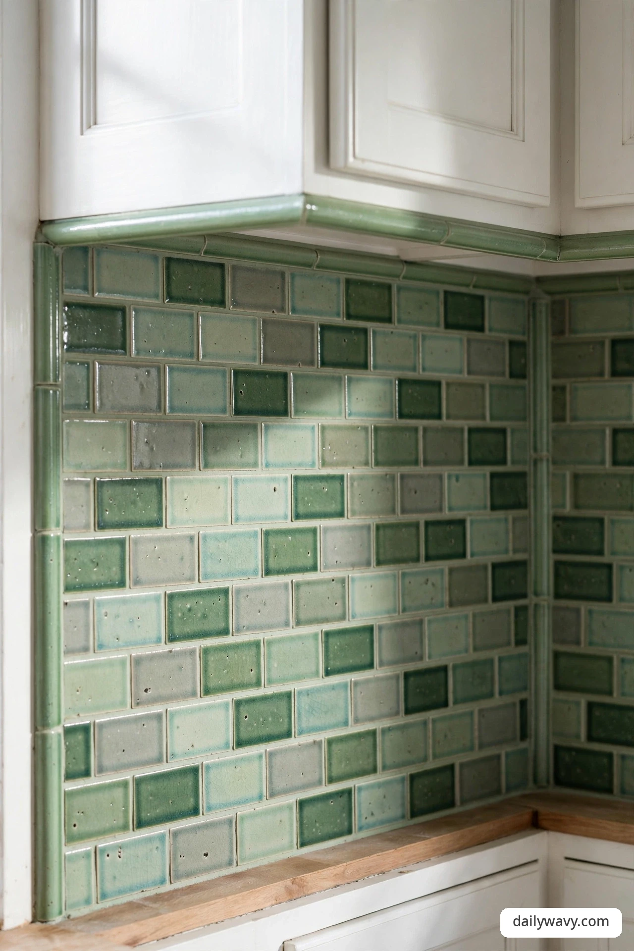
Tonal design means staying inside one color family and letting the shape and finish do the talking. Several greens from the same tile line, say a pale celadon, a mid sage, and a deep bottle green, arranged with trim pieces in the exact same glaze, feel curated rather than cautious. The matching trim is what sells it: chair rails, pencil liners, and edge pieces in the same color make the installation look custom.
What to measure: map your trim lines on the wall with painter’s tape before ordering, so you know exactly how many linear feet of chair rail and edge pieces you need. Materials: one tile line that offers field tile plus matching trim in multiple tones, or a single tone with the trim in the same glaze. Placement: use the darkest tone low near the counter and step lighter as you go up, or frame one tone with another as a wide border. Approximate effort: moderate DIY; cutting trim pieces takes patience and a wet saw for the trim cuts. Realistic lower-cost alternative: buy the field tile in your favorite tone and paint a simple wood trim strip to match with cabinet-grade paint.
4. A narrow border defining one zone
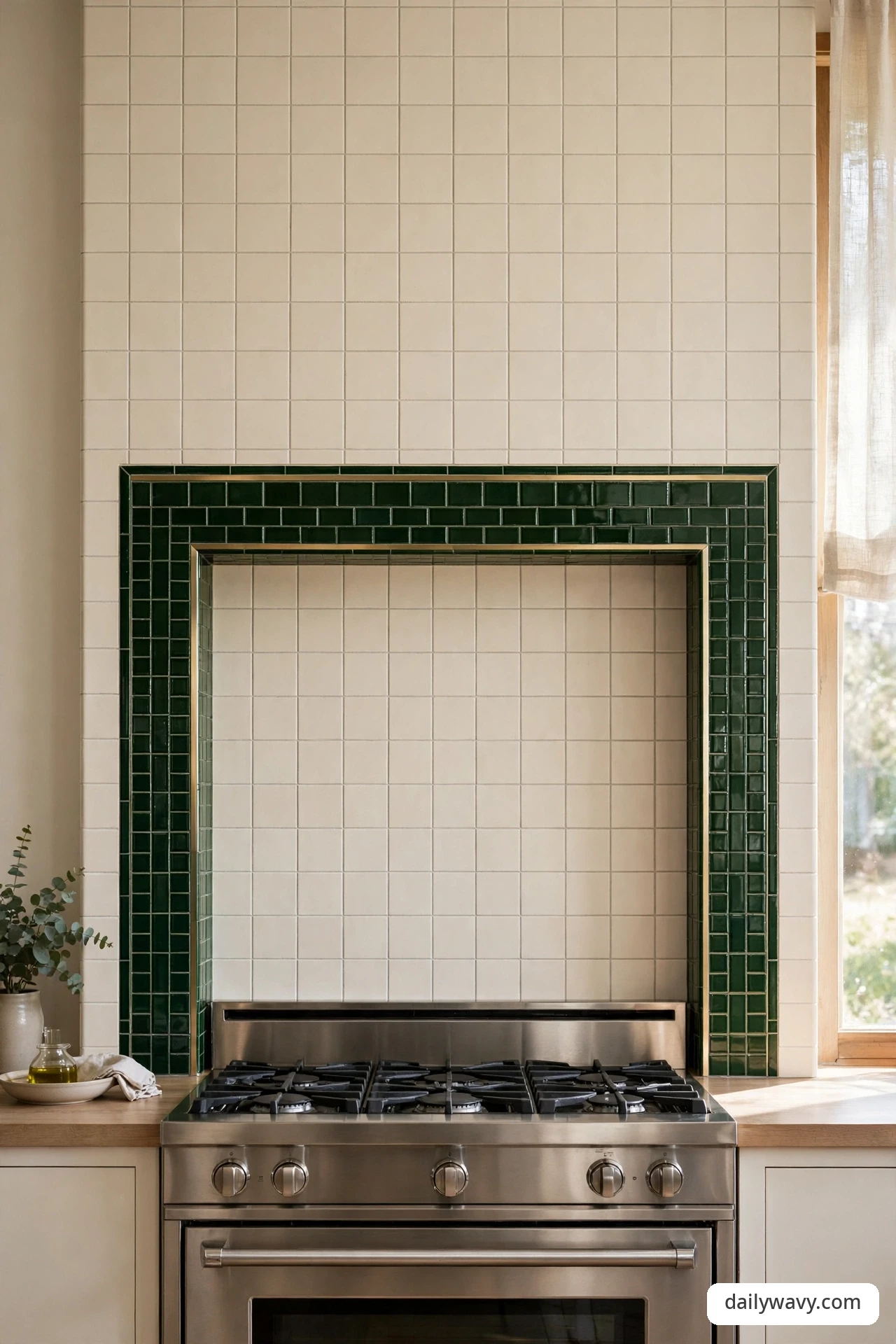
When the kitchen is one open room, a narrow border of green tile can draw a clean line around the cooking zone without building anything. A six-inch band of deep green tile running behind the range, framed top and bottom by slim liner strips, reads like a picture frame for the cooktop. The rest of the wall stays plain, so the border carries all the color.
What to measure: the width of the range plus 12 to 18 inches on each side for the framed panel; standard height is the 18-inch splash, or extend to the hood for drama. Materials: a contrasting green tile (handmade-look squares work beautifully), two pencil liners or flat trim strips for the frame, and your plain field tile for the rest. Placement: center the bordered panel on the range, not on the room; it should feel like it belongs to the appliance. Approximate effort: straightforward weekend project if the plain field is already planned; the border just replaces a rectangle of it. Realistic lower-cost alternative: paint the bordered rectangle with washable cabinet paint and skip the tile, then tile the rest plain.
5. A single focal area with plain surroundings
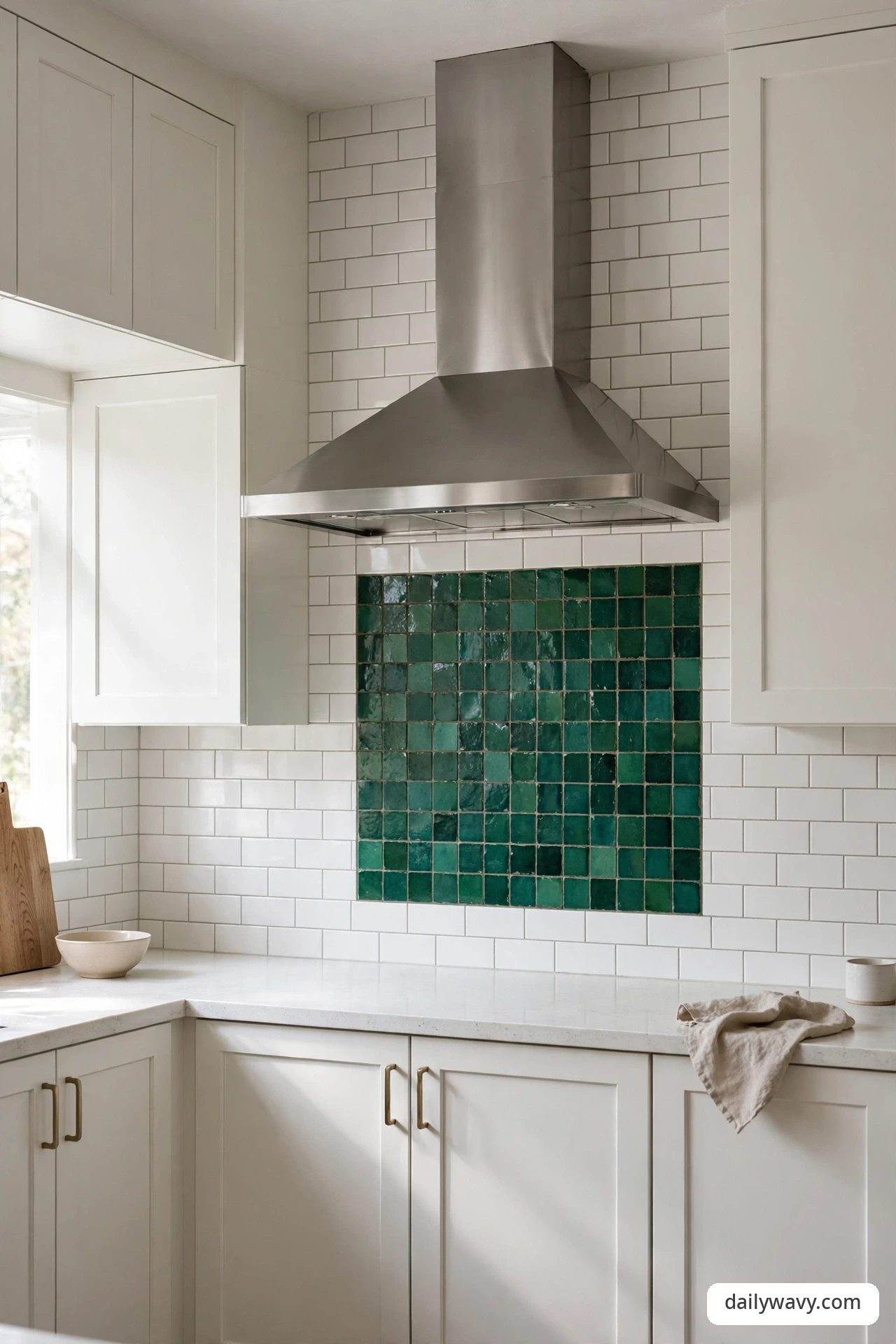
Not every wall needs the star treatment. This idea puts one confident green moment, a handmade-look emerald tile, a bold mosaic, a deep green slab, directly behind the range, and keeps everything else in a quiet white or cream. The focal area gets the attention, the plain surroundings give it room to breathe, and the budget stays sane because the expensive tile covers a small area.
What to measure: a focal panel usually runs the width of the range plus a foot on each side, and from counter to hood or ceiling. Price it by the square foot; this is where a handmade or artisan tile becomes affordable. Materials: your statement tile, a simple edge treatment (a metal Schluter-style profile in brass or stainless gives a clean line), and plain field tile elsewhere. Placement: stop the focal tile at the cabinet line on each side so it reads as one deliberate panel. Approximate effort: low; the panel is typically 10 to 15 square feet. Realistic lower-cost alternative: a large-format green porcelain slab-look panel gives the focal drama at a fraction of handmade tile prices.
6. A dark accent repeated in hardware
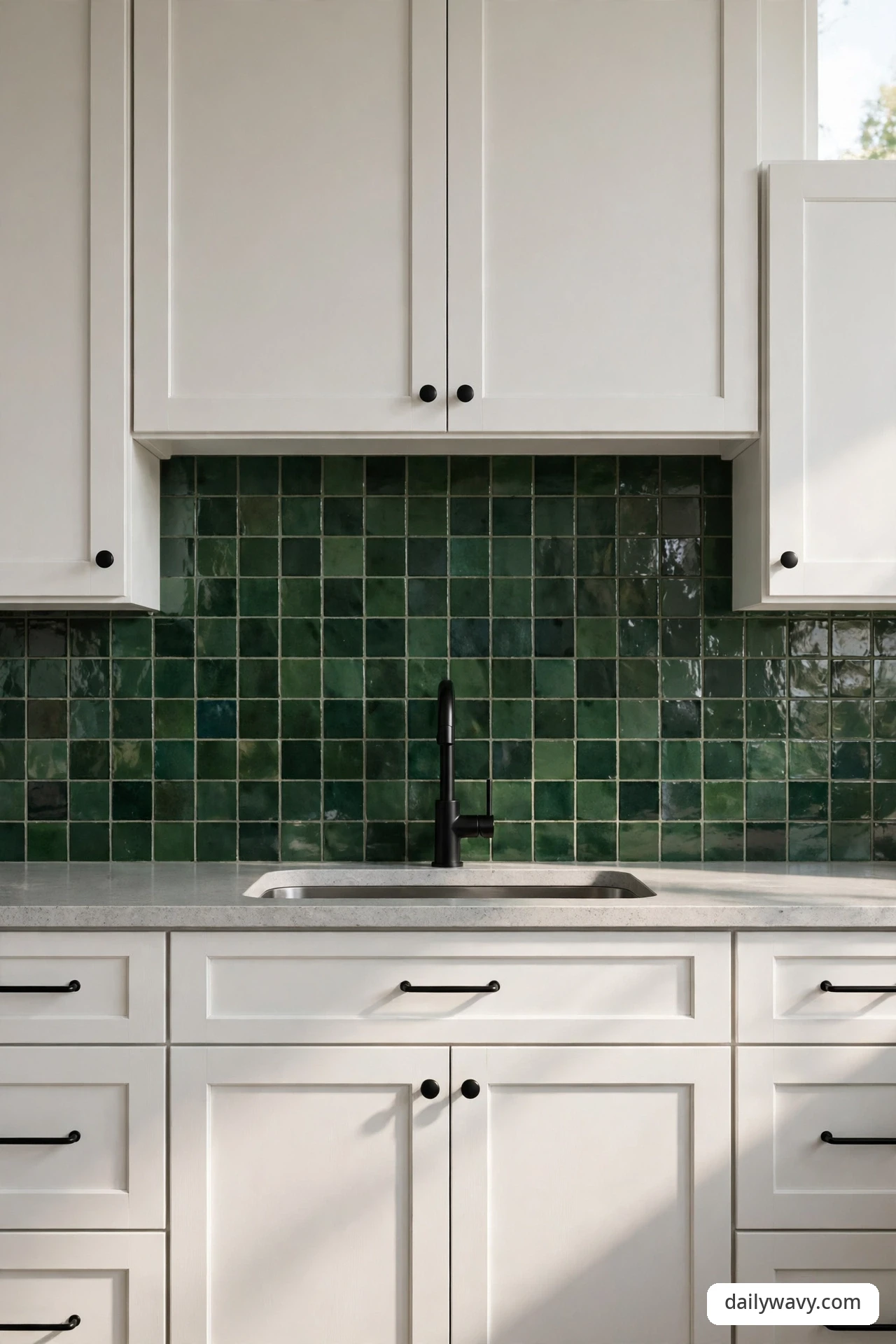
A deep green backsplash earns its keep twice when the same dark note shows up in the hardware. Matte black or oil-rubbed bronze pulls, knobs, and a matching faucet pick up the tile’s darkest tone and tie the whole wall together. The repetition is subtle, but it is the difference between a green wall and a green kitchen.
What to measure: count every pull, knob, and hinge cover, and measure the hole spacing (3-inch and 3-3/4-inch centers are the common ones) so replacements fit existing holes. Materials: your deep green tile plus hardware in a dark finish that matches the tile’s undertone, black reads cooler, bronze reads warmer. Choose real handles on the cabinet doors in the same finish; mismatched metals can undo the effect. Placement: hardware goes on every door and drawer, faucet at the sink, and consider the same finish for the pendant lights if they hang near the wall. Approximate effort: hardware swap is a half-day DIY job. Realistic lower-cost alternative: spray your existing handles with a durable metal-finish paint as a test before buying new.
7. A warm wood element softening the palette
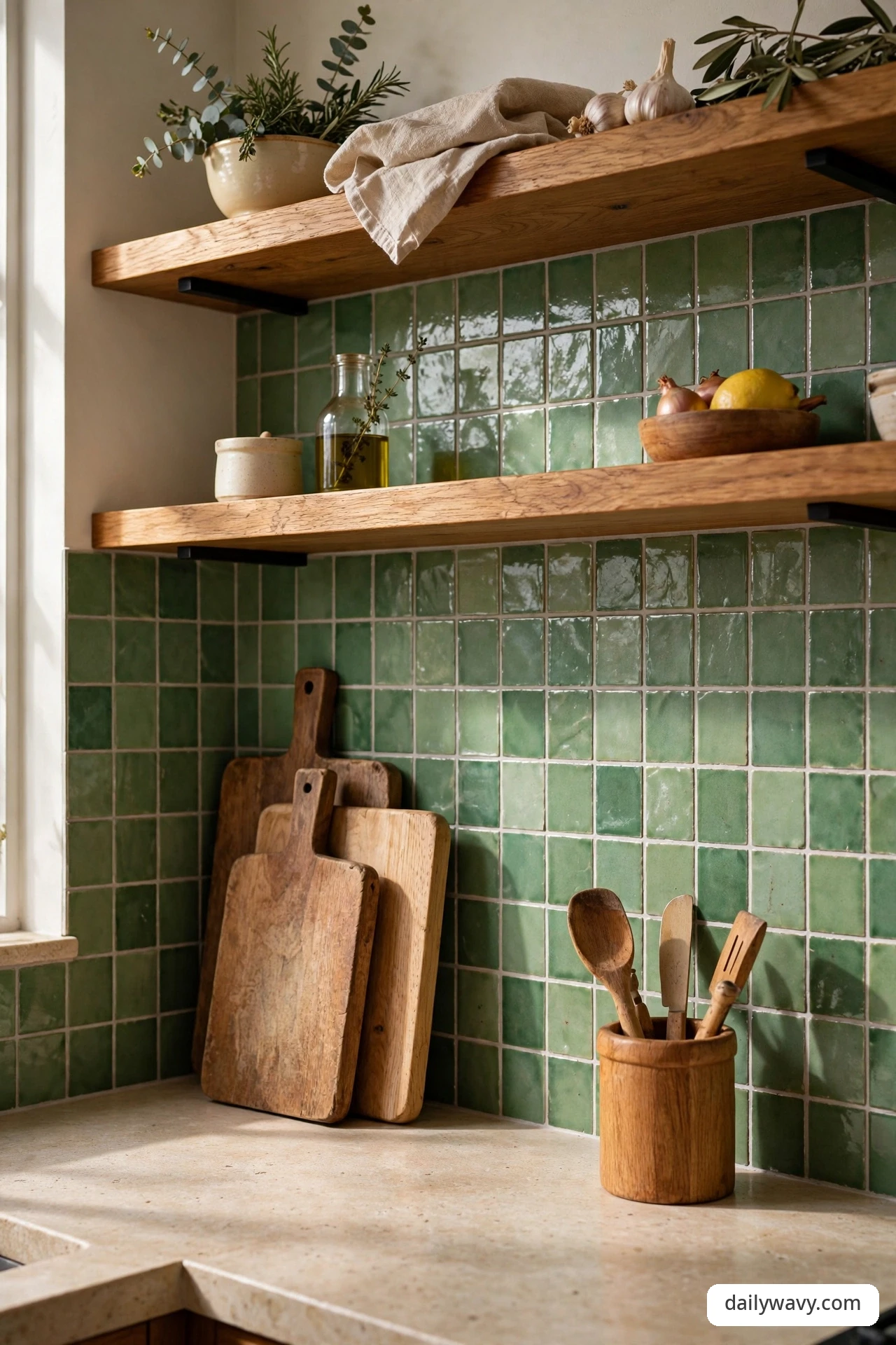
Green tile and warm wood are a natural pair. Open oak or walnut shelves, a wood countertop section, or even just a row of wooden cutting boards leaning against the wall soften the tile’s cool edge and make the kitchen feel lived in. The wood brings warmth the tile rarely offers, and the tile makes the wood look richer in return.
What to measure: for open shelves, allow 18 to 20 inches of clearance above the counter and keep shelf depth to 10 or 12 inches so nothing blocks the backsplash. Materials: your green tile, plus solid wood shelves with proper brackets or a butcher-block counter run; oil-finished wood handles splashes better than raw wood. Placement: mount shelves so the tile shows between them; the green becomes the backdrop and the wood the frame. Approximate effort: tiling plus shelf mounting is a full weekend for a DIYer; shelves alone are a half day. Realistic lower-cost alternative: skip the shelves and style the counter with wooden boards, a wooden utensil crock, and a small oak stool pulled up nearby.
8. A simple repeated line pattern
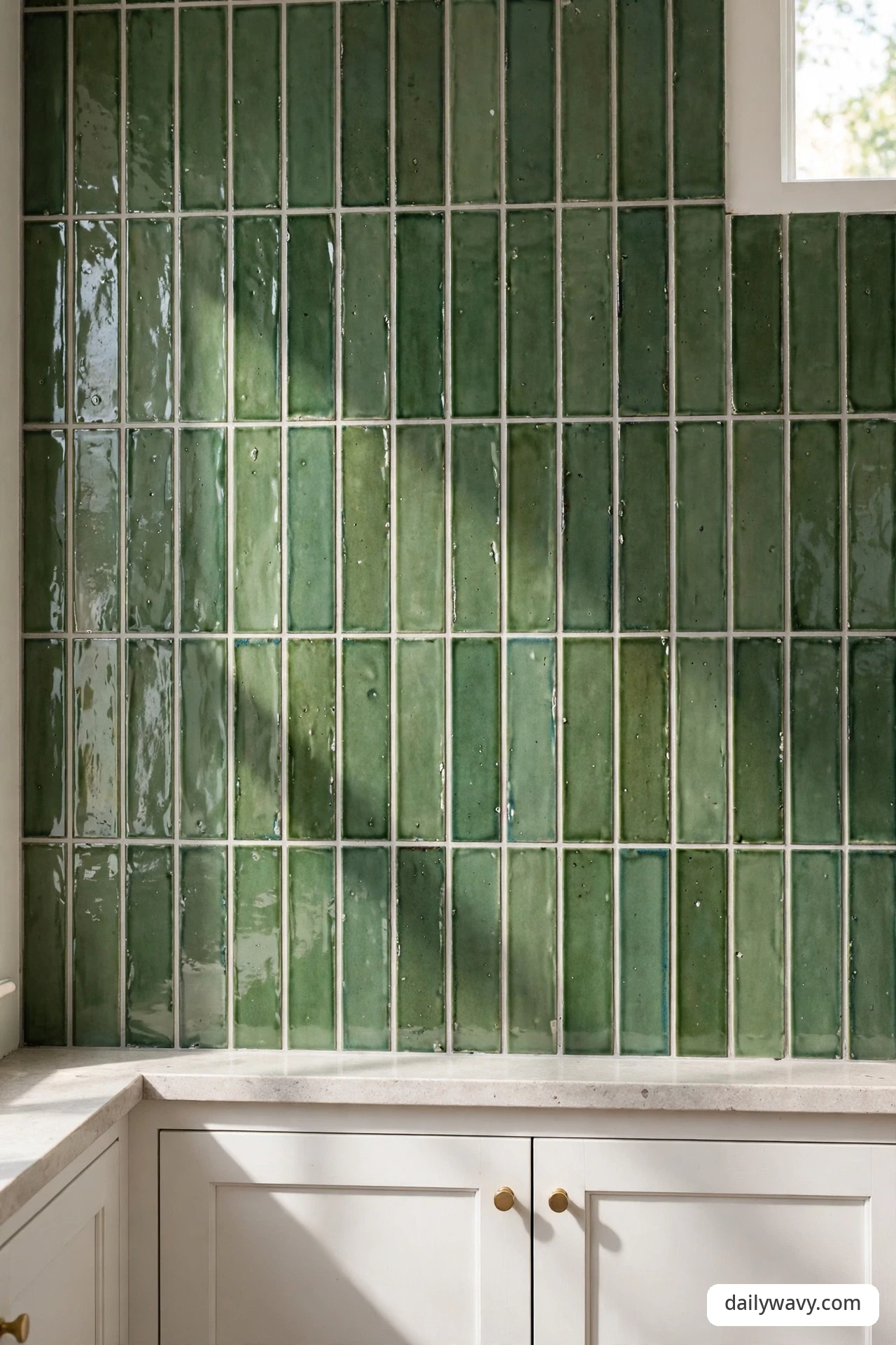
Sometimes a striking choice is the simplest one: a single tile shape repeated in a disciplined pattern. Vertical stacked subway tiles in green draw the eye upward and make an 18-inch splash feel taller; a straight herringbone at 90 degrees feels orderly and modern. The repetition is the design, so the grout lines need to be crisp.
What to measure: decide your grout line width first (1/16 inch for a tight modern look, 1/8 inch for a softer handmade feel) because it changes how many tiles you order. Materials: one green tile in one size, tile spacers, and unsanded grout for narrow joints. Placement: run a vertical stack to add height, or a horizontal stack for calm width; keep the pattern unbroken behind open areas and let cuts hide behind the range. Approximate effort: higher DIY difficulty than a basic offset pattern, because every line must stay true; budget an extra day. Realistic lower-cost alternative: a peel-and-stick tile in a stacked pattern gives the line geometry for a rental or a trial run.
9. A contrasting edge at the counter
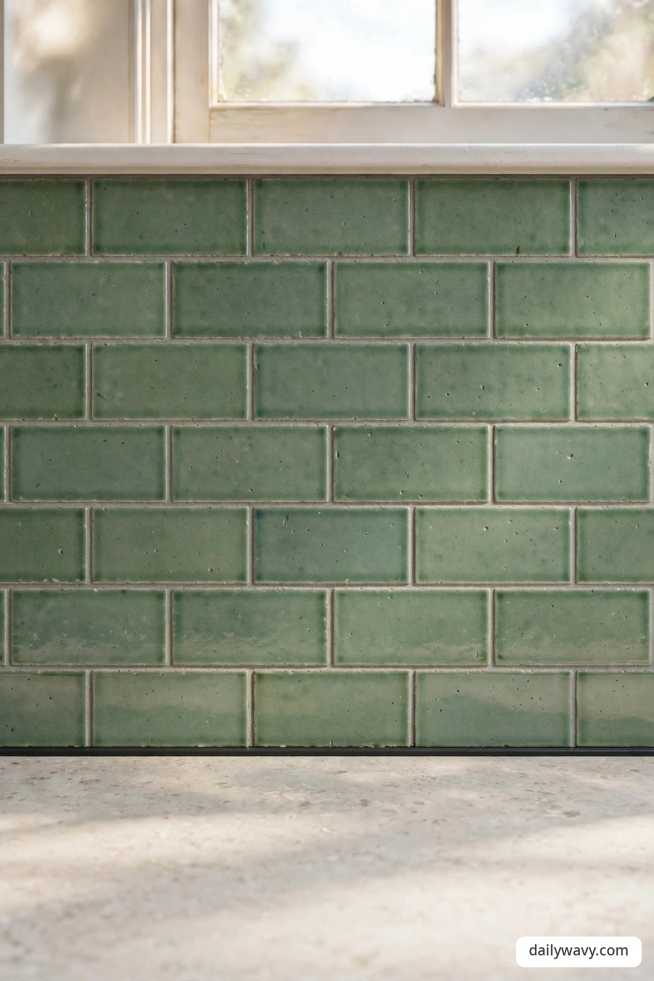
The line where tile meets countertop is a small detail with outsized impact. A contrasting edge, a slim black pencil liner, a brass metal profile, or a single row of dark green tiles along the bottom, grounds the whole wall and hides the inevitable unevenness where two surfaces meet. It is the baseboard of the backsplash, and it makes everything above it look sharper.
What to measure: the full linear footage of countertop-to-wall joints, including windowsills and any jogs around cabinets. Materials: liner strips, a metal edge profile, or one row of contrasting tile, plus color-matched caulk (not grout) for the final joint, which needs to flex. Placement: run the edge continuously along every counter run so it reads as one decision. Approximate effort: small add-on to any tiling job; on its own, an afternoon. Realistic lower-cost alternative: a bead of dark silicone caulk in place of grout at the joint gives a quiet contrasting line for almost nothing.
10. A textured surface with plain accessories

Handmade-look green tile with a rippled, uneven glaze catches light differently throughout the day, and that movement is the whole point. Because the surface is already doing so much, the accessories should stay plain: a white kettle, a simple wooden board, a stoneware crock in cream. The restraint lets the texture be the star instead of competing with it.
What to measure: handmade-look tiles vary in size, so measure a sample of ten tiles and use the average when planning your layout and ordering 15 percent overage instead of the usual 10. Materials: zellige-look or handmade ceramic tile, grout in a tone close to the tile so the texture, not the grid, dominates. Placement: keep accessories minimal and in solid neutrals; one patterned towel or busy appliance is all it takes to tip this into clutter. Approximate effort: moderate; the tiles are forgiving of imperfect walls but slow to lay because each one is slightly different. Realistic lower-cost alternative: a standard glossy green subway tile with a wavy handmade-look glaze line costs far less than true handmade tile.
11. A low-contrast palette in a compact space
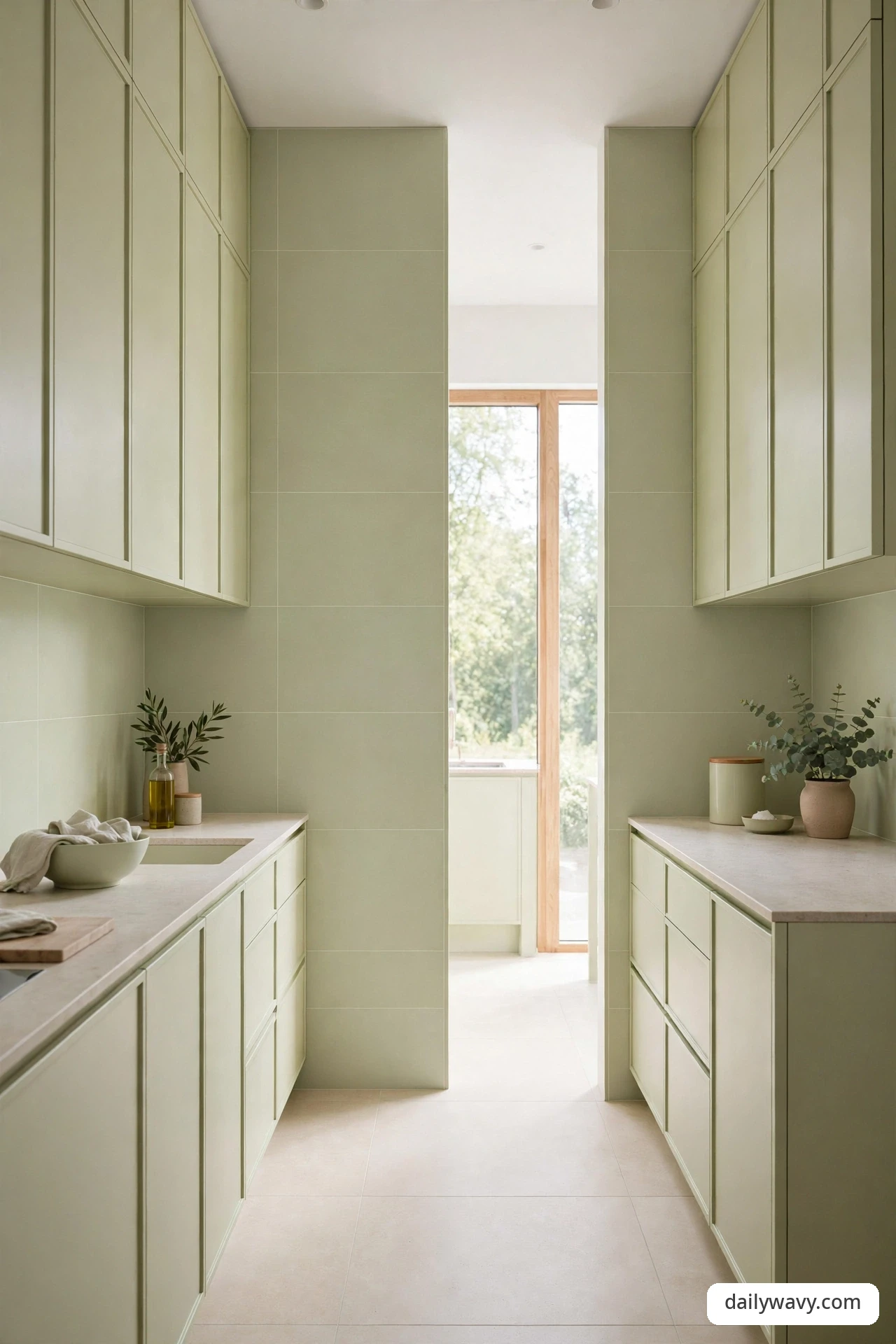
Small kitchens do not need to fear green; they just need it in a low-contrast dose. A pale pistachio or soft sage tile that sits close to the cabinet color keeps the walls from chopping the room into pieces. The eye moves across the space without stopping, and the kitchen feels larger than its footprint.
What to measure: in a compact kitchen, every inch counts, so measure carefully and consider running the tile to the ceiling; the unbroken vertical line adds perceived height. Materials: large-format pale green tile (fewer grout lines means a calmer surface), light grout, and cabinets painted or chosen within two shades of the tile. Placement: full-height behind the range and the standard 18 inches elsewhere, or full-height everywhere for a more spacious feel. Approximate effort: full-height tiling adds substantially to the square footage and the time. Realistic lower-cost alternative: keep the standard splash height and paint the wall above in the same pale green so the color continues without the tile cost.
12. An accent pulled from nearby artwork
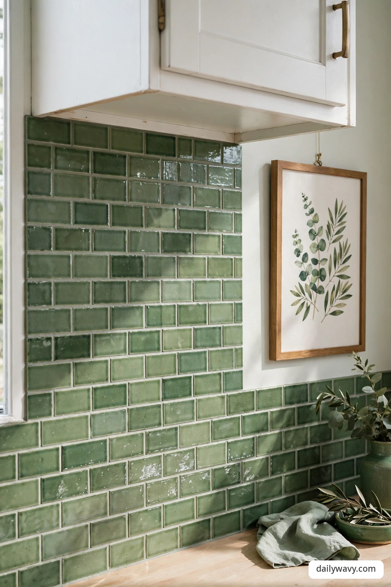
Some of the most personal backsplashes borrow their color from something you already love. If a framed print, a vintage poster, or a piece of pottery in the dining area holds a green you keep coming back to, pull that exact tone into the tile. The connection between the art and the wall makes the kitchen feel collected over time rather than decorated in a weekend.
What to measure: bring the artwork (or a good photo of it) when you shop for tile, and compare under store lighting plus your own; greens shift noticeably between light sources. Materials: tile matched to the artwork’s green, in whatever shape suits the room; a simple frame of liner tile can echo a picture frame. Placement: hang or prop the artwork where it relates to the tile, on the adjacent wall or a nearby shelf, so the conversation between them is visible. Approximate effort: the matching process takes the time; the installation is standard. Realistic lower-cost alternative: paint a small section of wall or the inside of open shelving in the artwork’s green and tile the rest in a quiet neutral.
13. A vintage-inspired detail with modern shapes

Vintage charm and modern lines are not opposites when green is the bridge. An encaustic-look tile or a crackle-glaze subway in bottle green brings the old-soul character, while flat-panel modern cabinets and a simple waterfall edge keep the room current. The tile whispers history; the shapes say today.
What to measure: vintage-look tiles often come in small formats, so confirm your square-foot coverage and order the full 15 percent overage; small tiles mean more cuts. Materials: crackle-glaze or encaustic-look porcelain in green, modern flat-front cabinets in white, warm gray, or natural wood, and one unlacquered brass detail to age alongside the tile. Placement: let the tile carry all the vintage feeling and keep everything else clean; two vintage notes in one kitchen is plenty. Approximate effort: standard tiling; the modern cabinetry actually makes installation easier with its straight lines. Realistic lower-cost alternative: standard green subway tile plus a vintage-style brass faucet delivers most of the character for much less.
14. A restrained mix of two finishes
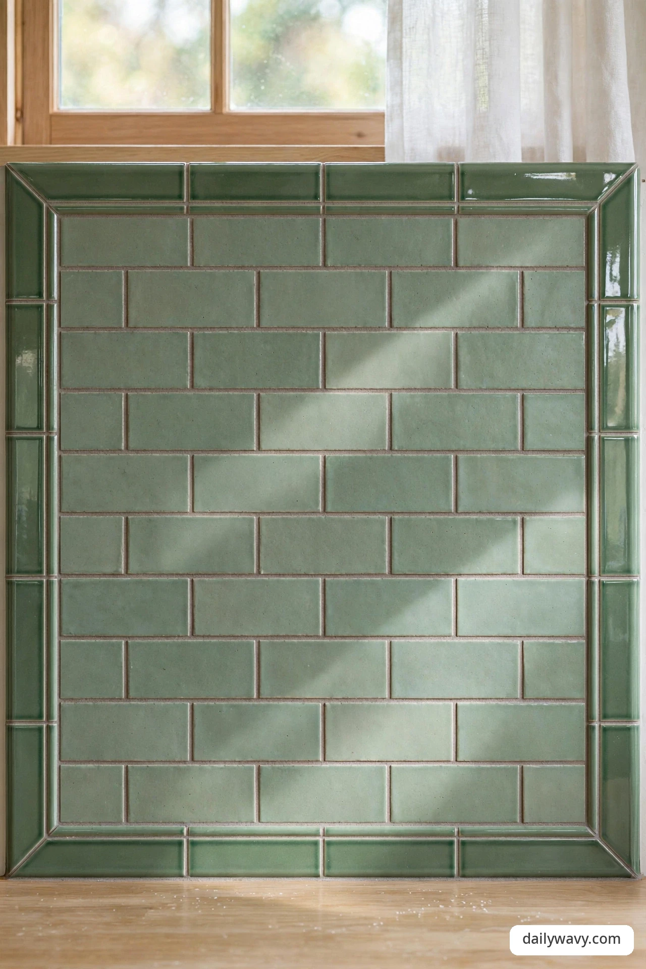
Mixing matte and glossy tile in the same green adds depth without adding color, which is ideal if you want richness without risk. A matte field with a glossy border, or glossy hand-cut squares scattered through a matte grid, catches light in patches as you move. The key word is restrained: two finishes, one color, one clear rule for where each goes.
What to measure: sketch the finish zones on paper first and count each finish’s square footage separately, since they are different products. Materials: the same tile line in matte and gloss (many lines offer both), which helps the color match closely. Placement: give each finish a defined territory, matte for the field and gloss for the border, for example, rather than mixing them randomly. Approximate effort: slightly more planning, standard installation. Realistic lower-cost alternative: use one finish for the tile and get your second finish from the accessories, a glossy green vase or matte green crock on the counter.
15. A repeated shape across adjacent surfaces
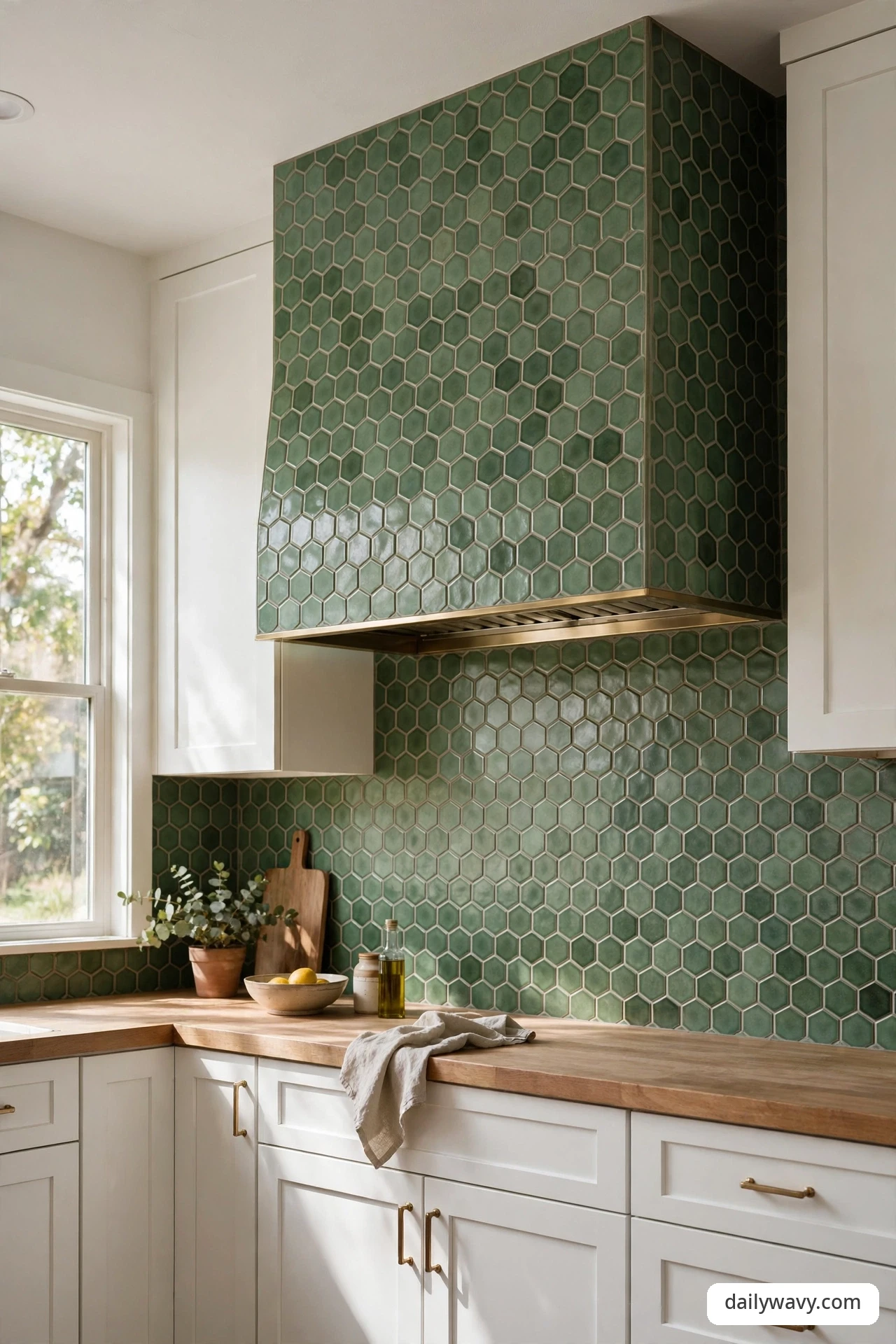
Repeating one tile shape across two surfaces, the backsplash and the range hood surround, or the backsplash and the island front, makes the kitchen feel designed in one gesture. A green hexagon or fish-scale tile that climbs from behind the range up the hood face turns two separate areas into a single composition. It is a confident move, and it tends to photograph well.
What to measure: measure both surfaces as one project and order all the tile together so the dye lots match; running short mid-project risks a visible batch change. Materials: enough of your chosen shape in green for both surfaces, plus trim pieces to finish the edges where tile meets paint or plaster. Placement: align the pattern so it flows from one surface to the next without an awkward break at the corner or edge. Approximate effort: higher; tiling a hood surround or island front adds vertical and curved work. Realistic lower-cost alternative: repeat the shape in paint instead, a stenciled hexagon band on the hood that echoes the tiled backsplash.
16. A light background with one saturated accent

If full green walls feel like too much, invert the ratio: keep the background light and let one saturated green accent do all the talking. A creamy white backsplash with a single band of deep emerald at eye level, or a soft neutral field with an emerald niche behind the range, gives you the color hit without the commitment. It is also one of the easiest versions to live with long term.
What to measure: decide the accent’s height and position first; a band at eye level (about 48 to 54 inches from the floor) gets strong visibility. Materials: plain light field tile, your saturated green accent tile, and liner strips to frame the accent cleanly. Placement: one accent per wall, maximum; a band on every wall stops being an accent and starts being a stripe theme. Approximate effort: low to moderate; the accent is a small area but the framing cuts take care. Realistic lower-cost alternative: paint the accent band with a washable enamel in your emerald tone and tile only the light field.
17. A balanced warm-and-cool pairing
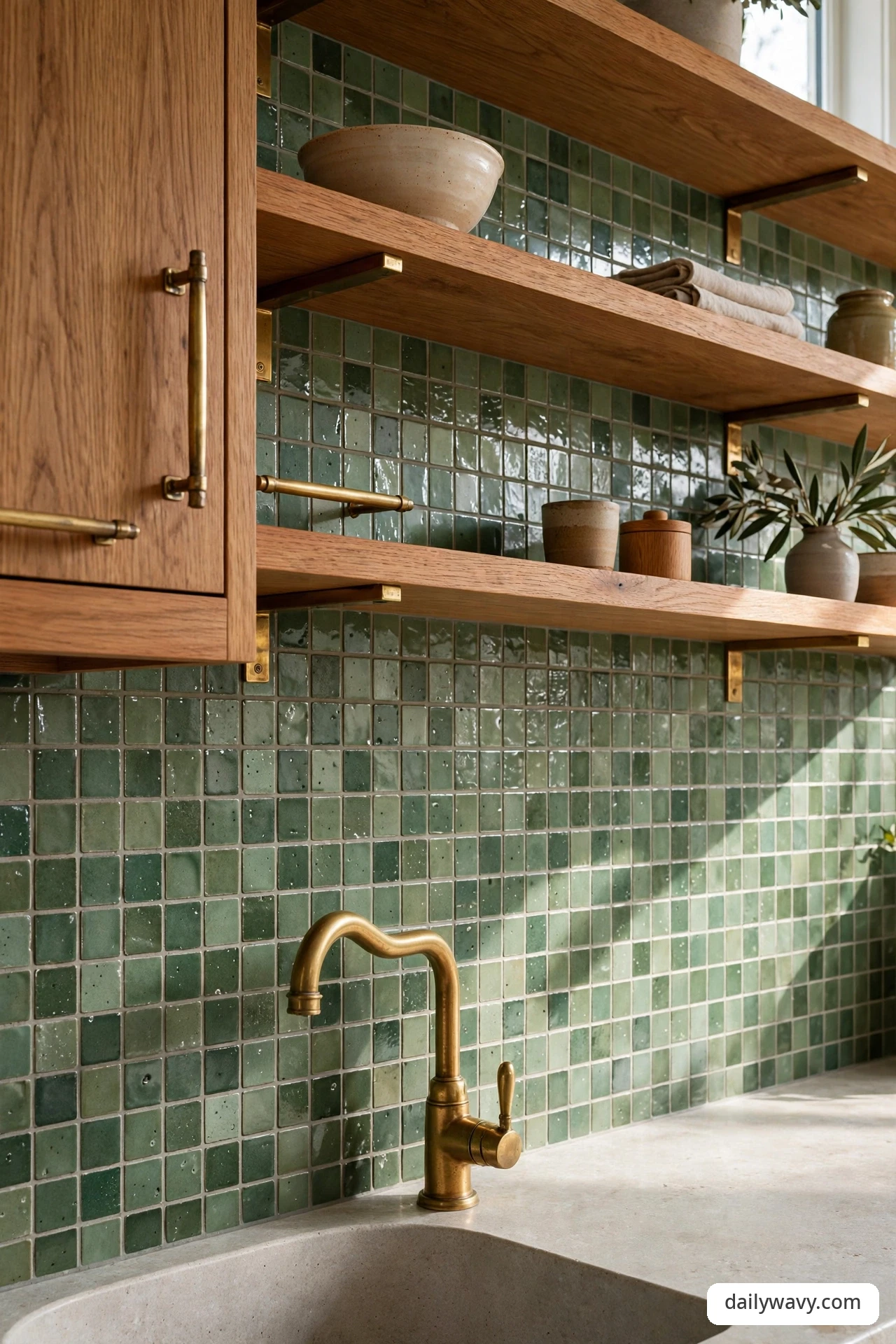
Green sits on the cool side of the spectrum, and it pairs well with something warm beside it. Brass hardware and faucets, copper pendants, honey-toned wood floors, or a warm beige grout all keep a green backsplash from feeling chilly. The balance does not need to be equal; even a small share of warm material can change the temperature of the room.
What to measure: audit the warm versus cool materials already in the room before you shop; if everything is cool, you will need more warmth than you think. Materials: your green tile plus deliberate warm companions: unlacquered brass pulls, oak open shelving, a warm white paint on the walls. Compare the actual cabinet color and real handles together with the tile sample before deciding. Placement: distribute the warm notes around the room, not just in one corner, so the balance holds from every angle. Approximate effort: moderate; this idea is mostly about coordination rather than labor. Realistic lower-cost alternative: warm LED bulbs (2700K), a wooden bowl of fruit, and brass-look adhesive hardware covers shift the temperature for very little.
18. A small-scale grid with restrained contrast

A small-scale mosaic grid in green, one-inch squares or tiny hexagons, with grout kept close to the tile tone, is texture you can feel with your eyes. The restrained contrast keeps it sophisticated rather than busy, and the small scale means the pattern wraps neatly around outlets and corners. It is a classic restaurant-kitchen look that works just as well at home.
What to measure: mosaic sheets cover a set area (usually one square foot per sheet); measure the wall and divide, then add 15 percent for cuts. Materials: green mosaic sheets, unsanded grout in a close tone, and a grout sealer since mosaic means many grout lines. Placement: run the sheets in whole rows and plan your cuts for the least visible spots, under cabinets and behind appliances. Approximate effort: faster than it looks, because sheets go up quickly; grouting takes the time. Realistic lower-cost alternative: a large-format tile printed with a small grid pattern gives a similar read from a few feet away at a lower price.
Frequently asked questions
Do I need to seal a green tile backsplash?
The tile itself rarely needs sealing if it is glazed ceramic or porcelain, but the grout usually benefits from it. Apply a penetrating grout sealer after the grout cures fully, typically 48 to 72 hours, and reapply every year or two in the splatter zone behind the range. Natural stone tiles are the exception; those need sealing on the tile face as well.
How do I compare green tones in my own light?
Order physical samples of no more than three options and tape them to the wall for at least three days. Look at them in morning daylight, afternoon light, and under your evening bulbs, because green can shift noticeably between light temperatures. Check the sample against your cabinets, countertop, and floor at the same time; a green that looks great alone can clash with a warm wood floor.
Can I put tile directly behind a gas range?
Yes. Ceramic, porcelain, and glass tiles are noncombustible and handle the heat behind a range without issue, which is one reason tile is the standard choice there. Keep wallpaper, peel-and-stick panels, and wood treatments on side walls or other areas away from direct heat unless the product is specifically rated for high-heat zones.
What grout color works best with green tile?
A grout close to the tile tone gives a calm, seamless look and hides the grid; a light contrasting grout emphasizes the pattern and each tile’s shape. For handmade-look tile, matching grout keeps the focus on the glaze texture. Whichever you choose, buy a grout sample card and hold it against your tile sample in your own light before committing.
How much tile should I order?
Measure each wall section’s width times height, add the sections together, then add 10 percent overage for standard tile and 15 percent for handmade-look or small-format tile, which need more cuts. Ordering everything at once also keeps you in a single dye lot, so the color stays consistent across the whole wall. For more on planning the storage around a kitchen refresh, see our small pantry organization ideas.
Can I install a backsplash myself or should I hire a pro?
A standard subway or square tile on a flat wall is a realistic weekend DIY project if you rent a wet saw and take your time with layout. Hire a professional for natural stone, intricate mosaics, full-height installations, or any wall that is seriously out of plumb. Either way, dry-lay your first few rows on the counter to check the pattern before the thinset goes on the wall.
Choose the green that fits your kitchen
Eighteen ideas, and the right one is the one that fits your light, your cabinets, and the way you actually cook. Narrow your list to two or three favorites, order the samples, and live with them on the wall for a few days before you decide. A backsplash stays with you for years, so the extra week of comparing is usually worth it.
For the rest of the home, browse more ideas in Home & Decor or see how tile and storage work together in small spaces with our small bathroom storage ideas.

One Comment