20 Blue Kitchen Backsplash Ideas to Compare Before You Choose
A blue kitchen backsplash can change the entire mood of a kitchen. Pick the right shade and it feels calm,…
A blue kitchen backsplash can change the entire mood of a kitchen. Pick the right shade and it feels calm, collected, and timeless. Pick the wrong one and the whole room fights with itself. That is why it pays to compare options side by side before you commit to tile, paint, or paneling. This guide walks you through 20 blue backsplash ideas, each with real materials, measurements, and placement advice, so you can picture every look in your own kitchen and choose with confidence. Every idea includes a matching room photo to study. And if green is also on your shortlist, our green kitchen backsplash ideas make a handy side-by-side comparison.
Jump to your favorites
- A Narrow Border Defining One Zone
- A Single Focal Area With Plain Surroundings
- A Dark Accent Repeated In Hardware
- A Warm Wood Element Softening The Palette
- A Simple Repeated Line Pattern
- A Contrasting Edge At The Counter
- A Textured Surface With Plain Accessories
- A Low-Contrast Palette In A Compact Space
- An Accent Pulled From Nearby Artwork
- A Vintage-Inspired Detail With Modern Shapes
- A Restrained Mix Of Two Finishes
- A Repeated Shape Across Adjacent Surfaces
- A Light Background With One Saturated Accent
- A Balanced Warm-And-Cool Pairing
- A Small-Scale Grid With Restrained Contrast
- A Vertical Rhythm That Draws The Eye Upward
- A Warm Accent Paired With A Cool Neutral
- A Subtle Geometric Motif
- A Matte Finish Beside A Reflective Detail
- A Tonal Arrangement With Matching Trim
How to compare samples before you commit
Before you order a single box of tile, measure the wall between your counter and your upper cabinets. In most kitchens that strip is 18 inches tall, though older homes run anywhere from 15 to 24 inches. Measure the full run length of every wall you plan to cover, then multiply length by height to get your square footage. Add 10 percent for cuts and waste. That number decides whether a handmade tile is a weekend splurge or a budget problem.
Order loose samples of every finalist, not just one. Tape them to the wall with painter’s tape at eye level and live with them for three or four days. Check each sample in morning light, at noon, and under your evening kitchen lighting, because blue shifts dramatically between daylight and warm bulbs. Hold the sample against your countertop, your cabinet paint, and your floor. A navy that looks rich against white quartz can turn murky next to warm wood tones.
Test grout color too. The same blue tile reads crisp with light gray grout and moody with dark charcoal grout. Ask the tile shop for small grout sample sticks, or smear a little grout on the back of a sample board. Most installers can show you previous jobs with the same combination. If you are renting or not ready for tile, removable peel-and-stick panels let you test a look for a season. And if your kitchen needs a smaller refresh first, a small pantry organization project is a good low-cost way to see how your space feels before you invest in a new backsplash.
1. A Narrow Border Defining One Zone

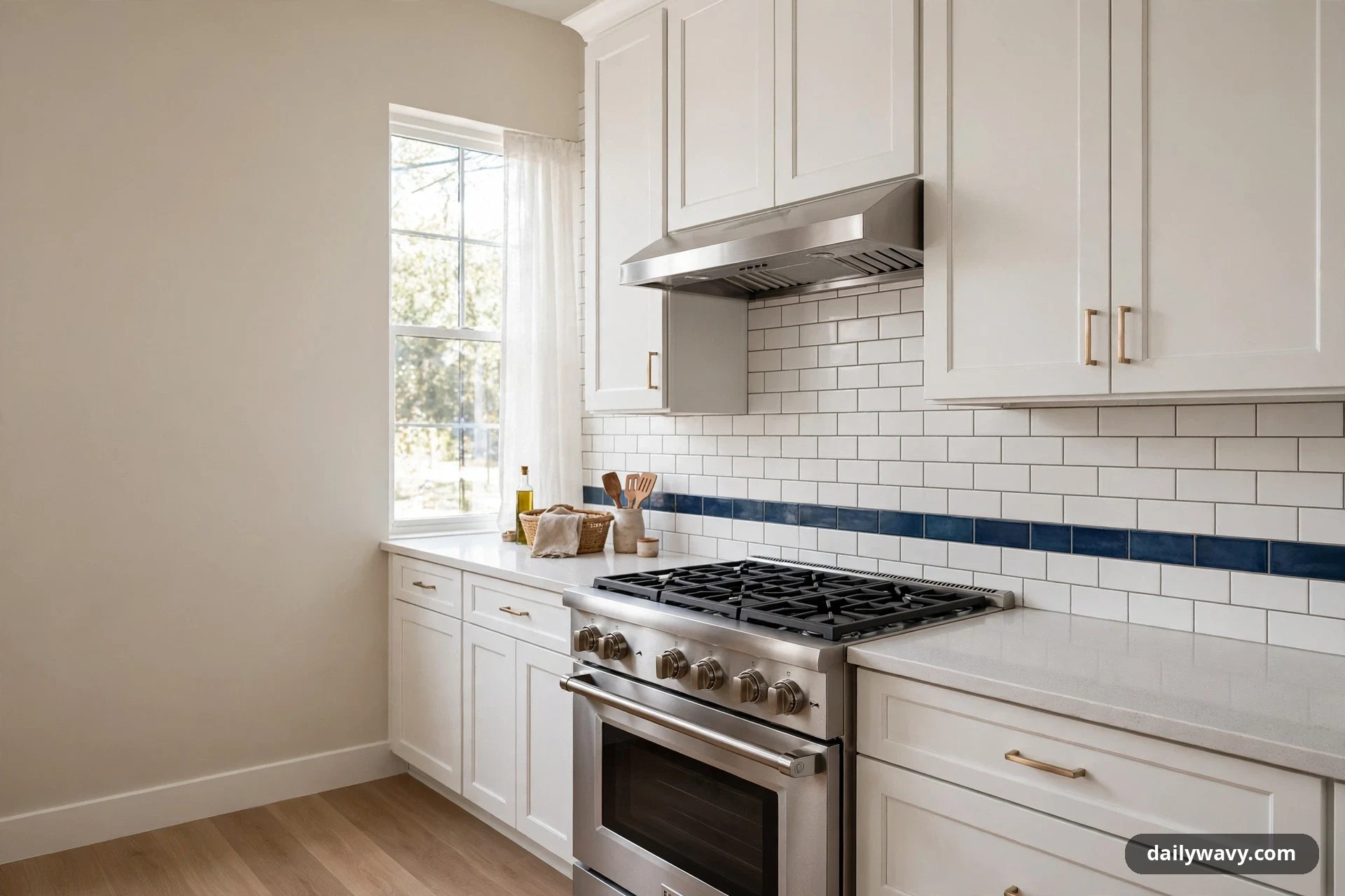
A slim band of blue tile can mark the cooking zone without covering the whole wall. Picture a 4-inch tall strip of deep blue ceramic running just behind the range, set into a field of plain white subway tile. The border reads like a frame for the stove, giving the busiest part of the kitchen its own identity. Everything else stays quiet and simple.
What to measure: the exact width of your range or cooktop, plus 3 inches of breathing room on each side for the border to sit centered. Materials: one row of 2-by-8-inch or 3-by-6-inch blue glazed tile, matching white field tile, and a coordinating grout. Placement: the blue strip usually sits at the back of the range, centered on the appliance, with the top of the border aligning with the field tile rows. Effort and cost: modest, since the blue tile covers only a few square feet. This is often a one-day add-on during a larger tile job. Lower-cost alternative: a painted stripe in washable eggshell paint, sealed with a clear kitchen-safe topcoat, gives a similar zone-defining line without any tile work.
2. A Single Focal Area With Plain Surroundings
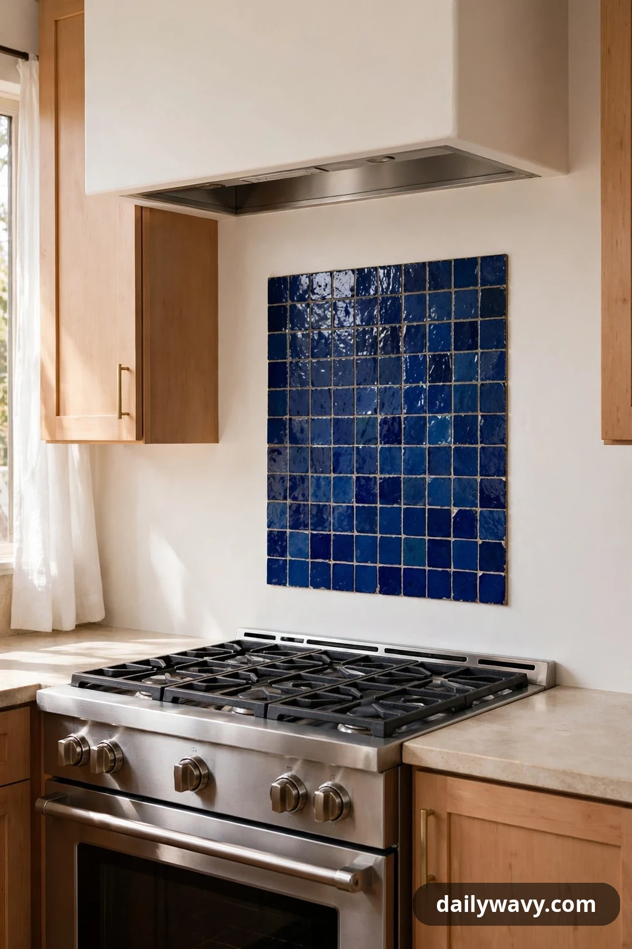
One statement panel of blue tile, surrounded by plain plaster or painted drywall, lets a single area do all the talking. Imagine a 30-by-30-inch square of cobalt blue zellige tile directly behind the range, with the rest of the backsplash wall finished in soft warm white paint. The contrast makes the blue feel deliberate and gallery-like instead of busy.
What to measure: the width of your range plus a few inches on each side, and the height from counter to the bottom of the range hood. Materials: handmade-look square tiles in cobalt or indigo blue, a Schluter-style edge trim to finish the raw tile edge cleanly, and unsanded grout in a close tone. Placement: center the panel on the range and let the surrounding painted wall run the full counter-to-cabinet distance. Keep the painted area in a washable finish so splatters wipe off. Effort and cost: moderate, since you are tiling one defined panel rather than the whole run. Lower-cost alternative: a framed piece of blue patterned wallpaper or a large ceramic art tile set in a simple frame, hung on the wall beside the range, away from direct burner heat.
3. A Dark Accent Repeated In Hardware
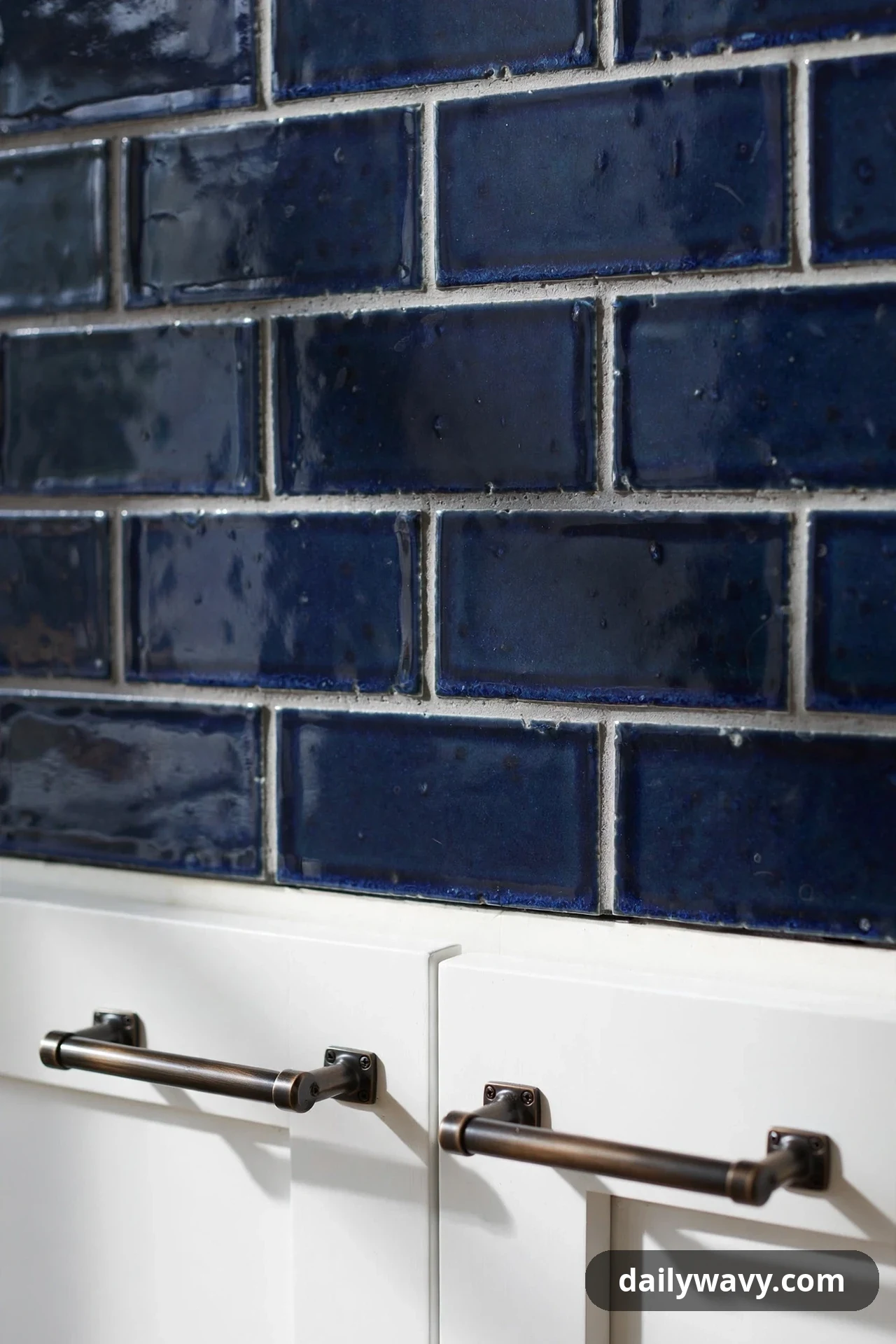
A deep navy backsplash looks even better when the same dark note shows up in the cabinet hardware. The repetition makes the kitchen feel designed rather than decorated. Try a matte navy subway tile wall paired with dark bronze or matte black bar pulls on the cabinets. The two darks do not have to match exactly; they just need to share the same depth so they read as partners.
What to measure: the distance between existing cabinet pull holes before you order replacements, since hole spacing is fixed on most doors. Materials: navy glazed subway tile, white or light gray grout, and new bar pulls or knobs in a dark finish. Placement: run the navy tile across the full backsplash wall, then swap the hardware on the upper and lower cabinets along that same wall. Effort and cost: moderate for the tile, plus the cost of pulls, which you can phase in a few at a time. Lower-cost alternative: spray-paint your existing pulls with a quality metal spray paint in matte black, working outdoors or in a well-ventilated area and letting each coat cure fully before reinstalling.
4. A Warm Wood Element Softening The Palette

Cool blue tile next to warm wood is one of the most forgiving combinations in a kitchen. A medium-blue backsplash with open oak shelves mounted on it feels balanced: the wood warms up the blue, and the blue makes the wood look richer. The shelves also give you styling room for cutting boards, small plants, and everyday dishes.
What to measure: the shelf length you want, the stud positions in the wall for secure mounting, and the clearance between the counter and the bottom of the lowest shelf (12 to 15 inches keeps items reachable). Materials: blue backsplash tile of your choice, solid oak or walnut shelf boards 8 to 10 inches deep, and concealed floating-shelf brackets rated for the load. Placement: tile the full wall first, then mount two shelves over the section of backsplash beside the range rather than above it, where steam and grease are heaviest. Effort and cost: moderate; the shelves are a weekend project after the tile is done. Lower-cost alternative: a single pine shelf stained to a warm tone, or even a freestanding wooden rail with hooks hung from the cabinet bottom.
5. A Simple Repeated Line Pattern
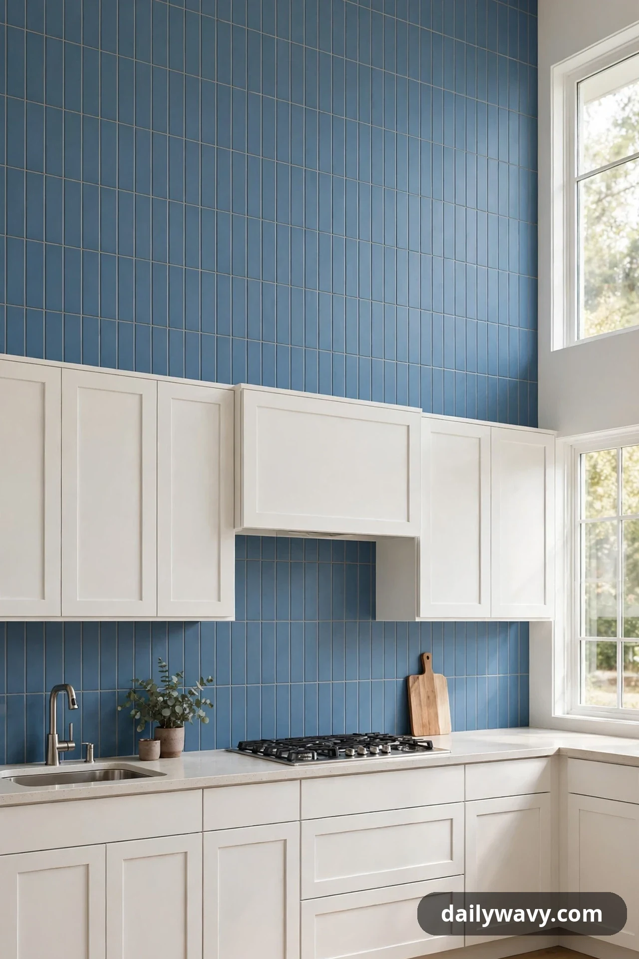
A backsplash built on one simple repeated line keeps blue feeling calm instead of loud. Think of narrow blue tiles laid in a straight stack, with each tile separated by a thin, even grout line. The repetition creates rhythm without any motif to compete with your dishes, curtains, or rugs. It works especially well in kitchens where the counters or floors already have a lot of pattern.
What to measure: the full backsplash area so you can calculate how many slim tiles you need, since narrow tiles cover less per box than standard sizes. Materials: slim rectangular tiles (1-by-6 or 2-by-8 inches) in a medium blue, sanded grout in a matching or slightly lighter tone. Placement: stack the tiles in straight columns with aligned joints for the cleanest rhythm, running the pattern across the entire wall. Effort and cost: moderate to higher, because small tiles mean more pieces per square foot. Lower-cost alternative: a blue beadboard panel with evenly spaced vertical grooves, painted in a single blue, gives the same linear rhythm for much less.
6. A Contrasting Edge At The Counter
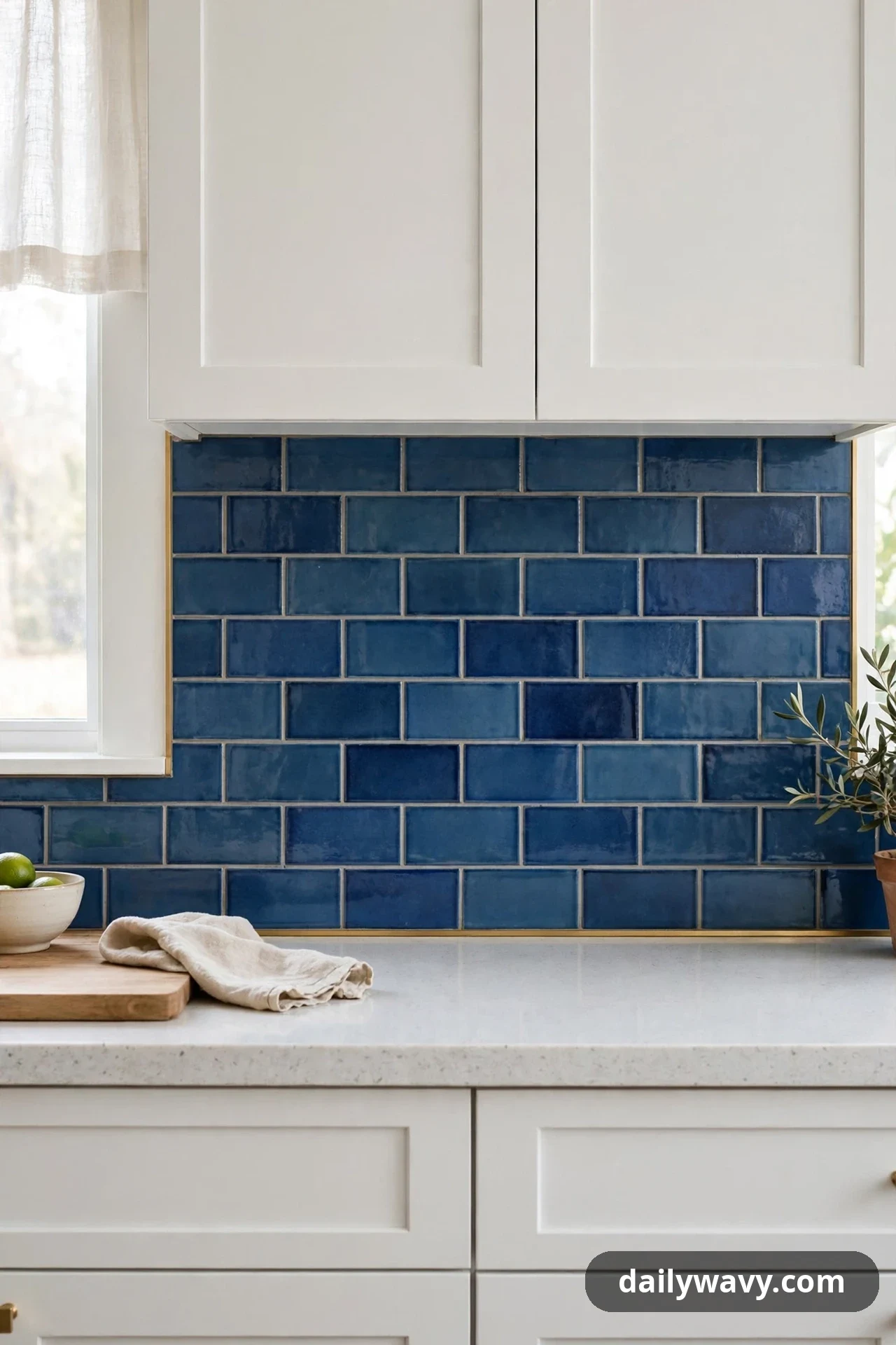
A thin contrasting edge where the backsplash meets the counter adds a tailored finish. This is the slim pencil liner or metal trim that runs along the very bottom of a blue tile wall, right where it touches the countertop. A brass or soft gold liner against dusty blue tile looks especially considered, like the binding on a well-made book.
What to measure: the total linear feet where the backsplash meets the counter, so you can order enough liner. Materials: your chosen blue field tile plus a pencil liner or metal edge trim in a contrasting finish, and grout. Placement: install the liner as the bottom-most row of the backsplash, sitting directly on the counter with a tiny silicone bead underneath for a clean seal. Effort and cost: small add-on cost during a tile install; the liner itself is usually sold by the piece or by the linear foot. Lower-cost alternative: a crisp caulk line in a contrasting color, applied neatly with painter’s tape on both sides, gives a similar finished edge for almost nothing.
7. A Textured Surface With Plain Accessories
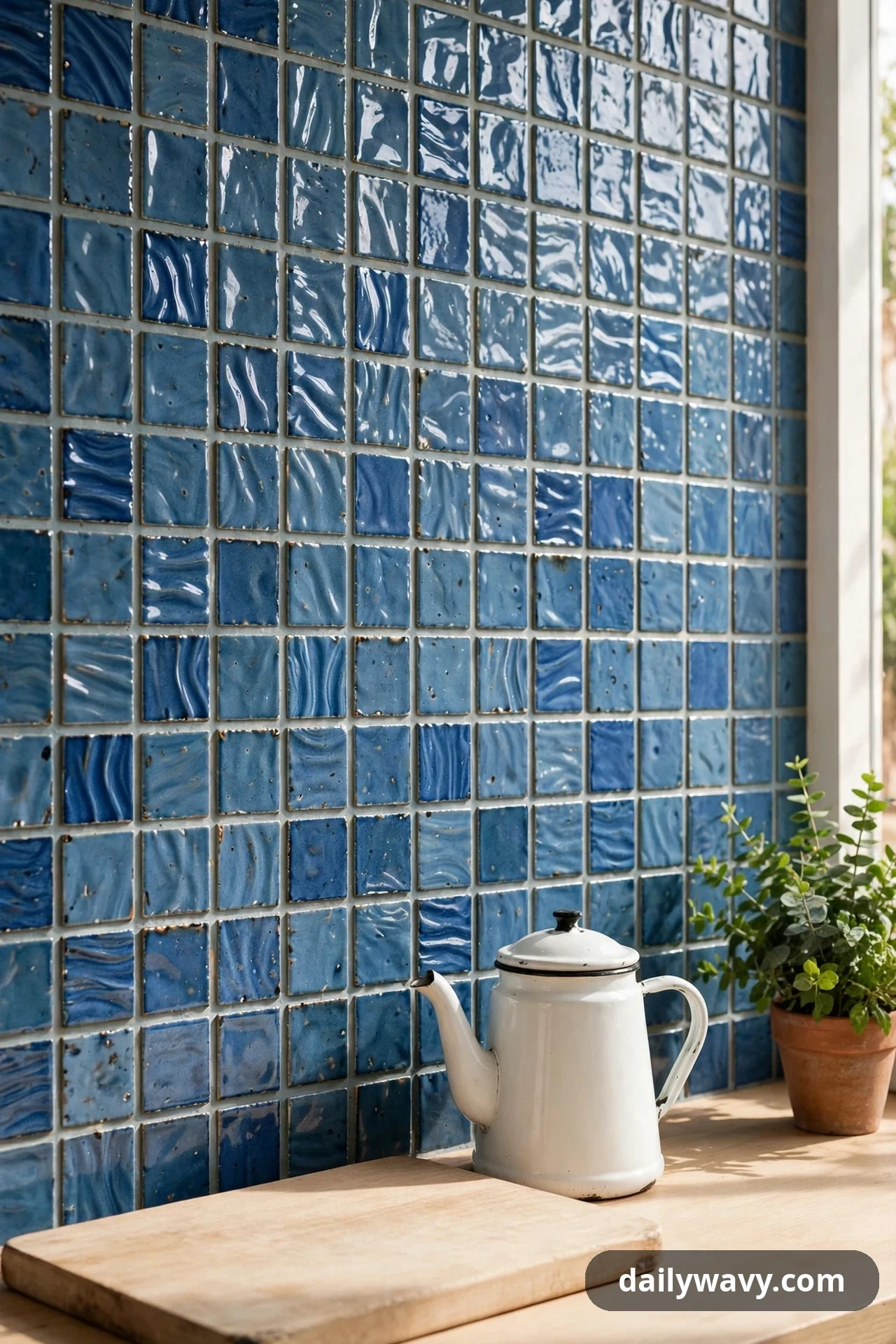
Textured blue tile, like handmade zellige with its soft ripples, brings the interest on its own. That means the accessories on the counter can stay plain and simple. Pair a rippled denim-blue zellige wall with a plain wooden cutting board, a simple white kettle, and one small plant. The tile does the visual work; the styling stays quiet so the texture can be seen.
What to measure: the backsplash area, and remember that handmade tiles vary in size, so order 15 percent overage instead of the usual 10. Materials: zellige-style or handmade-look tiles in denim or dusty blue, grout in a tone close to the tile. Placement: run the textured tile wall to wall for full effect, and keep the counter in front of it styled with no more than three plain items per section. Effort and cost: higher, since handmade-look tile costs more and takes longer to set. Lower-cost alternative: a machine-made tile with a softly undulating glaze, which gives most of the texture at a fraction of the price.
8. A Low-Contrast Palette In A Compact Space
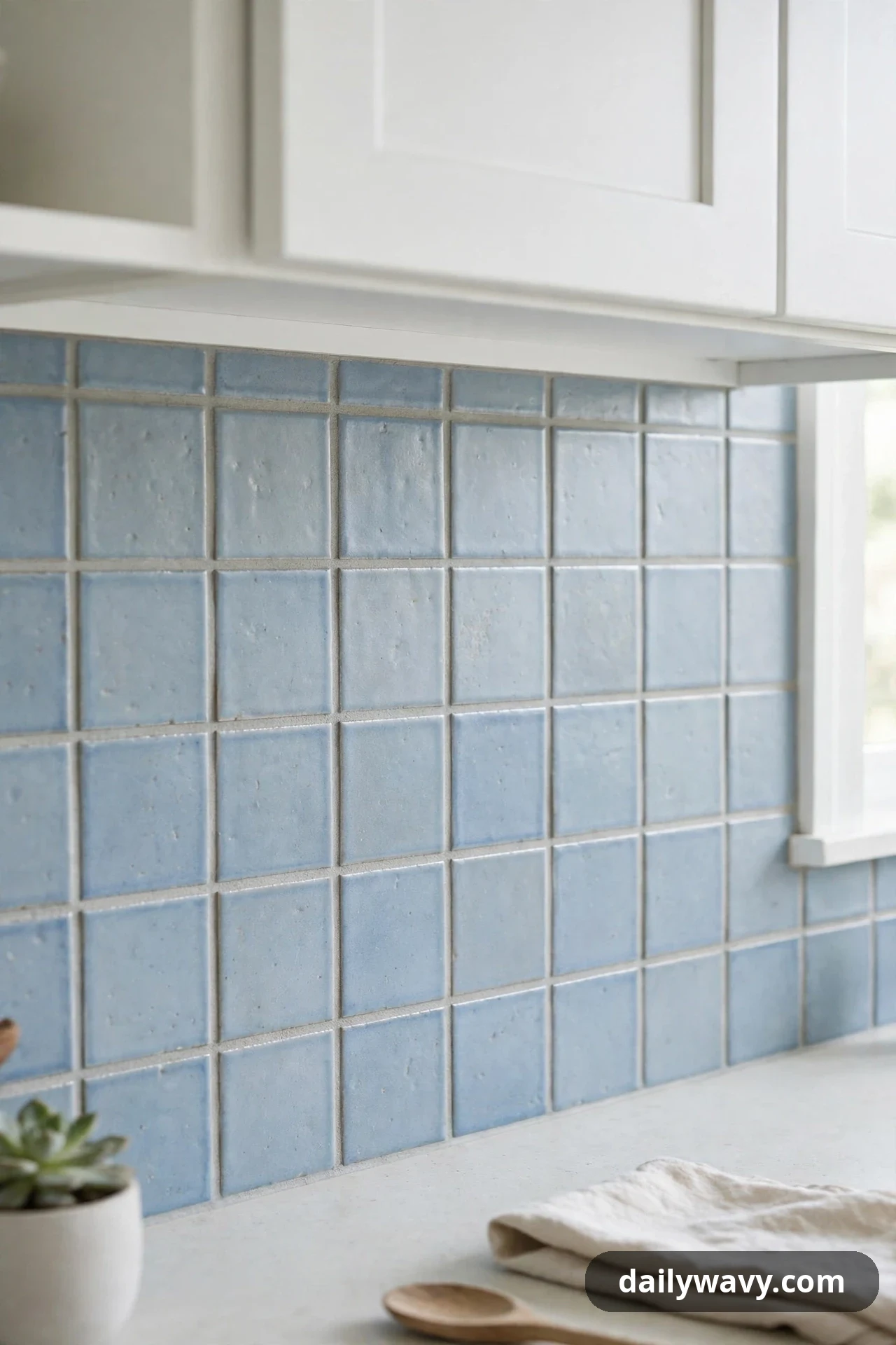
In a small kitchen, a backsplash that stays close in tone to the cabinets and walls makes the room feel larger. A powder-blue tile with white cabinets and a pale countertop creates a low-contrast envelope where nothing shouts. The blue still adds personality, but the gentle transitions keep sightlines open and the space airy.
What to measure: your full backsplash area plus the cabinet and wall paint chips, so you can compare all three tones together before ordering. Materials: powder-blue or pale slate-blue tile, grout in a near-matching light tone so joints disappear. Placement: tile the full wall, and let the tile color sit one or two steps deeper than the cabinet paint. That small step-down reads as intentional shading rather than a mismatch. Effort and cost: moderate, comparable to any full-wall tile job. Lower-cost alternative: paint the backsplash wall in a pale blue washable paint for the same low-contrast effect, and spend the savings on new cabinet hardware.
9. An Accent Pulled From Nearby Artwork

One of the easiest ways to choose a blue is to steal it from art you already love. If a framed print in your kitchen has a beautiful teal-blue sea or a cobalt flower, pull that exact shade into the backsplash. Hang the artwork on the adjacent wall and let the tile echo it. The kitchen feels connected because the color has a reason to be there.
What to measure: the artwork itself and the wall where it hangs, so the echo reads across the room rather than competing up close. Materials: tile matched to one blue from the artwork (bring a photo to the tile shop; many shops can color-match), grout in a neutral tone. Placement: place the blue backsplash on the wall the artwork faces or beside, so the eye travels between the two. Keep the rest of the styling neutral so the color conversation stays clear. Effort and cost: moderate for the tile; matching takes a little extra shopping time. Lower-cost alternative: paint a backsplash panel in a color matched to the artwork at the paint store, using a washable kitchen finish.
10. A Vintage-Inspired Detail With Modern Shapes
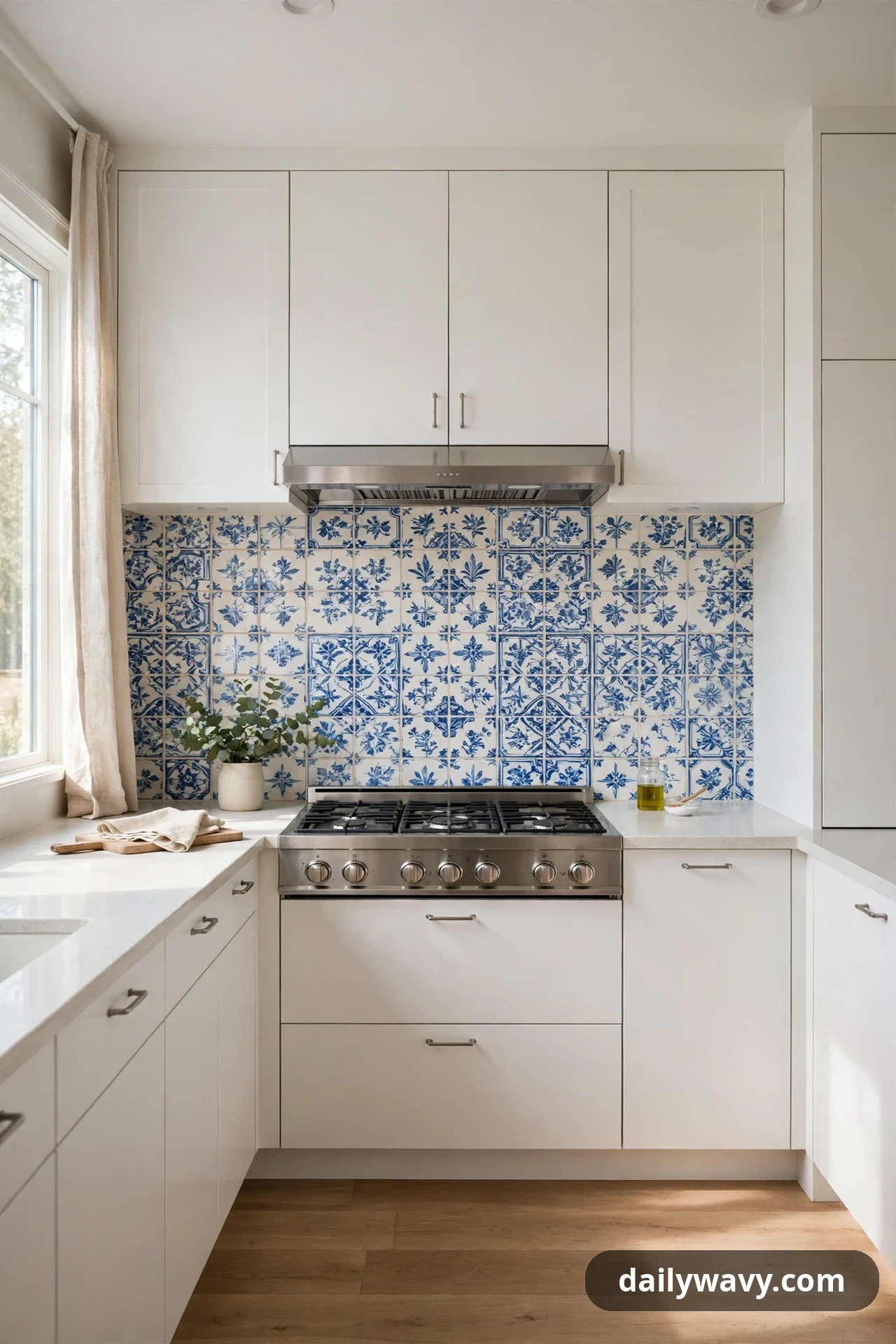
A vintage-looking blue tile keeps its charm when everything around it stays modern. Picture classic blue-and-white patterned tiles, the kind with old Portuguese or Dutch motifs, set behind flat-front cabinets with simple hardware. The old pattern and the new shapes balance each other: the tile brings soul, the cabinets keep the kitchen feeling current.
What to measure: the backsplash area, and decide whether the pattern runs the full wall or a defined panel, since patterned tile at full-wall scale can feel busy. Materials: patterned ceramic tiles in blue and white, grout in white or very light gray. Placement: many kitchens use the pattern as a panel behind the range and plain blue or white tile elsewhere, which gives the vintage detail room to breathe. Effort and cost: moderate to higher; patterned tiles cost more per piece and need careful layout. Lower-cost alternative: patterned peel-and-stick tiles for a trial run, or a single row of patterned tiles as a border above plain field tile.
11. A Restrained Mix Of Two Finishes
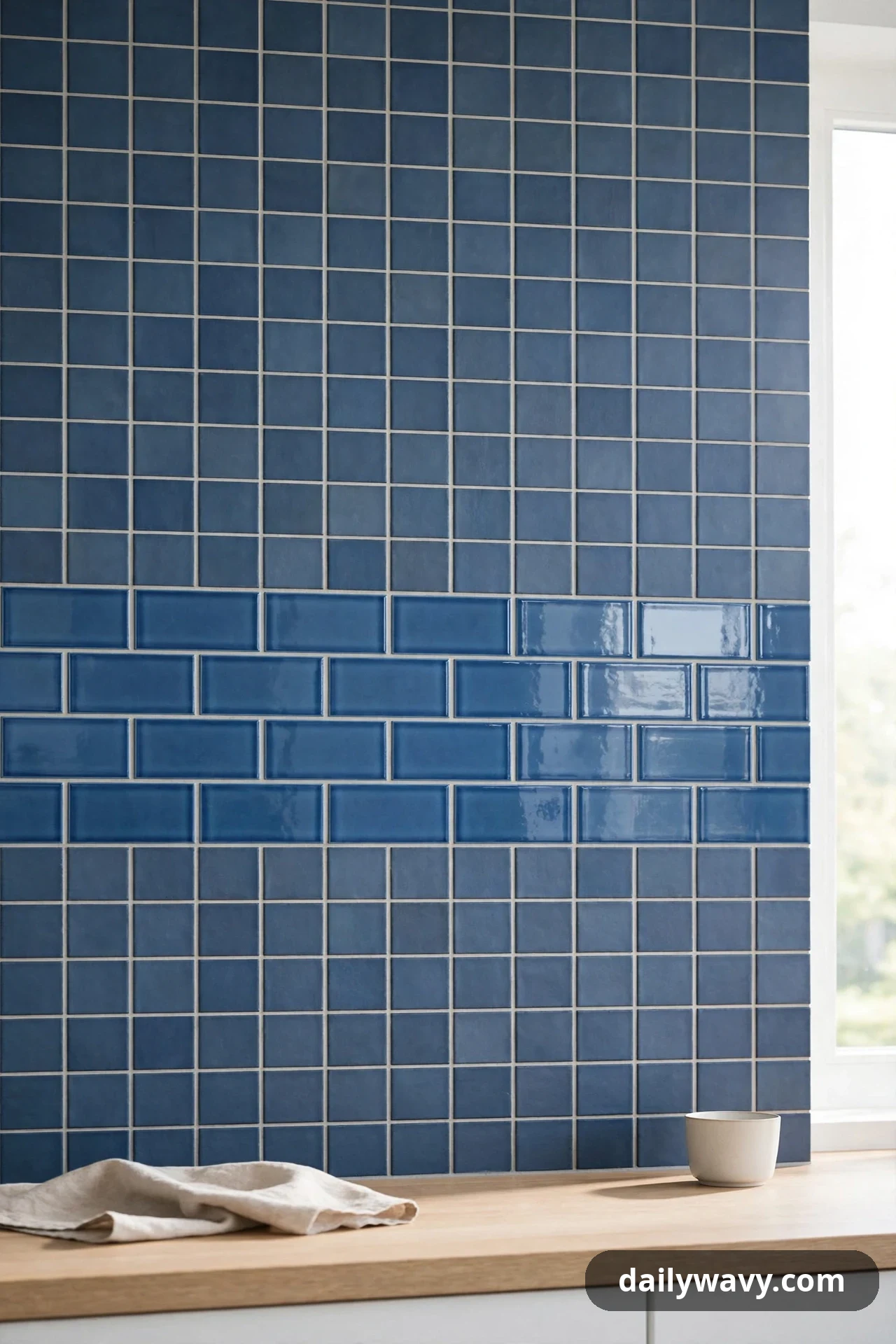
Two finishes of the same blue family add depth without adding color. A backsplash that pairs matte square tiles with a band of glossy subway tiles in a close blue reads as one idea with two layers. The light catches the glossy band and skims over the matte field, so the wall feels richer than a single finish could manage.
What to measure: the height of the glossy band you want (a 6-inch band is a common choice) and the full wall length. Materials: matte tiles and glossy tiles in matching or near-matching blues, grout in one consistent tone. Placement: run the glossy band at eye level across the middle of the wall, with the matte tile above and below. Keep the ratio roughly two-thirds matte to one-third gloss so the mix stays restrained. Effort and cost: moderate, with the extra step of planning the transition line. Lower-cost alternative: use glossy and matte versions of the same paint color in horizontal bands on a painted backsplash wall.
12. A Repeated Shape Across Adjacent Surfaces
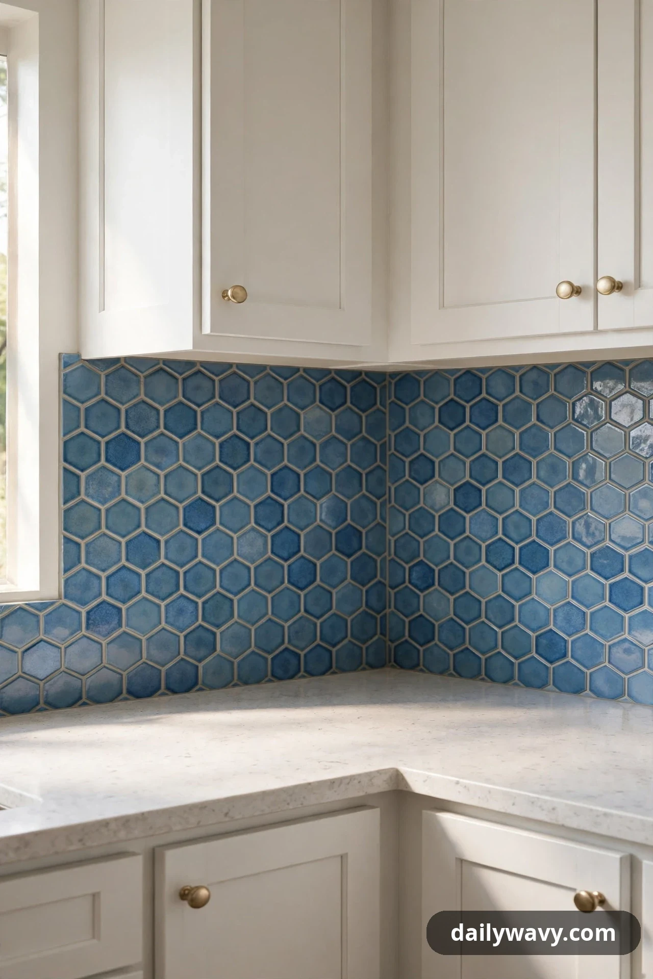
Carrying one tile shape from the backsplash onto an adjacent surface makes the kitchen feel custom. Hexagonal blue tiles that start at the range wall and wrap around the corner onto the side wall erase the visual stop of the corner. The shape becomes a signature for the room rather than a one-wall treatment.
What to measure: both walls, including the corner transition, so the hexagons align cleanly around the bend. Materials: hexagonal ceramic tiles in a medium blue, grout in a tone that lets the hex shapes show. Placement: dry-lay the first row around the corner before setting anything, so the pattern does not drift off-center. Effort and cost: moderate to higher, since corners need careful cutting and layout time. Lower-cost alternative: keep the hexagons on the main wall only and paint the adjacent wall in the same blue family for a hint of the wrap effect.
13. A Light Background With One Saturated Accent
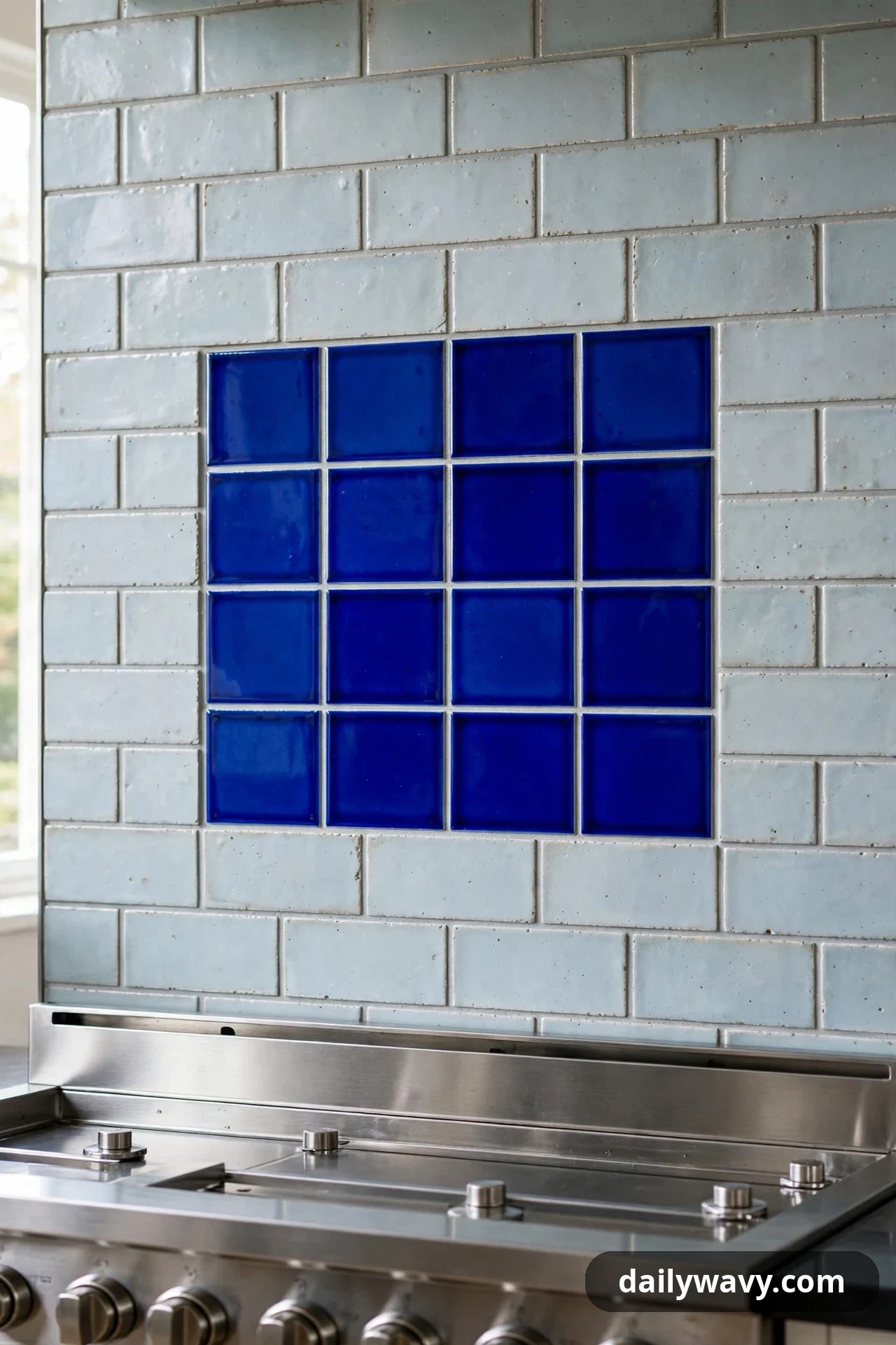
A pale backsplash with a single saturated blue accent gives you drama with an easy exit. Picture a wall of pale gray-blue subway tile with one vivid cobalt panel set behind the range, like a piece of framed art. If you ever tire of the strong color, you only need to rethink one panel, not the whole wall.
What to measure: the accent panel size (roughly the width of the range) and the surrounding field area. Materials: pale blue-gray field tile, a smaller quantity of saturated cobalt or ultramarine tile, edge trim for the panel. Placement: center the saturated panel on the range and let the pale field carry the rest of the wall. Keep the grout light throughout so the pale field feels seamless. Effort and cost: moderate; the two tiles are set in one job. Lower-cost alternative: a pale painted backsplash wall with a framed set of saturated blue art tiles hung behind the range, removable anytime.
14. A Balanced Warm-And-Cool Pairing
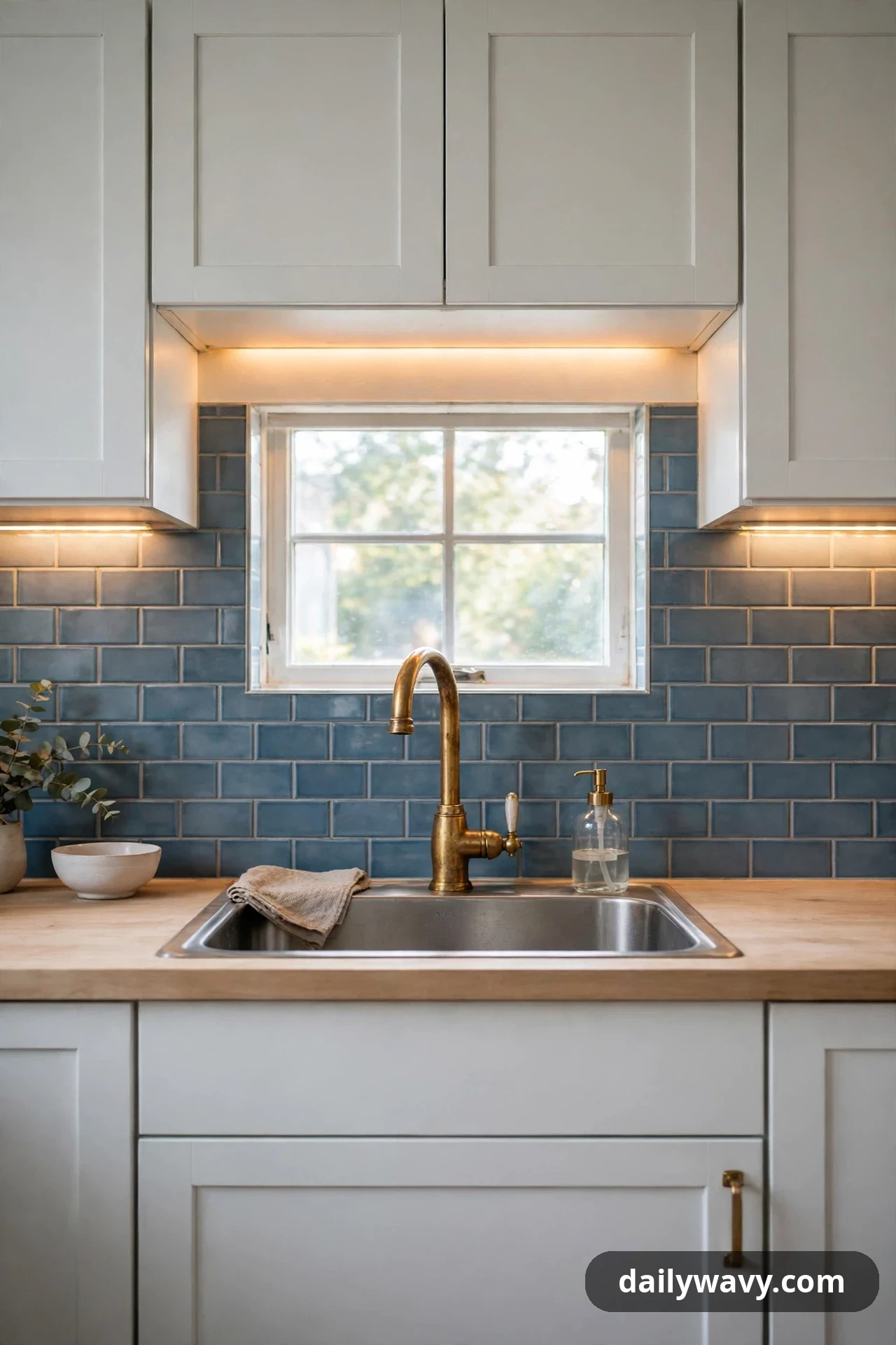
Blue cools a kitchen down, so pairing it with warm metals keeps the room inviting. A steel-blue backsplash with unlacquered brass faucets and warm under-cabinet lighting hits the balance: the blue provides calm, the brass provides glow. Neither side dominates, and the kitchen works in both daylight and evening.
What to measure: faucet hole spacing if you are swapping fixtures, and the color temperature of your under-cabinet lights (2700K to 3000K keeps the warm side cozy). Materials: steel-blue or slate-blue tile, brass or warm gold faucet and cabinet details, warm-white LED strips. Placement: tile the full wall, then introduce the warm metals at the sink and along the cabinets so the warm notes repeat at intervals. Effort and cost: moderate for tile; fixtures can be phased in later if the budget is tight. Lower-cost alternative: keep your existing faucet and add warmth with brass cabinet pulls, a warm-toned pendant, and wooden accessories on the counter.
15. A Small-Scale Grid With Restrained Contrast

A small-scale grid of blue mosaic tiles gives a kitchen a tailored-suit feel. Two-inch squares in a muted blue, set with tight joints, create a fine grid that reads as texture from across the room and as craft up close. The restrained contrast between tile and grout keeps the grid from turning busy.
What to measure: the backsplash area, noting that mosaic sheets cover about one square foot each. Materials: blue mosaic tile sheets, grout in a tone close to the tile for a calm grid. Placement: run the sheets across the full wall, keeping the grout joints tight and even. Small mosaics forgive slightly uneven walls, which makes them a kind choice for older homes. Effort and cost: moderate; sheets install faster than individual small tiles. Lower-cost alternative: a blue grid-look wallpaper rated for kitchen use, or painted grid lines on a solid blue wall using painter’s tape and a steady hand.
16. A Vertical Rhythm That Draws The Eye Upward
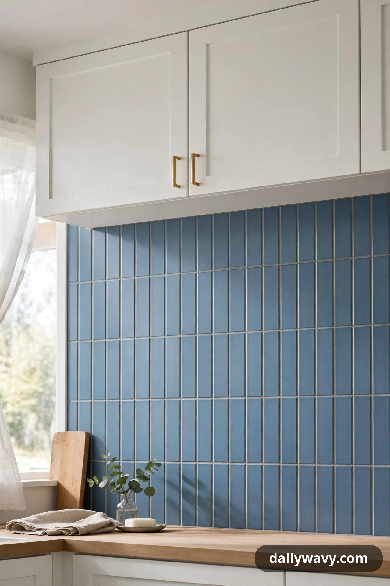
Tiles set vertically pull the eye up and make a low ceiling feel taller. Stack slim blue tiles in vertical columns from counter to cabinet, and the wall gains height it does not actually have. This trick works hardest in kitchens with low soffits or short upper cabinets, where every inch of vertical emphasis helps.
What to measure: the exact counter-to-cabinet height, since vertical stacks need to divide evenly into that distance or end in an awkward cut. Materials: slim rectangular tiles (2-by-8 or 1-by-6 inches) in any blue you love, grout in a close tone. Placement: stack the tiles in straight vertical columns with aligned joints, and plan the layout so full tiles land at the counter line where the eye rests. Effort and cost: moderate, similar to any stacked tile job. Lower-cost alternative: vertical blue beadboard or fluted paneling, painted in one blue, gives the same upward rhythm for less.
17. A Warm Accent Paired With A Cool Neutral
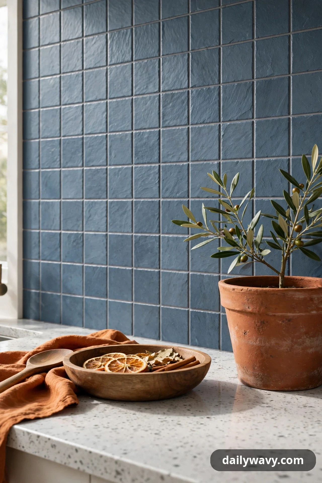
A warm accent next to a cool blue backsplash keeps the kitchen from feeling chilly. Try a cool slate-blue tile wall with a single warm note nearby: a terracotta pot, a wooden bowl, or a row of warm tan open shelving. The warmth does not have to be on the wall itself; it just needs to live close enough to be seen in the same glance.
What to measure: the shelf or counter area where the warm accent will live, so the pairing reads as intentional rather than accidental. Materials: cool blue tile in slate, steel, or powder tones, plus your chosen warm accent in wood, terracotta, or caramel leather. Placement: tile the wall in the cool blue, then place the warm accent on the counter or shelf directly in front of it, repeated two or three times along the run. Effort and cost: moderate for the tile; the warm accent can be as simple as pieces you already own. Lower-cost alternative: paint the backsplash wall in a cool blue and style the counter with wooden cutting boards and a terracotta planter.
18. A Subtle Geometric Motif
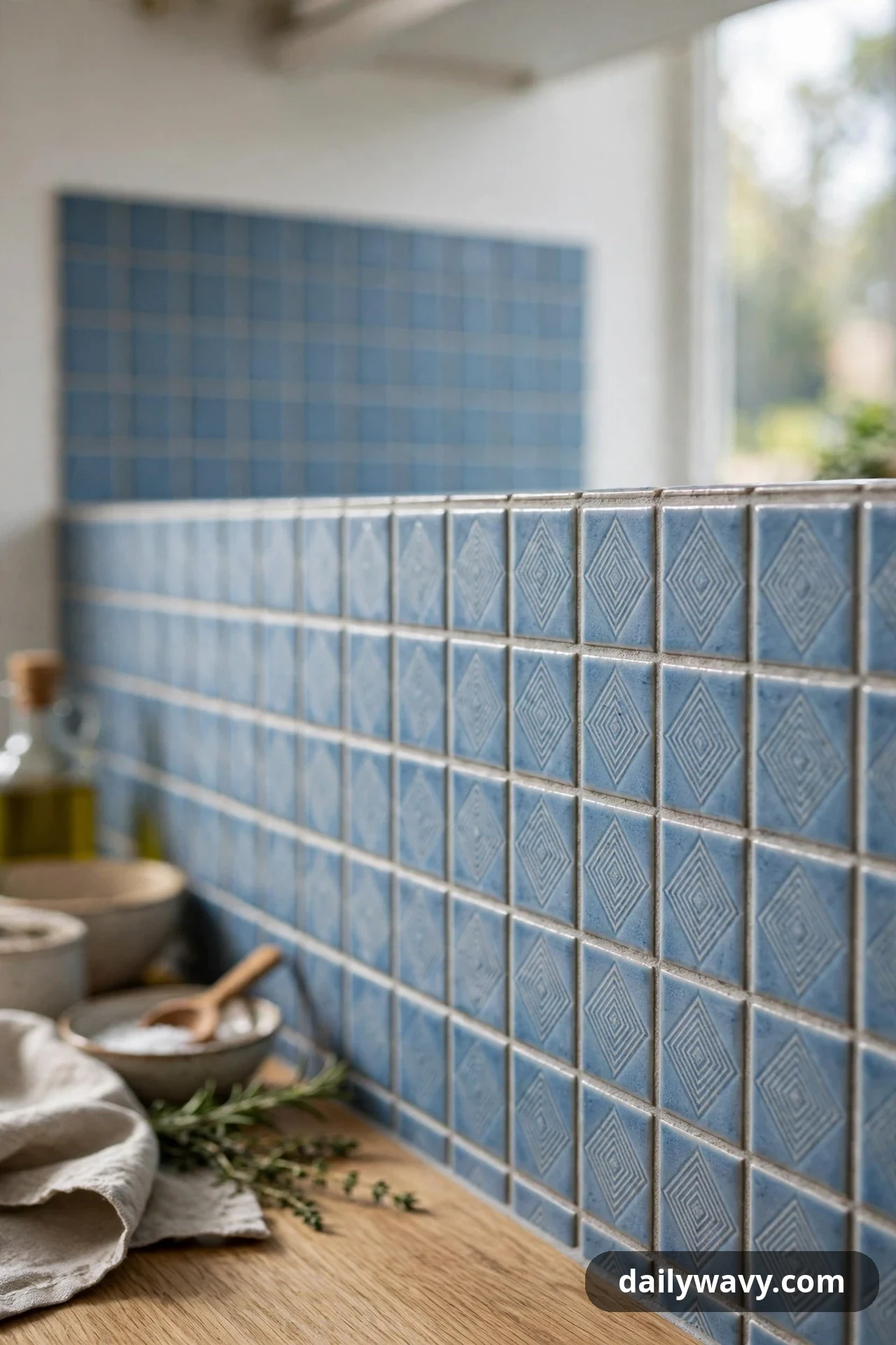
A quiet geometric motif gives blue tile a second layer of interest. Think of a tone-on-tone diamond or star pattern worked into the tile itself, visible up close but calm from across the room. The motif rewards the person standing at the counter without demanding attention from everyone else in the house.
What to measure: the backsplash area and the repeat size of the motif, so you can center the pattern on the range. Materials: patterned tiles in two close blues, or a mix of plain and patterned tiles from the same line, with grout in a neutral tone. Placement: many kitchens run the motif as a full-wall field or as a defined panel; either way, center the repeat on the range so the geometry feels anchored. Effort and cost: moderate to higher, since patterned layouts need dry-fitting time. Lower-cost alternative: a stencil in a slightly deeper blue over a painted blue backsplash wall, sealed with a kitchen-safe topcoat.
19. A Matte Finish Beside A Reflective Detail
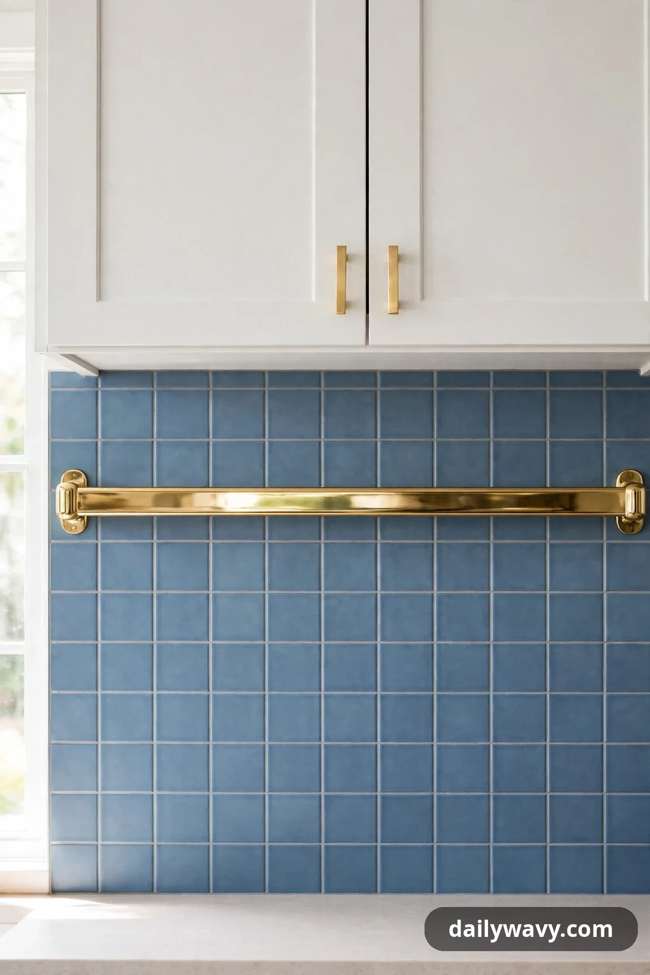
A matte blue wall next to one reflective detail plays with light in a quiet way. The matte tile absorbs light and stays soft, while a polished brass rail, a mirrored shelf bracket, or a glossy inset tile catches it. The contrast between flat and shine gives the wall a tailored edge without any extra color.
What to measure: the length of the reflective detail (a brass rail is usually sized to the range width or a prep zone). Materials: matte blue tile, plus one reflective element in brass, polished nickel, or a glossy accent tile. Placement: tile the wall in matte blue, then mount the reflective rail or set the glossy inset at the section of wall you use most, like the prep zone beside the sink. Effort and cost: moderate for the tile; the reflective detail is a small add-on. Lower-cost alternative: a matte painted backsplash wall with a polished metal picture ledge or a row of glossy blue accent tiles as the reflective note.
20. A Tonal Arrangement With Matching Trim
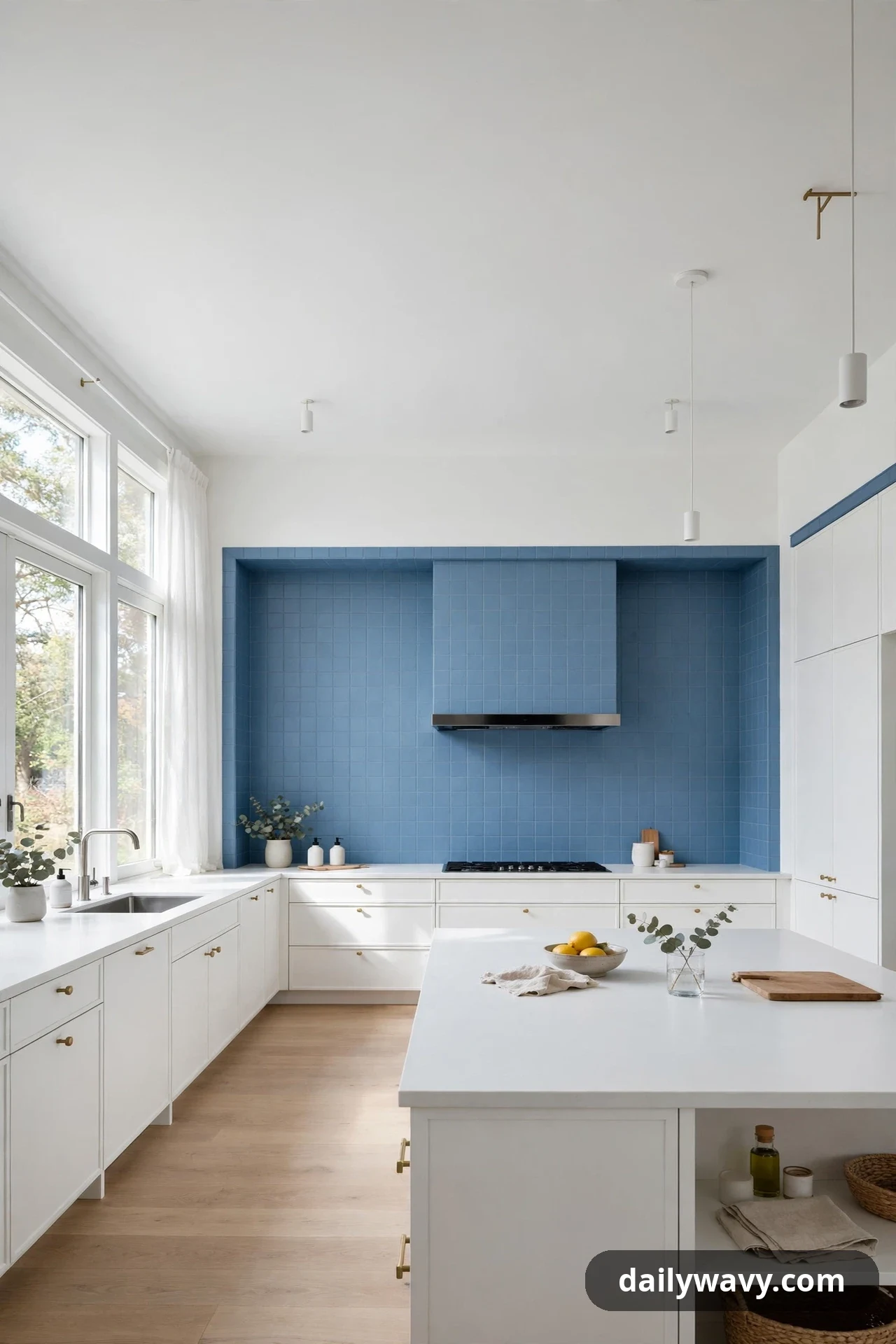
A tonal arrangement, where the tile, grout, and trim all sit in the same blue family, feels calm and custom. Instead of contrasting edges, everything melts together: medium-blue tile, medium-blue grout, and a trim piece glazed in the same tone. The wall reads as one continuous surface, which suits minimalist kitchens and lets the cabinetry or counters take the spotlight.
What to measure: the full backsplash area and the linear feet of trim needed for edges and corners. Materials: field tile, grout, and edge trim all chosen from the same blue color family (ask the tile shop to pull them together). Placement: run the tonal set across the whole wall, using the matching trim at every exposed edge so no raw tile edge shows. Effort and cost: moderate; the challenge is sourcing all three pieces in a true match, so order them together. Lower-cost alternative: paint the wall, the trim, and the removable outlet covers (taken off the wall first, and never paint the outlets themselves) in one washable blue for a tonal look with no tile at all.
Blue backsplash questions, answered
How do I choose between all these blue shades?
Start with your fixed elements: the countertop, the floor, and the cabinet color. Pull 3 or 4 blue samples that sit near those tones, tape them to the wall, and live with them for several days. Check each one in daylight and under your evening lights. The shade that looks good in both, and that you still like on day four, is your winner.
Should the backsplash be darker or lighter than the cabinets?
Either works, but most kitchens look best with a clear step between the two. A backsplash one or two tones deeper than white cabinets gives definition. With dark cabinets, a lighter blue backsplash keeps the wall from closing in. The key is contrast you can see from the doorway, not a near-match that looks accidental.
What grout color works with blue tile?
Light gray grout is the safest all-rounder: it defines the tile shape without competing. White grout looks crisp with pale blues but shows stains faster near the range. Dark grout with navy tile creates a moody, seamless wall. Whatever you choose, test it on a sample board first, because grout changes the whole read of the tile.
Can I do a blue backsplash in a rental?
Yes. Peel-and-stick tile panels now come in convincing blue finishes, from subway to zellige looks, and they remove without damage when applied to smooth, clean walls. For an even simpler test, a painted panel or a framed set of art tiles hung at backsplash height gives you the color with zero commitment.
How much should I budget for a blue backsplash?
For a typical 30-square-foot backsplash wall, machine-made ceramic tile plus installation often lands in the few-hundred-dollar range for materials, more for handmade or patterned tile. Labor usually matches or exceeds the material cost. Peel-and-stick or painted options can bring the whole project under $100. Always add 10 percent overage for cuts.
Will blue go out of style?
Blue has been a kitchen color for centuries, from Dutch delft tiles to classic farmhouse kitchens, because it sits between neutral and color. Muted and mid-tone blues age the best; very bright or trendy shades are the ones most likely to feel dated. If you love a bold blue, use it in one defined zone so a future refresh stays small.
Pick the blue that fits your kitchen
The best blue backsplash is the one that suits your light, your cabinets, and the way you actually use the kitchen. Tape up samples, compare them over a few days, and notice which shade you keep coming back to. Whether you choose a narrow border, a full tonal wall, or a single saturated panel, the comparing is the part that makes the choice feel right. Once the tile is up, put it to work with a lemon garlic chicken skillet on a busy weeknight, or keep lunch simple with our chickpea wrap ideas assembled right at the counter.
For more kitchen and home inspiration, browse the Home & Decor collection for room-by-room ideas. Save your favorite ideas from this guide and bring your samples to the tile shop with confidence.