10 Neutral Kitchen Backsplash Ideas to Compare Before You Choose
A neutral backsplash is the quietest hardworking surface in your kitchen. It has to look calm next to busy mornings,…
A neutral backsplash is the quietest hardworking surface in your kitchen. It has to look calm next to busy mornings, shrug off tomato splatter, and still feel right ten years from now. That is a lot to ask of a few square feet of tile, which is why the smartest move is to compare before you commit. Seeing warm whites, soft greiges, and handmade textures side by side teaches you more in an afternoon than weeks of scrolling. This guide walks through ten distinct neutral approaches, each with the materials that make it work and the styling details that keep it interesting, and it starts with the sample checks to make before you spend a dollar.
In This Guide
- A Warm Wood Element Softening the Palette
- A Simple Repeated Line Pattern
- A Contrasting Edge at the Counter
- A Textured Surface With Plain Accessories
- A Low-Contrast Palette in a Compact Space
- An Accent Pulled From Nearby Artwork
- A Vintage-Inspired Detail With Modern Shapes
- A Restrained Mix of Two Finishes
- A Repeated Shape Across Adjacent Surfaces
- A Light Background With One Saturated Accent
The Neutral Backsplash Rules Before You Start
Neutral does not mean foolproof. Two whites that looked identical in the showroom can read completely different on your wall, because undertones wake up in your specific light. Before anything else, bring home full-size samples of your top three or four tiles. Tape them to the wall where the backsplash will live and look at them in morning light, midday light, and under your evening bulbs. Hold them against your cabinet door and a piece of your countertop at the same time. This is the single most useful hour of the whole project.
Grout deserves its own decision. A grout color close to the tile keeps the surface calm and continuous; a contrasting grout turns every tile edge into a line drawing. Behind the range, light grout will show cooking stains, so choose a grout that matches the tile tone, seal it, or ask your installer about epoxy grout for that zone. Grout width matters too: thin lines read modern and quiet, wider lines read handmade and relaxed.
Finish is about light and maintenance. Glossy tile bounces light around a small or north-facing kitchen, which is genuinely useful. Matte tile hides water spots and fingerprints between cleanings. Both wipe clean with a damp cloth; the difference is how they behave between wipes.
Scale sets the mood. Small tiles mean more grout lines, which adds visual texture even in a neutral color. Large-format tiles mean fewer lines and a calmer read. Neither is better; they are different tools.
Finally, respect heat and water. Tile and stone handle the zones behind the range and sink without complaint. Wallpaper, painted panels, or peel-and-stick products stay outside direct heat and wet zones unless the manufacturer rates them for those areas. And when you plan hardware and cabinet pairings, judge real handles and real cabinet colors together with the tile, because a finish that looked warm on its own can turn cool next to the wrong white.
1. A Warm Wood Element Softening the Palette
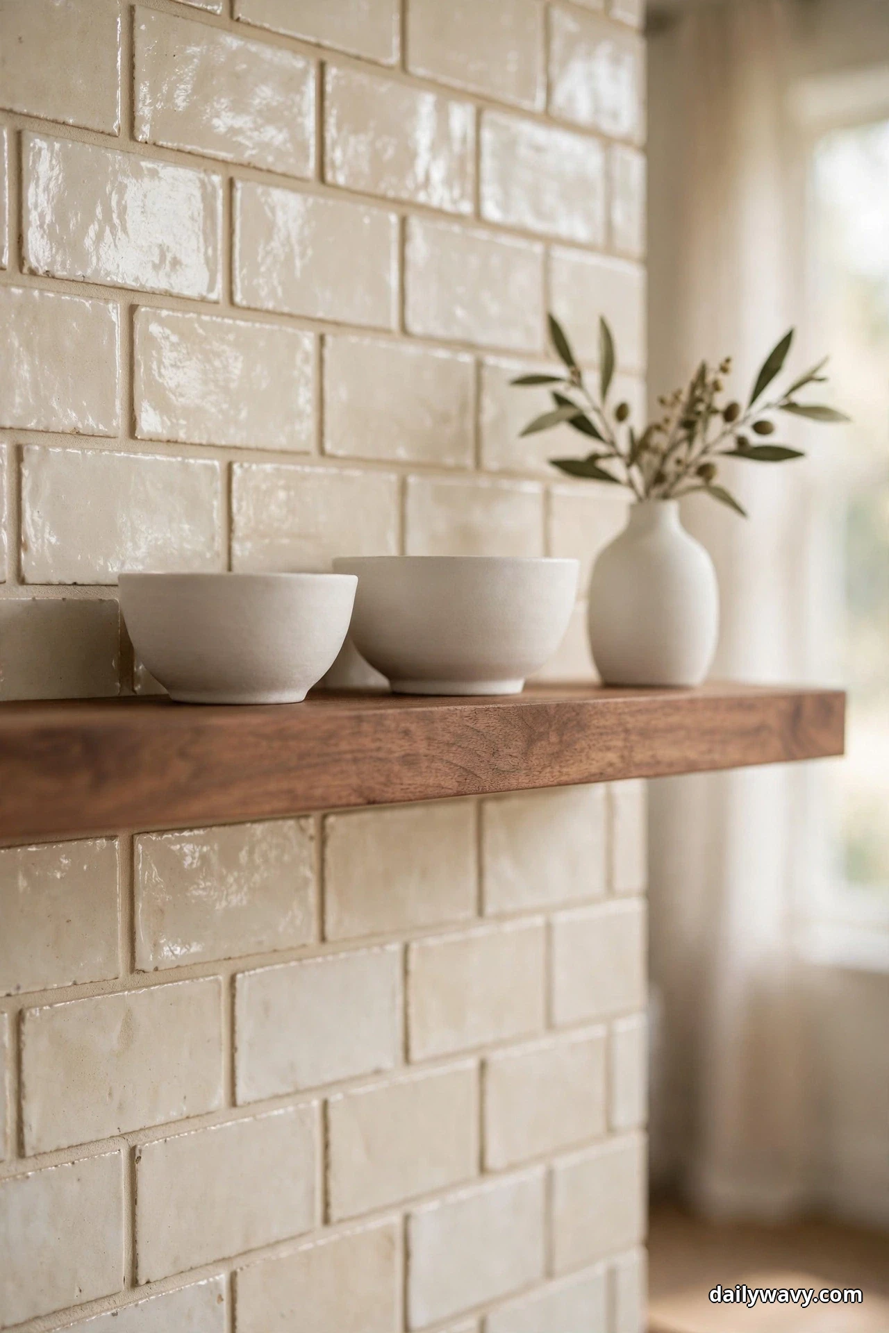
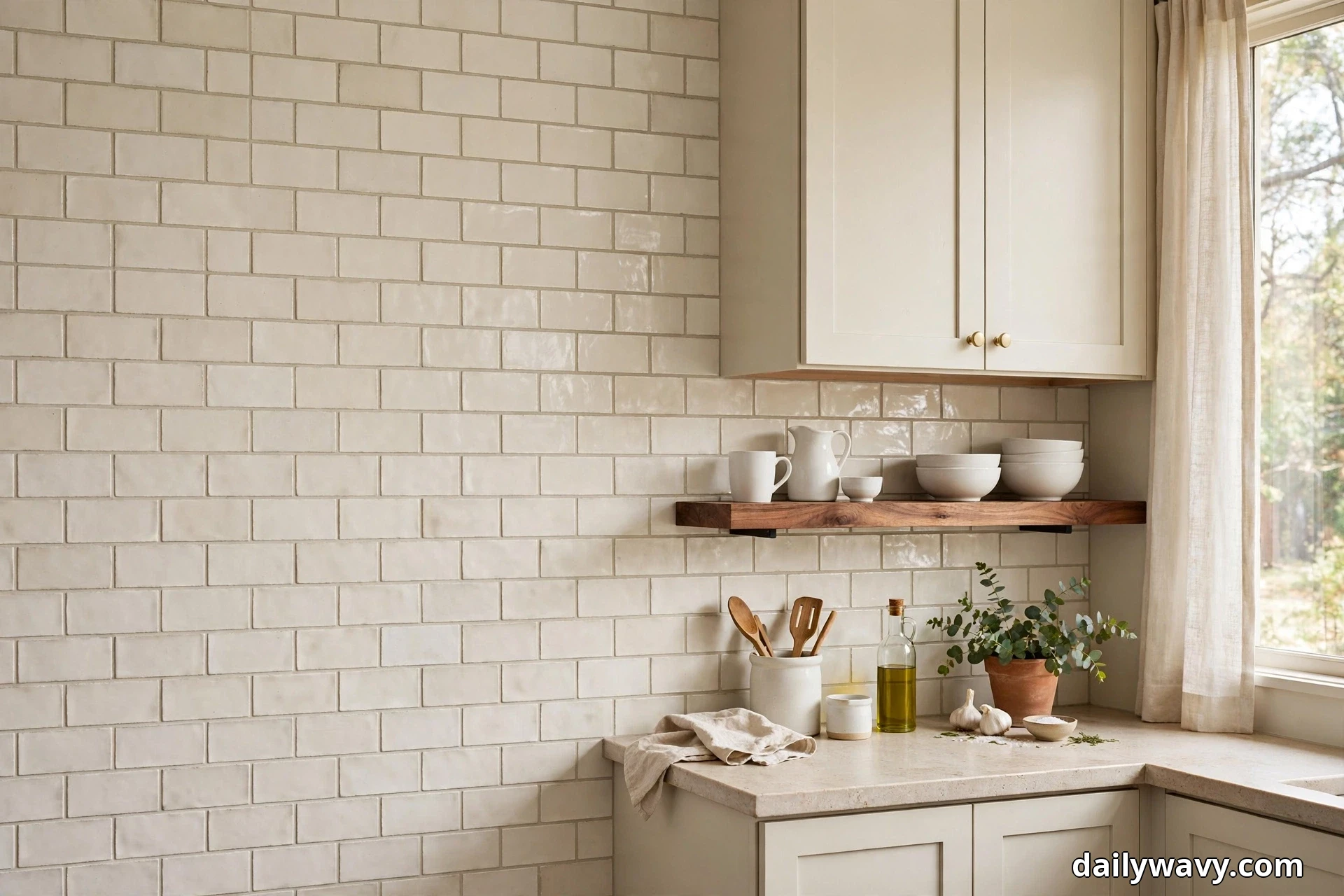
Tile is hard and cool to the touch, and a whole run of it can feel a little clinical even in the warmest white. One warm wood element fixes that instantly. Think of a walnut open shelf carrying everyday ceramics, a row of maple cutting boards leaning against the tile, or a simple oak stool tucked where it catches the light. The wood does not compete with the backsplash; it gives the eye somewhere soft to land.
This works best with creamy handmade-look subway tile or a soft white square tile, because the slight variation in the glaze already has a warm character that wood echoes. Keep the wood to one or two elements. A shelf plus boards is plenty; a shelf plus boards plus a wooden range hood starts to feel like a theme.
On the practical side, seal any wood that sits near cooking or the sink. A food-safe hardwax oil or mineral oil finish, refreshed once or twice a year, keeps splatter from staining. Mount an open shelf at a depth of eight to ten inches so plates and bowls sit securely, and anchor it into studs or proper wall anchors because loaded shelves are heavy. When you sample, hold your wood finish sample right against the tile sample in your kitchen light. Walnut deepens a creamy tile beautifully; pale oak can make a cool white look colder than you expected.
2. A Simple Repeated Line Pattern

Sometimes the pattern is the whole design. A straight stack of classic white subway tiles, laid with thin grout lines that nearly match the tile, creates a calm grid that recedes and lets everything else in the kitchen breathe. It is the most forgiving neutral choice there is, and it suits nearly every cabinet color.
The layout decision is where this idea gets personal. A running bond (the classic brick offset) feels traditional and relaxed. A straight stack feels tailored and a little more modern. Turn the same tile vertical and the wall seems taller, a useful trick in kitchens with low ceilings or short cabinet runs. All three use the same tile, so this is a styling decision you make with your installer, not a different purchase.
Ask for tight, consistent grout lines and check a few courses with a level as the work progresses, especially with handmade-look tile where edges vary. That slight handmade variation is actually the charm here; perfectly uniform tile in a straight stack can look a bit flat, while a little edge wobble catches the light. For grout, a white or very light warm gray keeps the grid quiet. Save contrasting grout for a bolder project, because it turns this calm idea into a graphic one.
3. A Contrasting Edge at the Counter
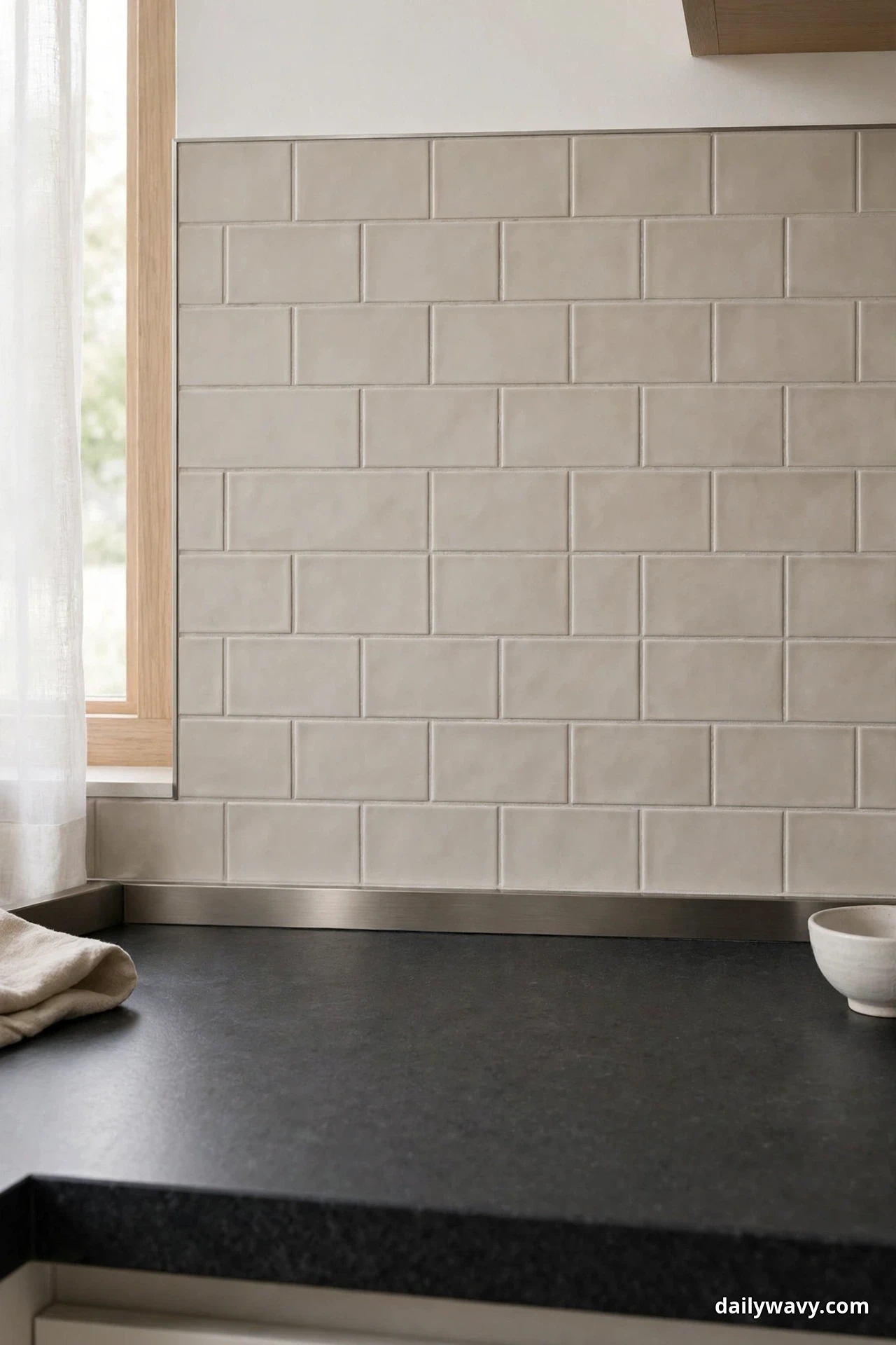
A light neutral backsplash gains instant definition when it meets a darker countertop. The contrast draws a crisp line along the whole run of the kitchen, which makes the wall feel intentional rather than default. Honed charcoal stone, deep bronze quartz, or even a dark-stained butcher block all give you that anchoring edge against creamy or greige tile.
The key is keeping the contrast moderate and the transition clean. A slim metal edge trim in brushed nickel or matte black, set where tile meets counter, gives you a razor-sharp line and protects the tile edge at the same time. Your installer can also finish the tile edge with a bullnose or a mitered return, which reads softer. Pick one approach and run it consistently along every counter run.
When sampling, look at the countertop and tile together, not separately. Put the two samples on your actual counter height and step back six feet. If the dark edge feels like it is shouting, try a mid-tone instead: a warm gray counter with cream tile gives you definition without drama. Also check the contrast in evening light, when under-cabinet lighting can make dark counters read even darker against a glowing tile wall.
4. A Textured Surface With Plain Accessories

Zellige-style and handmade-look glazed tiles are neutral in color but anything but plain. Every tile catches the light a little differently, so the whole wall shimmers softly as you move through the kitchen. Because the surface itself carries so much interest, everything you put in front of it should stay quiet: plain white ceramics, clear glass canisters, one simple wood board.
This is one of the easiest neutrals to live with behind a real cooktop. The glaze wipes clean with a damp cloth, and the surface variation is forgiving of the odd water spot between cleanings. Before you commit, test a sample the honest way: smear a little tomato sauce on it, let it sit for an hour, then wipe it off. If it cleans up without a trace and the glaze still looks even, you have a winner.
Keep the grout color close to the tile so the texture, not the grid, does the talking. And resist the urge to add patterned accessories. A busy runner rug, patterned dish towels, and a textured wall all in one sightline will fight each other. Let the tile be the one interesting surface in the zone, and keep the rest simple.
5. A Low-Contrast Palette in a Compact Space
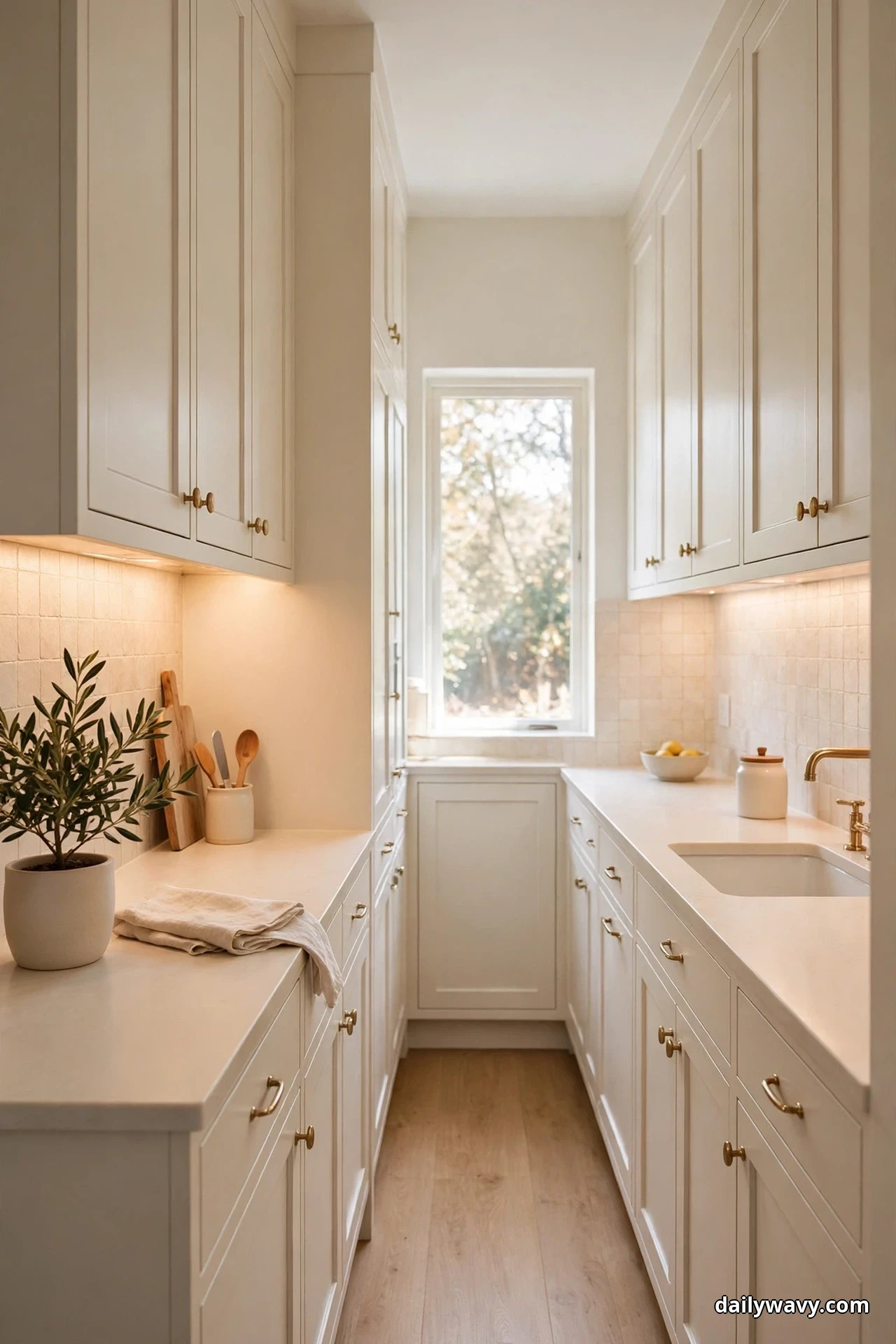
In a small galley or a tight U-shaped kitchen, a low-contrast palette is a space-expanding tool. Warm white cabinets, a cream backsplash, and pale counters blur the boundaries between surfaces, so the eye reads one continuous envelope instead of a series of small boxes. The kitchen genuinely feels larger, not just lighter.
The trick to keeping tone-on-tone from going flat is varying the finish, not the color. Pair matte cabinet paint with a softly glossy tile, or a honed counter with a glazed backsplash. Those small differences in how surfaces reflect light create depth without adding color. Under-cabinet lighting is almost essential here; it washes the tile with light and gives the whole run a gentle glow after dark.
Sample testing matters most in this scheme because there is nowhere for a wrong undertone to hide. Tape your tile, cabinet paint swatch, and counter sample together on the wall and live with them for a few days. If the tile pulls pink or green next to your cabinets, keep looking. The right low-contrast combination looks effortless, but it is the result of careful matching, not luck.
6. An Accent Pulled From Nearby Artwork
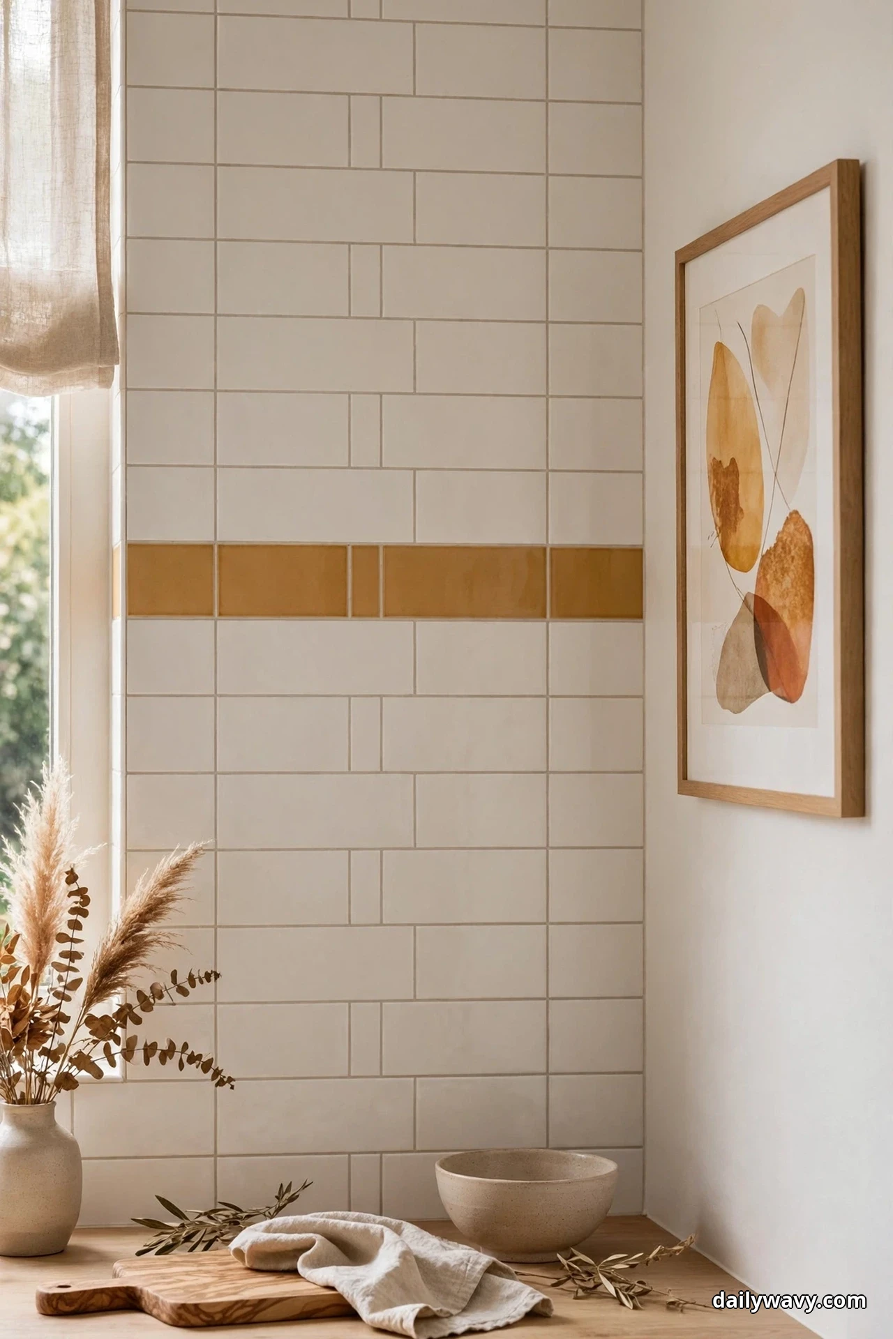
If you have art on an adjacent wall, your backsplash can quietly join the conversation. Pick one color from the piece, something like ochre, rust, sage, or dusty blue, and echo it in a narrow accent band, a few feature tiles behind the range, or a painted shelf bracket. The neutral field stays calm; the accent gives the whole open space a sense of being planned together.
Restraint is everything here. Keep the accent to a small fraction of the backsplash area, roughly one band or one feature zone, never a second color story. The accent should feel like a footnote, not a headline. When you sample, hold the artwork (or a photo of it) next to the tile and accent samples in your kitchen light. Colors shift between rooms, so test in the actual space where the tile will live.
This idea works especially well in open-plan kitchens where the cooking wall is visible from the living area. That one repeated color ties the two zones together without any need for matching furniture or themed decor.
7. A Vintage-Inspired Detail With Modern Shapes
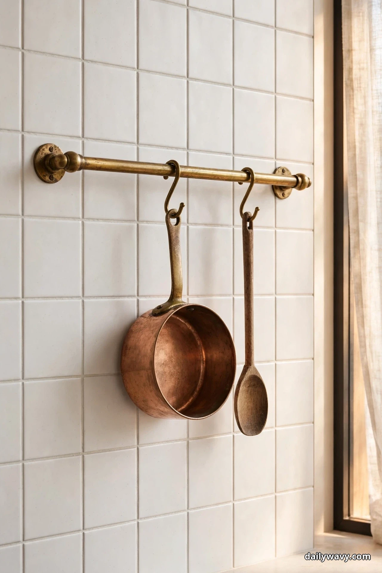
Pairing one vintage-inspired detail with clean modern tile creates the kind of tension designers love. An antique brass pot rail, a vintage-style bridge faucet, or classic bin-pull hardware against flat modern square tiles gives the kitchen character without pushing it into full period style. The tile stays quiet and current; the detail adds soul.
Unlacquered brass is the classic choice for this look, and it is worth knowing what you are signing up for. It arrives bright and gradually darkens into a rich patina with handling and air. If you love that living finish, choose unlacquered. If you want the brass to stay bright, choose a lacquered or sealed finish. Neither is wrong, but the surprise version is the one people regret.
Keep the modern side truly simple: flat square or subway tiles, minimal grout contrast, no competing pattern. One vintage note per zone is enough. A brass rail plus vintage-look pendants plus antique hardware starts to feel like a collection instead of an accent.
8. A Restrained Mix of Two Finishes

Using two finishes of the same neutral family adds depth that a single finish cannot. Picture matte warm-white wall tiles with a polished marble strip running behind the range, or satin-finish squares with one glossy ledge where the tile meets the windowsill. The color stays calm while the light play keeps it interesting.
The word restrained is doing real work in this idea. Confine the second finish to one zone: the range wall, a single shelf ledge, or the strip under open shelving. When two finishes alternate across the whole kitchen, the effect turns busy and the calm you wanted is gone.
Check that both finishes handle the zone the same way. A polished natural stone strip behind the range needs sealing and will etch if acidic splatter sits on it; a glazed ceramic glossy accent will not. Either is fine as long as you know the maintenance you are choosing. Sample both finishes side by side in your light, because matte and polished versions of the “same” color can read as two different colors once installed.
9. A Repeated Shape Across Adjacent Surfaces
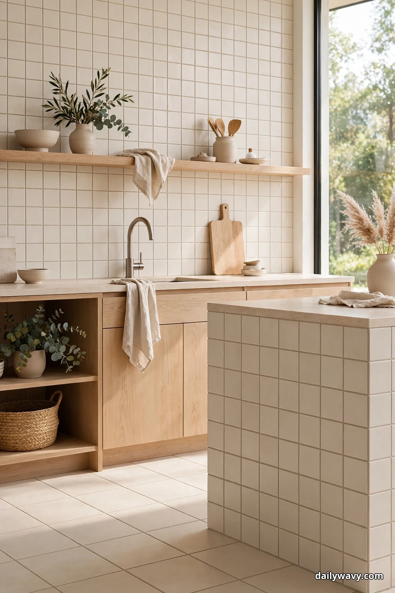
Repetition is one of the simplest ways to make a kitchen feel designed. When a shape from the backsplash reappears on an adjacent surface, the room reads as one composition. Square wall tiles echoed in square floor tiles, an arch niche repeated in an arched mirror, or a hexagonal floor tile nodded to with a hexagonal soap dish zone behind the sink. The echo does not have to be exact to work.
Scale is the decision that makes or breaks this idea. You can repeat the shape at the same size for a tailored, almost architectural feel, or graduate it deliberately: small hexagons on the wall, larger hexagons on the floor. What looks accidental is two nearly-but-not-quite matching sizes side by side, so commit to clearly same or clearly different.
Keep the color story neutral and let the shape carry the interest. A repeated shape in a calm palette reads sophisticated; the same repetition in bold colors reads playful. Since this guide is about neutrals, hold the palette steady and let geometry do the work.
10. A Light Background With One Saturated Accent
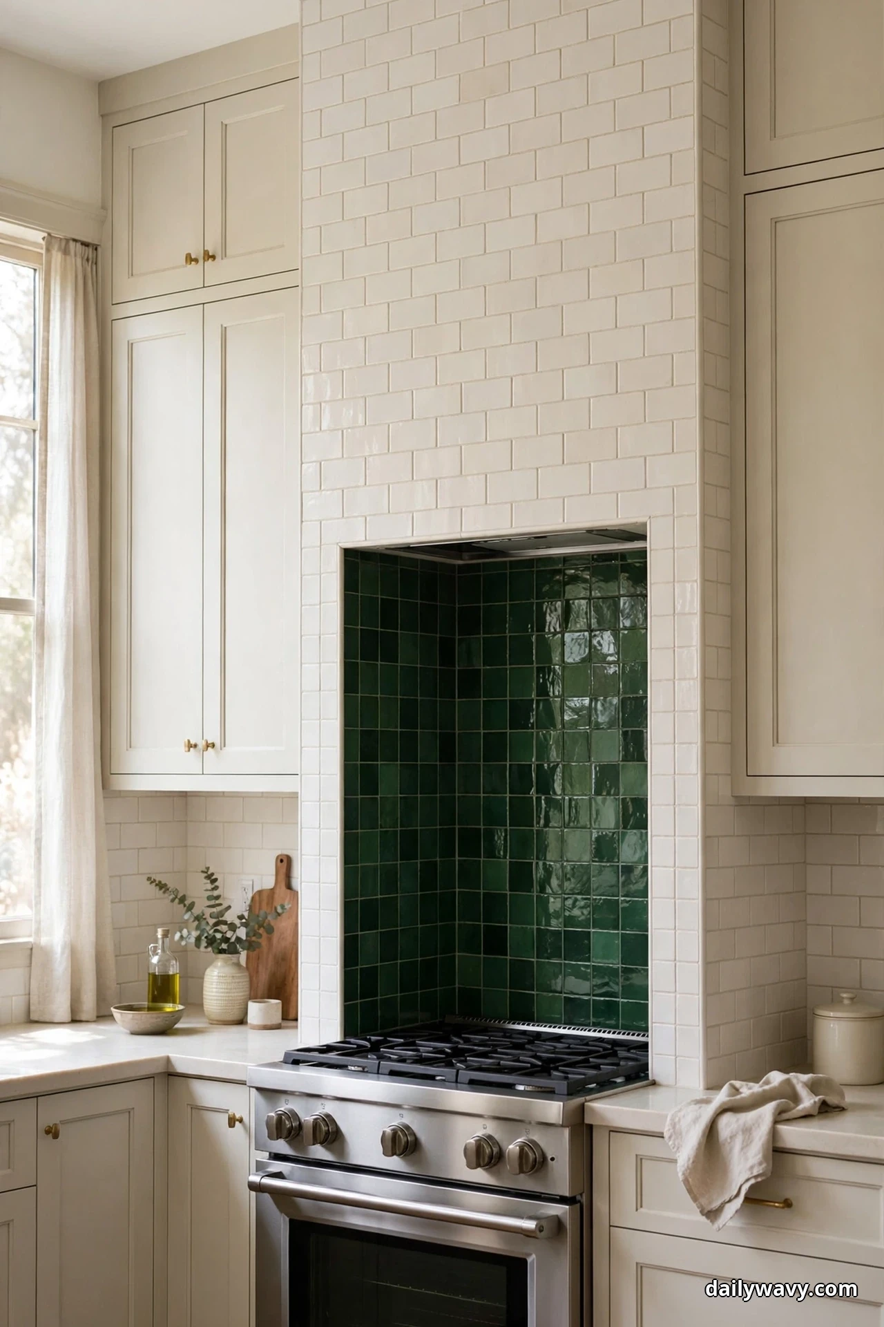
A creamy white field tile becomes dramatically more interesting with exactly one confident saturated move. A deep green range alcove, a navy painted shelf, or one run of saturated tile behind the sink gives the light background something to play against. The white field keeps the kitchen bright and timeless; the accent keeps it from feeling generic.
Commit to one accent only. The most common mistake with this idea is adding a second one: the green alcove plus the navy island plus the brass everything. One saturated note reads as a decision. Two reads as indecision. If you are drawn to a second color, put it in something changeable, like dish towels or a small appliance, not in tile.
Test the saturated sample at full size if you can. A four-inch sample of deep green looks jewel-like; a full alcove of it looks much stronger. Tape large paper or cardboard in the accent color to the wall for a few days to calibrate your comfort level. And check it in evening light, when saturated colors deepen and can dominate more than you expect.
Frequently Asked Questions
Should my backsplash be lighter or darker than my countertop?
Either direction works. A lighter backsplash than the counter keeps the wall bright and is the safer choice in small kitchens. A darker backsplash than the counter adds drama and hides splatter well. What matters is that you look at the two samples together, at counter height, in your own light, before deciding.
What grout color is best for a neutral backsplash?
Match the grout to the tile for the calmest read. Behind the range, where cooking stains happen, choose a grout close to the tile tone and seal it, or ask your installer about epoxy grout for that section. Avoid bright white grout with handmade-look tile unless you want every edge to stand out.
How do I test tile samples at home?
Get full-size samples of your finalists, tape them to the wall at backsplash height, and view them in morning, midday, and evening light. Hold them against your cabinet door and countertop sample at the same time. Live with them for at least a couple of days before ordering.
Glossy or matte tile for a neutral backsplash?
Glossy tile reflects light and brightens small or north-facing kitchens. Matte tile hides water spots and fingerprints between cleanings. Both wipe clean easily, so choose based on your light and how often you want to wipe, not on durability fears.
Can I use wallpaper as a backsplash?
Only outside direct heat and wet zones, unless the product is specifically rated for those areas. The wall behind the range and right at the sink should be tile, stone, or another hard surface. Wallpaper can work beautifully on a backsplash wall with no cooktop or sink, sealed appropriately.
How high should the backsplash go?
The standard run is eighteen inches, from countertop to the underside of the upper cabinets. Running tile full height to the ceiling behind the range, or behind open shelving, is a classic look that makes the wall feel finished. In kitchens with no upper cabinets, full-height tile on the main wall is worth considering.
A Calm Kitchen Starts With Comparison
The right neutral backsplash is the one you chose deliberately, not the one that happened to be in stock. Work through these ten ideas with real samples in your own light, and the decision gets much easier. Once the tile is settled, turn your attention to the storage around it: our guide to small pantry organization pairs well with any kitchen refresh, and the tile-choosing eye you have developed will serve you in the bathroom too, as in small bathroom storage. For more ideas across the whole home, browse the Home & Decor collection.